Looks like you're also looking for an answer from a predictive standpoint, so I put together a short demonstration of two approaches in R
- Binning a variable into equal sized factors.
- Natural cubic splines.
Below, I've given the code for a function that will compare the two methods automatically for any given true signal function
test_cuts_vs_splines <- function(signal, N, noise,
                                 range=c(0, 1),
                                 max_parameters=50,
                                 seed=154)
This function will create noisy training and testing datasets from a given signal, and then fit a series of linear regressions to the training data of two types
- The
cuts model includes binned predictors, formed by segmenting the range of the data into equal sized half open intervals, and then creating binary predictors indicating to which interval each training point belongs.
- The
splines model includes a natural cubic spline basis expansion, with knots equally spaced throughout the range of the predictor.
The arguments are
signal: A one variable function representing the truth to be estimated.N: The number of samples to include in both training and testing data.noise: The amound of random gaussian noise to add to the training and testing signal.range: The range of the training and testing x data, data this is generated uniformly within this range.max_paramters: The maximum number of parameters to estimate in a model. This is both the maximum number of segments in the cuts model, and the maximum number of knots in the splines model.
Note that the number of parameters estimated in the splines model is the same as the number of knots, so the two models are fairly compared.
The return object from the function has a few components
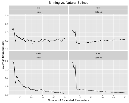
signal_plot: A plot of the signal function.data_plot: A scatter plot of the training and testing data.errors_comparison_plot: A plot showing the evolution of the sum of squared error rate for both models over a range of the number of estiamted parameters.
I'll demonstrate with two signal functions. The first is a sin wave with an increasing linear trend superimposed
true_signal_sin <- function(x) {
  x + 1.5*sin(3*2*pi*x)
}

obj <- test_cuts_vs_splines(true_signal_sin, 250, 1)
Here is how the error rates evolve

The second example is a nutty function I keep around just for this kind of thing, plot it and see
true_signal_weird <- function(x) {
  x*x*x*(x-1) + 2*(1/(1+exp(-.5*(x-.5)))) - 3.5*(x > .2)*(x < .5)*(x - .2)*(x - .5)
}

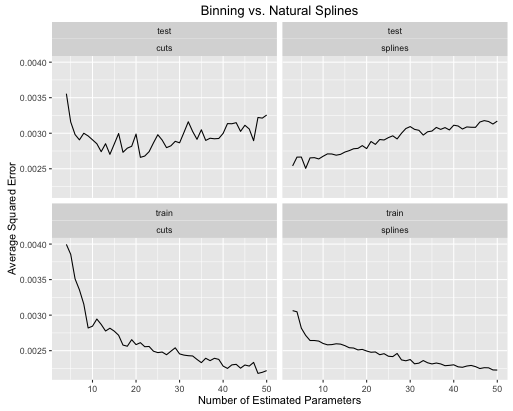
obj <- test_cuts_vs_splines(true_signal_weird, 250, .05)

And for fun, here is a boring linear function
obj <- test_cuts_vs_splines(function(x) {x}, 250, .2)

You can see that:
- Splines give overall better overall test performance when the model complexity is properly tuned for both.
- Splines give optimal test performance with much fewer estimated parameters.
- Overall the performance of splines is much more stable as the number of estimated parameters is varied.
So splines are always to be prefered from a predictive standpoint.
Code
Here's the code I used to produce these comparisons. I've wrapped it all in a function so that you can try it out with your own signal functions. You will need to import the ggplot2 and splines R libraries.
test_cuts_vs_splines <- function(signal, N, noise,
                                 range=c(0, 1),
                                 max_parameters=50,
                                 seed=154) {

  if(max_parameters < 8) {
    stop("Please pass max_parameters >= 8, otherwise the plots look kinda bad.")
  }

  out_obj <- list()

  set.seed(seed)

  x_train <- runif(N, range[1], range[2])
  x_test <- runif(N, range[1], range[2])

  y_train <- signal(x_train) + rnorm(N, 0, noise)
  y_test <- signal(x_test) + rnorm(N, 0, noise)

  # A plot of the true signals
  df <- data.frame(
    x = seq(range[1], range[2], length.out = 100)
  )
  df$y <- signal(df$x)
  out_obj$signal_plot <- ggplot(data = df) +
    geom_line(aes(x = x, y = y)) +
    labs(title = "True Signal")

  # A plot of the training and testing data
  df <- data.frame(
    x = c(x_train, x_test),
    y = c(y_train, y_test),
    id = c(rep("train", N), rep("test", N))
  )
  out_obj$data_plot <- ggplot(data = df) +
    geom_point(aes(x=x, y=y)) +
    facet_wrap(~ id) +
    labs(title = "Training and Testing Data")

  #----- lm with various groupings -------------
  models_with_groupings <- list()
  train_errors_cuts <- rep(NULL, length(models_with_groupings))
  test_errors_cuts <- rep(NULL, length(models_with_groupings))

  for (n_groups in 3:max_parameters) {
    cut_points <- seq(range[1], range[2], length.out = n_groups + 1)
    x_train_factor <- cut(x_train, cut_points)
    factor_train_data <- data.frame(x = x_train_factor, y = y_train)
    models_with_groupings[[n_groups]] <- lm(y ~ x, data = factor_train_data)

    # Training error rate
    train_preds <- predict(models_with_groupings[[n_groups]], factor_train_data)
    soses <- (1/N) * sum( (y_train - train_preds)**2)
    train_errors_cuts[n_groups - 2] <- soses

    # Testing error rate
    x_test_factor <- cut(x_test, cut_points)
    factor_test_data <- data.frame(x = x_test_factor, y = y_test)
    test_preds <- predict(models_with_groupings[[n_groups]], factor_test_data)
    soses <- (1/N) * sum( (y_test - test_preds)**2)
    test_errors_cuts[n_groups - 2] <- soses
  }

  # We are overfitting
  error_df_cuts <- data.frame(
    x = rep(3:max_parameters, 2),
    e = c(train_errors_cuts, test_errors_cuts),
    id = c(rep("train", length(train_errors_cuts)),
           rep("test", length(test_errors_cuts))),
    type = "cuts"
  )
  out_obj$errors_cuts_plot <- ggplot(data = error_df_cuts) +
    geom_line(aes(x = x, y = e)) +
    facet_wrap(~ id) +
    labs(title = "Error Rates with Grouping Transformations",
         x = ("Number of Estimated Parameters"),
         y = ("Average Squared Error"))

  #----- lm with natural splines -------------
  models_with_splines <- list()
  train_errors_splines <- rep(NULL, length(models_with_groupings))
  test_errors_splines <- rep(NULL, length(models_with_groupings))

  for (deg_freedom in 3:max_parameters) {
    knots <- seq(range[1], range[2], length.out = deg_freedom + 1)[2:deg_freedom]

    train_data <- data.frame(x = x_train, y = y_train)
    models_with_splines[[deg_freedom]] <- lm(y ~ ns(x, knots=knots), data = train_data)

    # Training error rate
    train_preds <- predict(models_with_splines[[deg_freedom]], train_data)
    soses <- (1/N) * sum( (y_train - train_preds)**2)
    train_errors_splines[deg_freedom - 2] <- soses

    # Testing error rate
    test_data <- data.frame(x = x_test, y = y_test)
    test_preds <- predict(models_with_splines[[deg_freedom]], test_data)
    soses <- (1/N) * sum( (y_test - test_preds)**2)
    test_errors_splines[deg_freedom - 2] <- soses
  }

  error_df_splines <- data.frame(
    x = rep(3:max_parameters, 2),
    e = c(train_errors_splines, test_errors_splines),
    id = c(rep("train", length(train_errors_splines)),
           rep("test", length(test_errors_splines))),
    type = "splines"
  )
  out_obj$errors_splines_plot <- ggplot(data = error_df_splines) +
    geom_line(aes(x = x, y = e)) +
    facet_wrap(~ id) +
    labs(title = "Error Rates with Natural Cubic Spline Transformations",
         x = ("Number of Estimated Parameters"),
         y = ("Average Squared Error"))


  error_df <- rbind(error_df_cuts, error_df_splines)
  out_obj$error_df <- error_df

  # The training error for the first cut model is always an outlier, and
  # messes up the y range of the plots.
  y_lower_bound <- min(c(train_errors_cuts, train_errors_splines))
  y_upper_bound = train_errors_cuts[2]
  out_obj$errors_comparison_plot <- ggplot(data = error_df) +
    geom_line(aes(x = x, y = e)) +
    facet_wrap(~ id*type) +
    scale_y_continuous(limits = c(y_lower_bound, y_upper_bound)) +
    labs(
      title = ("Binning vs. Natural Splines"),
      x = ("Number of Estimated Parameters"),
      y = ("Average Squared Error"))

  out_obj
}


