3
$\begingroup$

Say, I have 2 parameters, and based on my dataset, I have iteratively calculated the correlation coefficients between them by taking the correlation of the first i terms, where i ranges from 1 to the size of the dataset.

Now, if I plot these cumulative correlation coefficients and I find a plot which is - (i) almost a straight line (ii) an increasing line (iii) a decreasing line, what can I infer about the 2 parameters in each of these 3 cases?

EDIT: Say this is out dataset, called data, containing 2 columns, which are the 2 parameters:

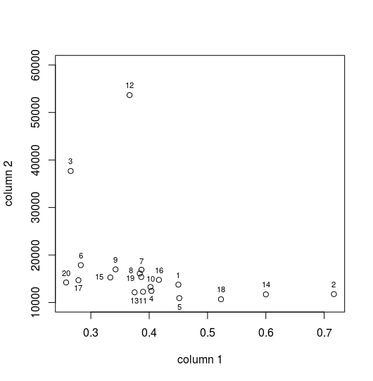
data = [0.450000000000000   13761
        0.716670000000000   11771
        0.265430000000000   37677
        0.403850000000000   12442
        0.451610000000000   10930
        0.282760000000000   17867
        0.386790000000000   16897
        0.383840000000000   16113
        0.342340000000000   16980
        0.402170000000000   13279
        0.389470000000000   12260
        0.366340000000000   53651
        0.375000000000000   12145
        0.600000000000000   11715
        0.333330000000000   15281
        0.416670000000000   14765
        0.278690000000000   14705
        0.523080000000000   10698
        0.386360000000000   15375
        0.257580000000000   14221]

Here is the MATLAB code to evaluate the cumulative correlations:

for i=1:size(data,1)-1
    C(i,1)=corr(data(1:i+1,1), data(1:i+1,2));
end
C(i+1,1)=corr(data(:,1), data(:,2));

Here is a part of the cumulative correlations, i.e., the output generated by the above code. The value in row i gives the correlation between elements 1 to i.

C = [-1
     -0.847686164758662
     -0.713720818907561
     -0.671570356292160
     -0.613123243096027
     -0.607412588640115
     -0.598822279828159
     -0.586376036290086
     -0.575999372323042
     -0.556829393824720
     -0.391060629488105
     -0.373141161547034
     -0.399999928278309
     -0.379689459376855
     -0.379704922466728
     -0.342786167856004
     -0.366493259831476
     -0.363622806570060
     -0.326063468688077
     -0.330843968356523]

The graph obtained by plotting C is: enter image description here
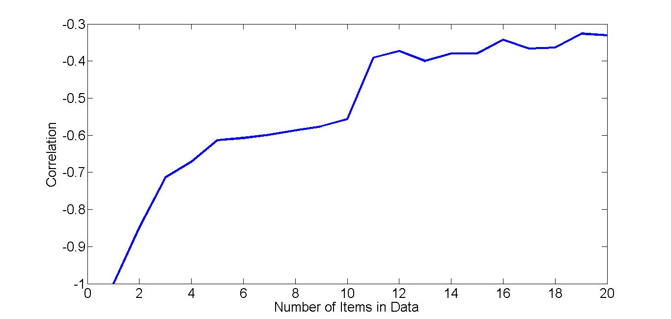
So, what does this graph signify? How can we interpret it?

$\endgroup$
5
  • $\begingroup$ Have you done this? If so, can you post your data, code, & the figures in question? This shouldn't happen (eg, r is bounded), so it's a little hard to interpret. $\endgroup$ Commented Oct 11, 2016 at 19:45
  • $\begingroup$ @gung I have now edited the question details to include the data, the code and the output. $\endgroup$ Commented Oct 12, 2016 at 5:21
  • 1
    $\begingroup$ Is there anything meaningful in the ordering of your data? Eg, was each row recorded on a consecutive day? $\endgroup$ Commented Oct 12, 2016 at 19:58
  • 1
    $\begingroup$ Yes, the records are sorted in decreasing order of frequency of appearance of each item. So, row i is the data for the ith most frequent item. $\endgroup$ Commented Oct 12, 2016 at 20:01
  • $\begingroup$ Could you tell us what the point of this exercise might be? What are you hoping to learn from such plots? $\endgroup$
    – whuber
    Commented May 2, 2022 at 12:51

2 Answers 2

1
$\begingroup$

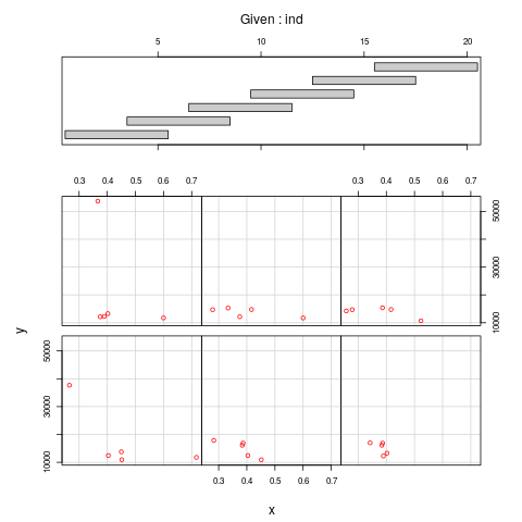
You have not given any context, and the data set is small. My suspicion is that whatever you are seeing in the plot is driven only by a few outliers, so be very careful with any interpretation. One useful way of plotting the data is an conditioning plot (conditioning on the ind(ex) number), using coplot function in R:

enter image description here

If you remove some few high y values, there is no correlation to be seen. What you see in your plot is probably pure artifice.

$\endgroup$
0
$\begingroup$

Your data does not seem to be strongly distributed along a single line and this is what makes your strong initial negative correlation change into a more weak correlation of -0.3 when you are adding more items to the set.

These changes may happen very randomly* and may depend on whatever distribution you are dealing with.

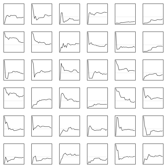
However, while it depends on chance, you will most typically see that with fewer points you have a larger variation of the sample correlation coefficient and are more likely to deviate from the true correlation. So often you will see a line decreasing or increasing from some initial estimate of the correlation with some large error towards some more precise estimate with less error.

In every case, you have an initial strong correlation. This is because with two points the correlation is always either fully +1 or -1. The strength will decrease when you start adding more points.

data


* In the image below you can see 36 cases of randomly generated cumulative correlation coefficients for data that is distributed with a multivariate normal distribution an -0.3 correlation. The differences in the curves are large (and this difference is what they have in common).

demonstrate

    library(MASS)
    
    set.seed(1)
    n = 6
    layout(matrix(c(1:(n^2)),n))
    par(mar = c(1,1,1,1))
    
    for (i in 1:(n^2)) {
      x <- mvrnorm(20, c(0,0), matrix(c(1,-0.3,-0.3,1),2)) 
            ### generate data
      s <- sapply(2:20, FUN = function(i) cor(x[1:i,1],x[1:i,2])) 
           ### compute cum correlation
      plot(2:20, s,
           type = "l", col = rgb(0,0,0,1), xlim = c(2,20), 
               ylim = c(-1,1),
           xlab = "", ylab = "", xaxt = "n", yaxt = "n")   
          ### plot correlation curve
      lines(c(2,20),c(1,1)*-0.3,col = 8, lty = 3)        
              ### add asymptote at -0.3
    }
$\endgroup$

Your Answer

By clicking “Post Your Answer”, you agree to our terms of service and acknowledge you have read our privacy policy.

Not the answer you're looking for? Browse other questions tagged or ask your own question.