2
$\begingroup$

I have some data values of type date/time (the last date that a resource was accessed) and I wish to chart this data on the y-axis against the different categories of resource on the x-axis.

What would be a sensible type of chart for displaying this sort of data ? For example is a histogram / bar chart satisfactory or is there a different graph type more applicable ?

EDIT: Are bar charts for only displaying quantities - can dates be considered quantities ?

$\endgroup$
6
  • 2
    $\begingroup$ Technically speaking, a histogram is used to show summary information about a frequency distribution. I think you want to ask "Is a bar chart satisfactory?", to which I would answer Yes. If there are repeated measures on the categorical variables, then you can capture variability with a box plot, as mentioned in csgillespie's comment. $\endgroup$ Commented Sep 7, 2010 at 2:22
  • $\begingroup$ @Josh - see updated question -> aren't bar charts for displaying quantities? : are dates quantities ? - $\endgroup$
    – Tom Carter
    Commented Sep 7, 2010 at 7:51
  • 1
    $\begingroup$ @Tom - Yes, bar charts are used to display quantities, so you could use a simple dot plot or line chart too. Some would argue that bar charts have a low "information-to-ink" ratio, but it is a perfectly reasonable choice here. And yes, I would consider dates quantities, especially in this setting where the dates are "days since some event". My original comment was admittedly nitpicking: your original question asked "For example is a histogram satisfactory...", but histograms are for when the independent variable is discrete/continuous over some interval. $\endgroup$ Commented Sep 7, 2010 at 15:41
  • $\begingroup$ One more thing: you have some votes for box plots but can you clarify if you have a single date for each category, or if you have multiple dates? $\endgroup$ Commented Sep 7, 2010 at 16:10
  • $\begingroup$ @Josh - no problem - I understood your distinction - I think you are right about dates being a quantity and in fact that's what I was struggling to see and hence the original question. $\endgroup$
    – Tom Carter
    Commented Sep 7, 2010 at 21:33

2 Answers 2

7
$\begingroup$

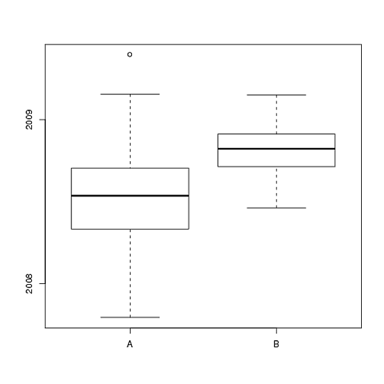
I presume that you have only a few resources that you are interested in? If so, then histograms are fine, or you could also try box-plots:

#Some R code
#Create random dates for resource A & resource B
dates.a = as.Date(rnorm(100, 200, 100), origin="2008-01-01")
dates.b = as.Date(rnorm(100, 300, 50), origin="2008-01-01")

df = data.frame(dates = c(dates.a, dates.b),
  type=rep(c("A", "B"), each=100))

#Plot the two resource together using boxplots
boxplot(df$dates~df$type)
#See ?hist for histograms.

This gives:

alt text

$\endgroup$
1
$\begingroup$

My personal preference would be for box plots. If the distributions of date/time in one or more categories are skewed, then box plots would definitely be more informative than bars.

$\endgroup$

Your Answer

By clicking “Post Your Answer”, you agree to our terms of service and acknowledge you have read our privacy policy.

Not the answer you're looking for? Browse other questions tagged or ask your own question.