6
$\begingroup$

I am analyzing a randomized trial, and aiming at appraising the impact of a given treatment on a non-fatal outcome, followed occasionally by death. I am thus conducting an event-free survival analysis with a time-dependent covariate (a preceding event). This can be easily modeled with Cox proportional hazard analysis.

However, I am not sure which is the best graph to describe such time-dependent survival analysis.

After some research, I have recognized that there are at least three possible alternatives: a landmark survival curve [1], a time-dependent Kaplan-Meier curve [2], and a Simon-Makuch plot [3] (based on the Mantel-Byar testing procedure [4]).

There is also a related post in CV: Visualize survival analysis with time dependent covariates.

Which is the best graph to depict this scenario? My packages of choice would be R or Stata.

References

  1. Dafni U. Landmark analysis at the 25-year landmark point. Circulation: Cardiovascular Quality and Outcomes 2011;4:363-71.

  2. Ying Z, Wei LJ. The Kaplan-Meier Estimate for Dependent Failure Time Observations. Journal of Multivariate Analysis 1994;50:17-29.

  3. Simon R, Makuch RW. A non-parametric graphical representation of the relationship between survival and the occurrence of an event: Application to responder versus non-responder bias. Statistics in Medicine 1984;3:35-44.

  4. Mantel N, Byar DP. Evaluation of responsetime data involving transient states: an illustration using heart-transplant data. Journal of the American Statistical Association 1974;69:81-6.

$\endgroup$
1
  • 3
    $\begingroup$ The ones I heard most has been the Kaplan-Meier curve and the landmark survival curve, in that order. $\endgroup$
    – llrs
    Commented Nov 23, 2016 at 11:03

1 Answer 1

1
$\begingroup$

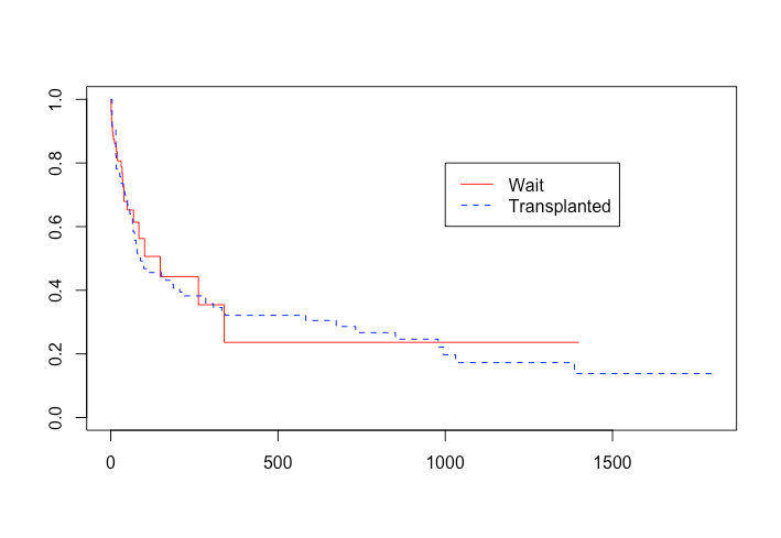
The patients at risk in a survival analysis must start time at risk at entry into the risk set. For a time-dependent covariate, time zero is the time when the at risk unit transfers from the initial to the new status. Thus time at risk in this new state begins at zero and everyone transferring is alive by definition and survival = 1.0 at time zero. The time of transfer in a time-dependent covariate analysis is usually arbitrary. If time at transfer to a new group is fixed, this suggests a possible crossover trial, where crossover time is specified, or some rare biologic condition where timing of group transfer is uniform. Regardless, the best way to graph this new group assignment is to start all units at tome 0 with survival at 1.0.

For example, in the Stanford transplant data, transplant occurs at a random time and it makes most sense to plot two curves beginning at time 0 and survival = 1.0: 1) all patients waiting, 2) those patients transplanted.

enter image description here

Using the landmark of the transplant time is not possible- the times are non-uniform. Shifting to a shared landmark time is possible, if the time is uniform, but the curve shifted to the right seems to imply implausible survival functions at plausible times at risk following transfer to the new at risk group.

$\endgroup$

Your Answer

By clicking “Post Your Answer”, you agree to our terms of service and acknowledge you have read our privacy policy.

Not the answer you're looking for? Browse other questions tagged or ask your own question.