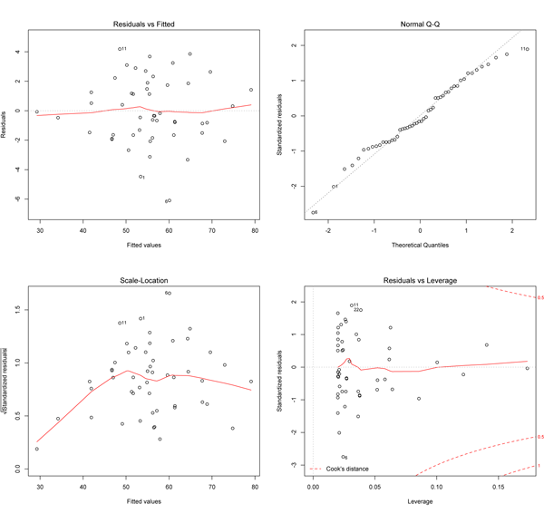
According to the discussion in Draper and Smith's Applied Regression Analysis (3rd edition, roughly page 59), this residual plot may be used to check for violations in model assumptions particularly related to incorrect specification or presence of heteroscedasticity.
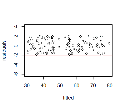
In the case that no violations are detects, the figure might look like the following.

Notice that the residuals are randomly distributed within within the red horizontal lines, forming a horizontal band along the fitted values. There is no visible pattern, which indicates that our regression model specifies an adequate relationship between the outcome, $Y$ and the covariates, $X$.
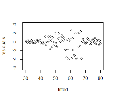
A figure depicting a potential violation in the model assumptions is

where a horizontal band with a particular width may work well for one part of the data, but might not work so well for another section of the fitted values. In this example, variances for the first quarter of the data, up to about a fitted value of 40 are smaller than variances for fitted values larger than 40. The middle portion of the fitted values has substantially larger variances than the outer values. This indicates that the regression model may have failed to account for heteroscedasticity.
As @ben-bolker mentions in his comments in the linked questions, this diagnostic plot may be even better suited for detection of non-linear relationships that that were not included in the specification. Two reproducible simulated examples of non-linear relationships are presented below. (the R code is presented at the bottom of the post).
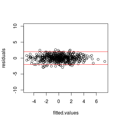
The first plot here repeats the ideal scenario, where the regression specification, $Y = \beta_0 + \beta_1 X + \epsilon$, adequately models the underlying relationship. In this instance, the fitted versus residual plot is

where the horizontal red lines are drawn at +- 2. As in the first figure, the points more or less lie in this horizontal band and no residuals are larger than 3 in magnitude (max(abs(regs[[1]]$residuals)) returns 2.932835).
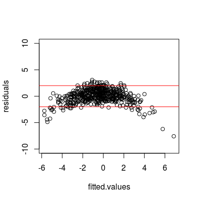
In the second example, the outcome variable has a quadratic relationship with its covariate, $Y = \beta_0 + \beta_1 X + \beta_2 X^2$, but the regression specification only allows for a linear relationship. Here, the fitted versus residual plot shows a fairly strong sign of non-linearity with an upside down "U" shape. This is because the second order term of $X$ has a negative relationship with $Y$.

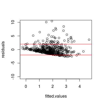
The third example provides an instance where $\ln Y$ has a linear relationship with X, with $Y = \exp{(\beta_0 + \beta_1 * x + \epsilon)}$ but the model fails account for the needed transformation of $Y$.

Here, the figure indicates a negative trend that isn't accounted for perhaps a bit of a funnel shape indicating heteroscedasticity. Further, there are larger numbers of residuals with extreme values, with 31 out of 500 values larger than 3 and four outside of the plot window, with values of roughly (10.1, 10.5 16.4, and 18.2). This relates to the non-normal error example in @glenn-b's answer to the question linked by @gung above.
data
set.seed(1234)

x <- rnorm(500)
x4 <- (.1 * x) + rnorm(500)
y1 <- 2 * x + rnorm(500)
y2 <- 2 * x + - (.5 * x^2) + rnorm(500)
y3 <- exp(.5 * x + rnorm(500))

# put data into dataframe to organize results
df <- data.frame(x, y1, y2, y3, y4)

# run regressions
regs <- lapply(df[-1], function(y) lm(y ~ x, data=df))

