I am trying to compare three data and report the results scaled in a range between 0 and 1. The objective is to allow an easy comparison between the data without worrying about their magnitude (which can range from very small to really big). I have tried to normalize the data between 0 and 1 but the output distort the figure and they become impossible to compare. Here is an example of how to generate my data:
import matplotlib.pyplot as plt
import numpy as np


def scale_magnitude_array(x):
    x = np.array(x)
    return (x - min(x)) / (max(x) - min(x))


def plot_data():
    y1 = [x + y for x, y in zip([1] * 100, np.random.rand(100))]
    y2 = [x + y for x, y in zip([2] * 100, np.random.rand(100))]
    y3 = [x + y for x, y in zip([3] * 100, np.random.rand(100))]
    x = np.arange(0, 100)

    plt.subplot(211)
    plt.plot(x, y1, label='y1')
    plt.plot(x, y2, label='y2')
    plt.plot(x, y3, label='y3')
    plt.ylabel('Original Data')
    plt.legend(loc='upper center', bbox_to_anchor=(0.5, 1.2), ncol=3)
    plt.gca().xaxis.set_major_locator(plt.NullLocator())
    y1_norm = scale_magnitude_array(y1)
    y2_norm = scale_magnitude_array(y2)
    y3_norm = scale_magnitude_array(y3)
    plt.subplot(212)
    plt.plot(x, y1_norm, label='normalized y1')
    plt.plot(x, y2_norm, label='normalized y2')
    plt.plot(x, y3_norm, label='normalized y3')
    plt.ylabel('Normalized Data')
    plt.legend(loc='upper center', bbox_to_anchor=(0.5, 1.2), ncol=3)
    plt.show()


if __name__ == '__main__':
    plot_data()
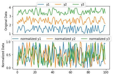
This gives this plot
Obviously, the normalized plot is more confusing than the original data. Is there any way to scale down the value in a range of 0-1 and keep the plot easy to interpret? (for example, in the above figure, scale the data in a way that y3 is always greater than y2 which is also greater than y1?)
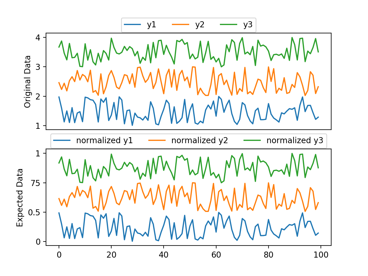
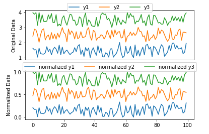
The expected result should look ideally like this:
 Notice that now the data is scaled between 0 and 1. However, the objective is not to just change the label of the data. It should be done mathematically by applying an appropriate magnitude scale to it. How can this be achieved?


