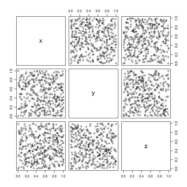
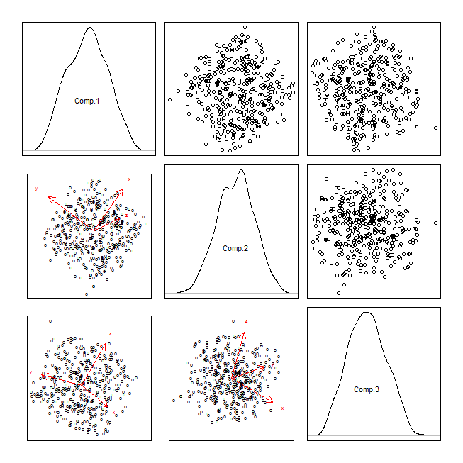
I think what primarily needs to be added to your list is coplots, but let's work our way up to that. The starting point for visualizing two continuous variables should always be a scatterplot. With more than two variables, that generalizes naturally to a scatterplot matrix (although if you have lots of variables, you may need to break that up into multiple matrices, see: How to extract information from a scatterplot matrix when you have large N, discrete data, & many variables?). The thing to recognize is that a scatterplot matrix is a set of 2D marginal projections from a higher-dimensional space. But those margins may not be the most interesting or informative. Exactly which margins you might want to look at is a tricky question (cf., projection pursuit), but the simplest possible next set to examine is the set that makes the variables orthogonal, i.e., scatterplots of the variables that result from a principal components analysis. You mention using this for data reduction and looking at the scatterplot of the first two principal components. The thinking behind that is reasonable, but you don't have to only look at the first two, others might be worth exploring (cf., Examples of PCA where PCs with low variance are “useful”), so you can / should make a scatterplot matrix of those, too. Another possibility with the output of a PCA is to make a biplot, which overlays the way the original variables are related to the principal components (as arrows) on top of the scatterplot. You could also combine a scatterplot matrix of the principal components with biplots.
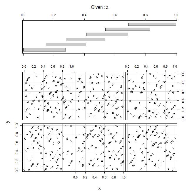
All of the above are marginal, as I mentioned. A coplot is conditional (the top part of my answer here contrasts conditional vs. marginal). Literally, 'coplot' is a blended word from 'conditional plot'. In a coplot, you are taking slices (or subsets) of the data on the other dimensions and plotting the data in those subsets in a series of scatterplots. Once you learn how to read them, they are a nice addition to your set of options for exploring patterns in higher-dimensional data.
To illustrate these ideas, here is an example with the RandU dataset (pseudorandom data generated by an algorithm that was popular in the 1970's):
data(randu)
windows()
  pairs(randu)
pca = princomp(randu)
attr(pca$scores, "dimnames")[[1]][1:400] = "o"
windows()
  par(mfrow=c(3,3), mar=rep(.5,4), oma=rep(2,4))
  for(i in 1:3){
    for(j in 1:3){
      if(i<j){
        plot(y=pca$scores[,i], x=pca$scores[,j], axes=FALSE); box()
      } else if(i==j){
        plot(density(pca$scores[,i]), axes=FALSE, main=""); box()
        text(0, .5, labels=colnames(pca$scores)[i])
      } else {
        biplot(pca, choices=c(j,i), main="", xaxp=c(-10,10,1), yaxp=c(-10,10,1))
      }
    }
  }
windows()
  coplot(y~x|z, randu)


parcoordfunction in theMASSpackage. Note that sometimes changing the order of the dimensions can make these plots more revelaing. $\endgroup$plot(jitter(y2) ~ jitter(x2), pch = 15)reference: thomasleeper.com/Rcourse/Tutorials/jitter.html $\endgroup$