2
$\begingroup$

I have 17 size distributions for different coral species, and I would like to be able to compare these distributions in one plot. However, the distributions are very different, so when I naively tried to overlay their density plots, many of the distributions were so small compared to the largest one that they were just crowded into the bottom-left corner.

Is there a better way to visualize these distributions in one plot which will allow me to compare relative sizes as well see the distribution within species?

$\endgroup$
4
  • 2
    $\begingroup$ A boxplot for each of the 17 on a single plot? Maybe log transform the y-variable before? $\endgroup$ Commented Jul 14, 2017 at 15:08
  • $\begingroup$ When differences of scale come in the obvious first thing would be to consider logs. $\endgroup$
    – Glen_b
    Commented Jul 15, 2017 at 2:22
  • $\begingroup$ Can you post some sample data for people to work with? $\endgroup$ Commented Jul 17, 2017 at 18:50
  • $\begingroup$ See stats.stackexchange.com/questions/28431/… $\endgroup$ Commented Jul 30, 2022 at 22:03

2 Answers 2

3
$\begingroup$

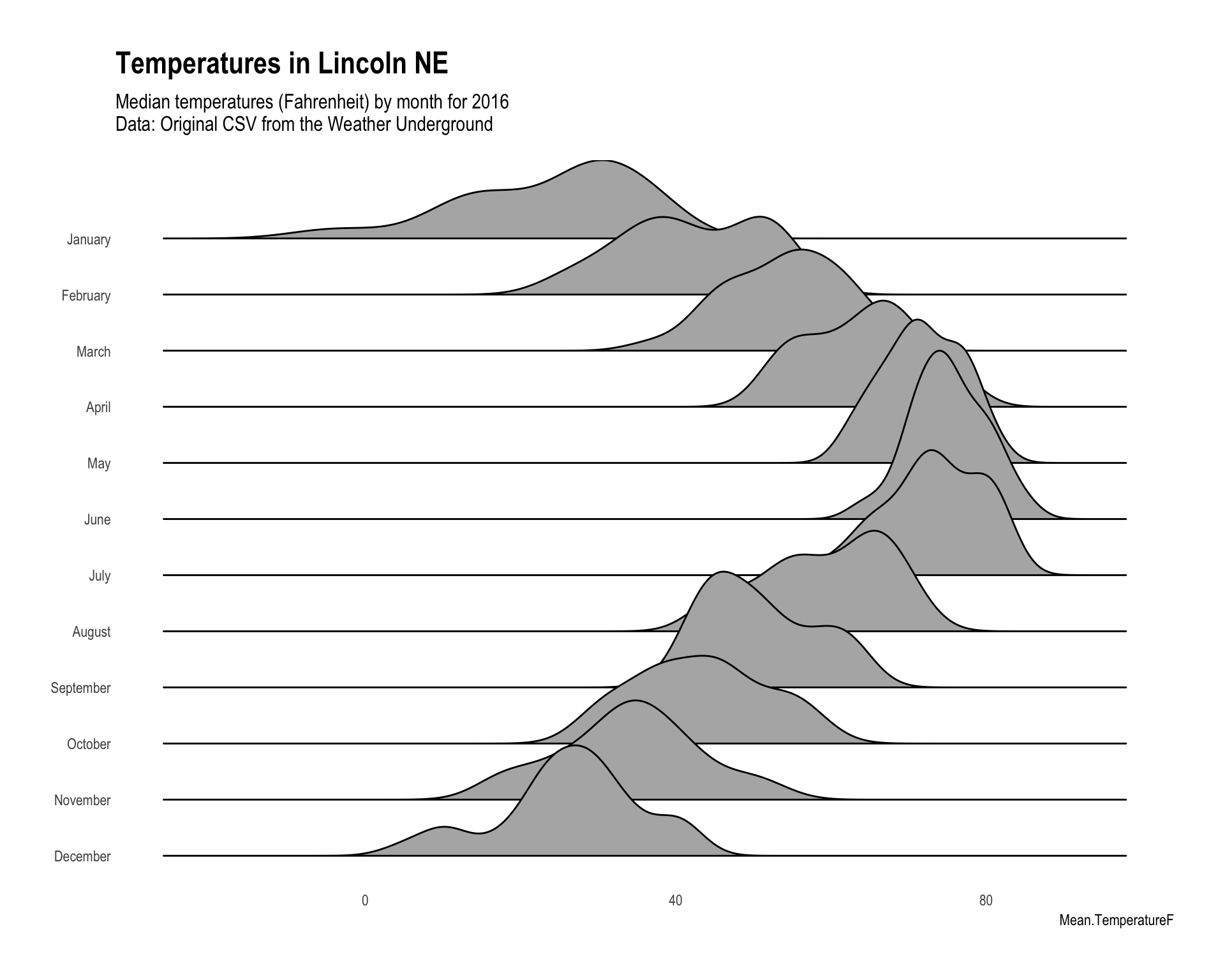
Perhaps a joy plot would bring you happiness?

http://austinwehrwein.com/data-visualization/it-brings-me-ggjoy/

This plot shows 12 months of temperature data with a separate histogram for each month. The histograms are sort of layered over each other. For this example, you'll need to download the CSV of data from the link, then the code is as follows:

library(ggjoy)
library(hrbrthemes)
weather.raw$month<-months(as.Date(weather.raw$CST))
weather.raw$months<-factor(rev(weather.raw$month),levels=rev(unique(weather.raw$month)))

#scales
mins<-min(weather.raw$Min.TemperatureF)
maxs<-max(weather.raw$Max.TemperatureF)

ggplot(weather.raw,aes(x = Mean.TemperatureF,y=months,height=..density..))+
  geom_joy(scale=3) +
  scale_x_continuous(limits = c(mins,maxs))+
  theme_ipsum(grid=F)+
  theme(axis.title.y=element_blank(),
        axis.ticks.y=element_blank(),
        strip.text.y = element_text(angle = 180, hjust = 1))+
  labs(title='Temperatures in Lincoln NE',
       subtitle='Median temperatures (Fahrenheit) by month for 2016\nData: Original CSV from the Weather Underground')

enter image description here

UPDATE

The necessary dataset is now included with the ggjoy package, so instead of downloading the CSV file, you can just run the following code to get a very similar plot:

library(ggjoy)
ggplot(lincoln_weather, aes(x = `Mean Temperature [F]`, y = `Month`)) +
  geom_joy(scale = 3, rel_min_height = 0.01) +
  scale_x_continuous(expand = c(0.01, 0)) +
  scale_y_discrete(expand = c(0.01, 0)) +
  labs(title = 'Temperatures in Lincoln NE',
       subtitle = 'Mean temperatures (Fahrenheit) by month for 2016\nData: Original CSV from the Weather Underground') +
  theme_joy(font_size = 13, grid = T) + theme(axis.title.y = element_blank())
$\endgroup$
3
  • $\begingroup$ could you please elaborate on why you need the line: "weather.raw$months<-factor(rev(weather.raw$month),levels=rev(unique(weather.raw$month)))"? Thank you! $\endgroup$ Commented Sep 1, 2017 at 21:24
  • $\begingroup$ @marika ggplot would have ordered the months in alphabetical order by default. By specifying the months as a factor and then providing a unique ordering, they will will be ordered correctly. $\endgroup$
    – syntonicC
    Commented Sep 11, 2017 at 18:31
  • $\begingroup$ It looks like ggjoy is being deprecated in favor of ggridges: cran.r-project.org/package=ggridges $\endgroup$ Commented Mar 24, 2019 at 17:16
1
$\begingroup$

I tend to use ecdf plots when viewing distributions, particularly if I have several distributions I'm trying to compare. Because these use lines rather than bars (histograms) or shapes (density plots) there is less of an issue with overlap.

library(data.table)
library(ggplot2)

set.seed(123)
dat_data <- data.table(meanval = rnorm(10),
                       sdval = runif(10, 0.5, 3),
                       rep = sample.int(1000, 10))
#         meanval     sdval rep
#  1: -0.56047565 2.7238483 964
#  2: -0.23017749 2.2320085 902
#  3:  1.55870831 2.1012670 690
#  4:  0.07050839 2.9856744 794
#  5:  0.12928774 2.1392645  25
#  6:  1.71506499 2.2713262 476
#  7:  0.46091621 1.8601651 754
#  8: -1.26506123 1.9853551 215
#  9: -0.68685285 1.2228993 316
# 10: -0.44566197 0.8677841 230

First, we generated some parameters for mean, sd, and rep. Then, randomly sample rep number of times from a normal distribution with a given mean and sd:

dat <- rbindlist(lapply(1:dim(dat_data)[1], 
                        function(x) data.table(rowval = x, 
                                               dist = rnorm(dat_data[x, rep], 
                                                            dat_data[x, meanval], 
                                                            dat_data[x, sdval]))))

That gives a test dataset. You wouldn't need to do any of the above since you already have your data. Now we can plot the ecdf.

ggplot(dat, aes(x = dist, group = factor(rowval), color = factor(rowval))) +
  stat_ecdf(size = 2)
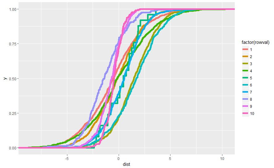
enter image description here

You'll notice that row 5, which has the lowest rep number of 25, looks quite choppy. The degree of 'chop' can give you a clue as to the relative number, to some degree.

For reference, plotting the same data with geom_density:

ggplot(dat, aes(x = dist, fill = factor(rowval))) +
  geom_density(alpha = 0.3)
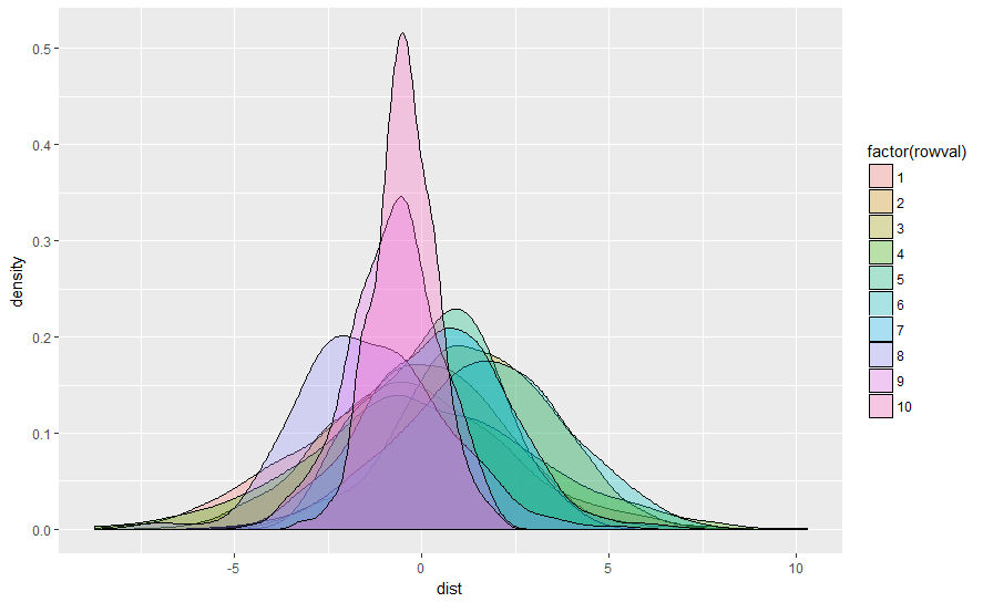
enter image description here

$\endgroup$

Your Answer

By clicking “Post Your Answer”, you agree to our terms of service and acknowledge you have read our privacy policy.

Not the answer you're looking for? Browse other questions tagged or ask your own question.