30
votes
$\begingroup$

I'm very new with R and stats in general, but I need to make a scatterplot that I think might be beyond its native capacities.

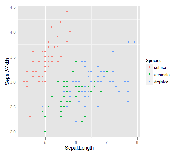
I have a couple of vectors of observations and I want to make a scatterplot with them, and each pair falls into one out of three categories. I would like to make a scatterplot that separates each category, either by colour or by symbol. I think this would be better than generating three different scatterplots.

I have another problem with the fact that in each of the categories, there are large clusters at one point, but the clusters are larger in one group than in the other two.

Does anyone know a good way to do this? Packages I should install and learn how to use? Anyone done something similar?

Thanks

$\endgroup$

3 Answers 3

53
votes
$\begingroup$

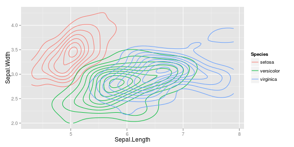
large clusters: if overprinting is a problem, you could either use a lower alpha, so single points are dim, but overprining makes more intense colour. Or you switch to 2d histograms or density estimates.

require ("ggplot2")
  • ggplot (iris, aes (x = Sepal.Length, y = Sepal.Width, colour = Species)) + stat_density2d ()
    density
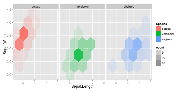
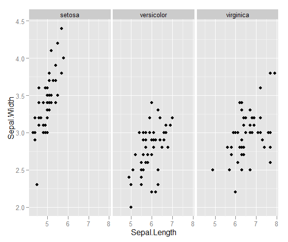
    You'd probably want to facet this...

  • ggplot (iris, aes (x = Sepal.Length, y = Sepal.Width, fill = Species)) + stat_binhex (bins=5, aes (alpha = ..count..)) + facet_grid (. ~ Species)
    hexbin
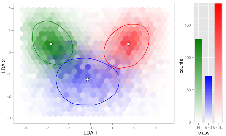
    While you can procude this plot also without facets, the prining order of the Species influnces the final picture.

  • You can avoid this if you're willing to get your hands a bit dirty (= link to explanation & code) and calculate mixed colours for the hexagons: enter image description here

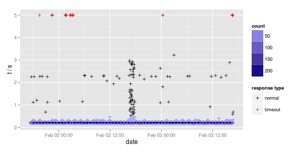
  • Another useful thing is to use (hex)bins for high density areas, and plot single points for other parts:

    ggplot (df, aes (x = date, y = t5)) + 
      stat_binhex (data = df [df$t5 <= 0.5,], bins = nrow (df) / 250) +
          geom_point (data = df [df$t5 > 0.5,], aes (col = type), shape = 3) +
      scale_fill_gradient (low = "#AAAAFF", high = "#000080") +
      scale_colour_manual ("response type", 
        values = c (normal = "black", timeout = "red")) + 
      ylab ("t / s")
    

    enter image description here


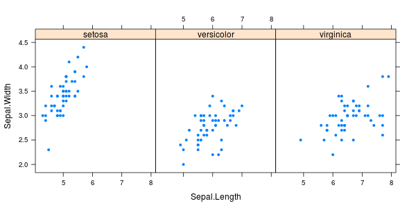
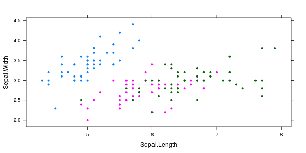
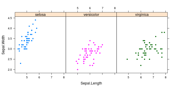
For the sake of completeness of the plotting packages, let me also mention lattice:

require ("lattice")
  • xyplot(Sepal.Width ~ Sepal.Length | Species, iris, pch= 20)
    <code>xyplot(Sepal.Width ~ Sepal.Length | Species, iris, pch= 20)</code>

  • xyplot(Sepal.Width ~ Sepal.Length, iris, groups = iris$Species, pch= 20)
    <code>xyplot(Sepal.Width ~ Sepal.Length, iris, groups = iris$Species, pch= 20)</code>

  • xyplot(Sepal.Width ~ Sepal.Length | Species, iris, groups = iris$Species, pch= 20)
    <code>xyplot(Sepal.Width ~ Sepal.Length | Species, iris, groups = iris$Species, pch= 20)</code>

$\endgroup$
1
  • $\begingroup$ Lovely! Thank you very much, the hex bins did the trick perfectly! $\endgroup$
    – crf
    Commented Jun 21, 2012 at 2:01
22
votes
$\begingroup$

This is one of the classic problems for the 'Iris' data set. This is a link to a whole set of plotting projects based on that data set with R code, which you may be able to adapt to your problem.

Here is an approach that uses with base R rather than an add-on package.

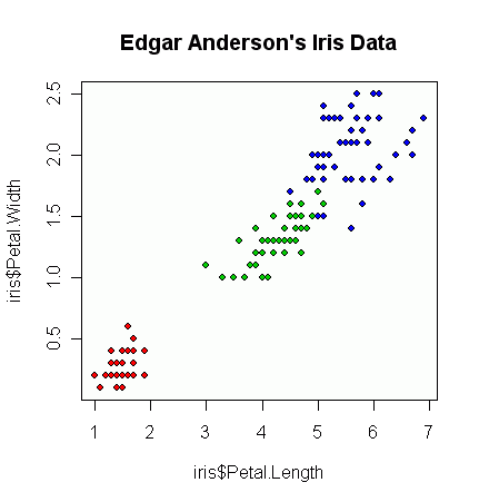
plot(iris$Petal.Length, iris$Petal.Width, pch=21, 
     bg=c("red","green3","blue")[unclass(iris$Species)], 
     main="Edgar Anderson's Iris Data")

which produces this figure:

enter image description here

From there, depending on your plot, you can start messing about with alpha/transparency levels to allow for overplotting, etc. but I would build up from a very basic graph first.

While there are many reasons to stick with base R, other packages simplify plotting. Separating out data by a distinguishing feature is one of the strengths of the ggplot2 and lattice packages. ggplot2 makes particularly visually appealing plots. Both packages are demonstrated in the answer by @cbeleites.

$\endgroup$
3
  • 4
    $\begingroup$ Slightly confusing because although you recommend ggplot2 you don't use it in your example? A ggplot2 equivalent woudl be library(ggplot2); qplot(Petal.Length, Petal.Width, color=Species, data=iris, main="Edgar Anderson's Iris Data"). This also has the advantage of automatically producing a legend. $\endgroup$ Commented Jun 20, 2012 at 6:37
  • $\begingroup$ @PeterEllis That's because while I can recognize something that lends itself well to ggplot2, I'm only even passingly competent with the base graphics. $\endgroup$
    – Fomite
    Commented Jun 20, 2012 at 6:41
  • 1
    $\begingroup$ Great trick with unclass() in base graphics BTW $\endgroup$ Commented Jun 22, 2012 at 21:48
16
votes
$\begingroup$

Or with ggplot2:

ggplot(iris, aes(x = Sepal.Length, y = Sepal.Width, colour = Species)) + geom_point()
ggplot(iris, aes(x = Sepal.Length, y = Sepal.Width)) + geom_point() + facet_grid(~Species)

Which produces

enter image description here

enter image description here

$\endgroup$

Not the answer you're looking for? Browse other questions tagged or ask your own question.