1
$\begingroup$

I want to cluster users of a web app based on their engagement, my data looks approximately like:

id | count of action 1 | count of action 2 | ... | count of action n

I have 40 different counts and a sample of around 30k users. From here I remove outliers and I further create some features and scale all the variables to be in $[0,1]$.

I am familiar with the basic algorithms and their drawbacks, however, these often relate to a structure of the data. That is quite easy to get a feeling for in two dimensions for example like here or here.

The question is, how can I explore my data with so many dimensions and see, for example, if my data follow a gaussian distribution. I know there's dimensionality reduction but using visual examination seems like it might be prone to errors in judgment because the reduced dimensions miss some important information. How can I inform the model choice in a smart/rigorous way?

I work in R.

$\endgroup$
3
  • 1
    $\begingroup$ If your data are counts, they really can't be Gaussian. They might be something else, though. Is there some kind of maximum possible count (eg, count of heads, where number of coin flips is known)? $\endgroup$ Commented Nov 14, 2017 at 17:54
  • 1
    $\begingroup$ Counts might be Gaussian if you expect users to perform some action a mean of $\mu$ times with some variance among them of $\sigma^2$. $\endgroup$ Commented Nov 14, 2017 at 18:31
  • $\begingroup$ That is a good point to start, does having this assumption required for the mixture of gaussians model really just means that each of my variables have to be Gaussian? Well they're rather not, most of the distributions are left skewed to 0. There's not really a maximum count, but after scaling the data it is of course bounded. $\endgroup$ Commented Nov 15, 2017 at 8:28

1 Answer 1

0
$\begingroup$

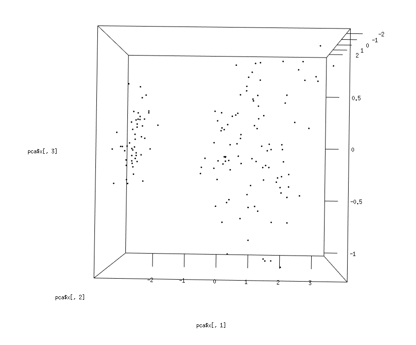
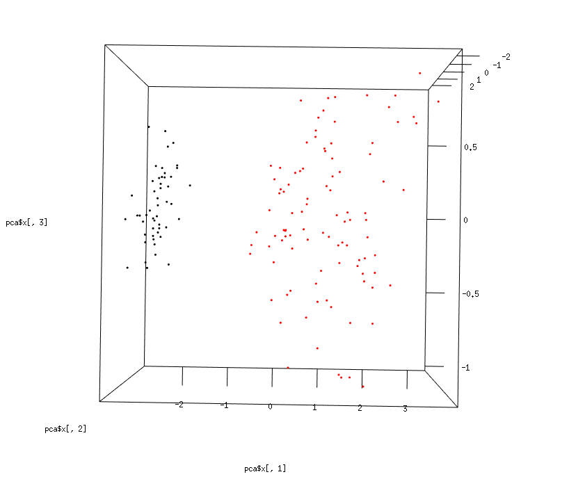
My idea after some more work on this task, illustrated with an example. I haven't found a way not relying on visualisation, but improved that at least to a usable extent. First apply PCA to the data, usually the first three components take most of the variance in the dataset, two is probably not enough. I can take the three and plot them in 3D (ideally interactive so I can quickly get a good understanding of how my data looks like). With this I can inform a bit better which clustering method to use. Second step, because the first step isn't perfect. I apply the clustering algorithm and in the same plot look at the results (clusters are colors). If it makes sense I can go on with applying some internal validity measures to check whether my visual understanding is in line with them.

library(mclust)
library(rgl)

data("iris")
head(iris)

iris = scale(iris[,-5])

# first perform PCA and look at the first three components in 3D
pca = prcomp(iris)
plot3d(x = pca$x[,1], y = pca$x[,2], z = pca$x[,3])

# Run clustering model and look at the results within the same plot
mod1 = Mclust(iris)

plot3d(x = pca$x[,1], y = pca$x[,2], z = pca$x[,3], col = mod1$classification)

Results of the PCA plot: enter image description here

Results after clustering: enter image description here

$\endgroup$

Your Answer

By clicking “Post Your Answer”, you agree to our terms of service and acknowledge you have read our privacy policy.

Not the answer you're looking for? Browse other questions tagged or ask your own question.