0
$\begingroup$

Here is my data set. After applying clustering on two variables Annual income and Spending score, I tried visualizing it using clustplot. I haven't scaled any of these variables before applying kmeans.

I'm unable to interpret the coordinates which look like some principle components. What exactly they refer to? why minus values are being shown in the graph even though there are no values as such.

CustomerID,Genre,Age,Annual Income (k$),Spending Score (1-100)
0001,Male,19,15,39
0002,Male,21,15,81
0003,Female,20,16,6
0004,Female,23,16,77
0005,Female,31,17,40
0006,Female,22,17,76
0007,Female,35,18,6


library(cluster)
clusplot(x, kmeans$cluster, lines = 0, shade =  TRUE, color = TRUE, labels = 2, plotchar = FALSE, span = TRUE, main = paste("Clusters of client"), xlab = "Annual income", ylab = "spending score")

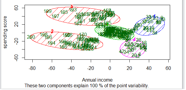
enter image description here

$\endgroup$

1 Answer 1

2
$\begingroup$

If you look at ?clusplot, you are referred to ?clusplot.default, where, under "Details", you find:

‘clusplot’ uses function calls ‘princomp(, cor = (ncol(x) > 2))’ or ‘cmdscale(, add=TRUE)’, respectively, depending on ‘diss’ being false or true. These functions are data reduction techniques to represent the data in a bivariate plot.

diss is by default FALSE, so your coordinates indeed come from a PCA.

$\endgroup$
2
  • $\begingroup$ can you help me what parameter should I change in order to make the plot on actual coordinates instead of components? $\endgroup$
    – yome
    Commented Dec 26, 2017 at 12:47
  • $\begingroup$ From the help pages, it doesn't look like there is an option for that. You may need to write your own function. $\endgroup$ Commented Dec 26, 2017 at 16:14

Not the answer you're looking for? Browse other questions tagged or ask your own question.