I'm reviewing Chapter 6 from An Introduction to Statistical Learning. I'm having trouble understanding PCA and the provided example.
Can someone explain how the first principal component direction can yield observation projections with the largest possible variance, but also minimize the sum of the squared perpendicular distances between each point and the line?
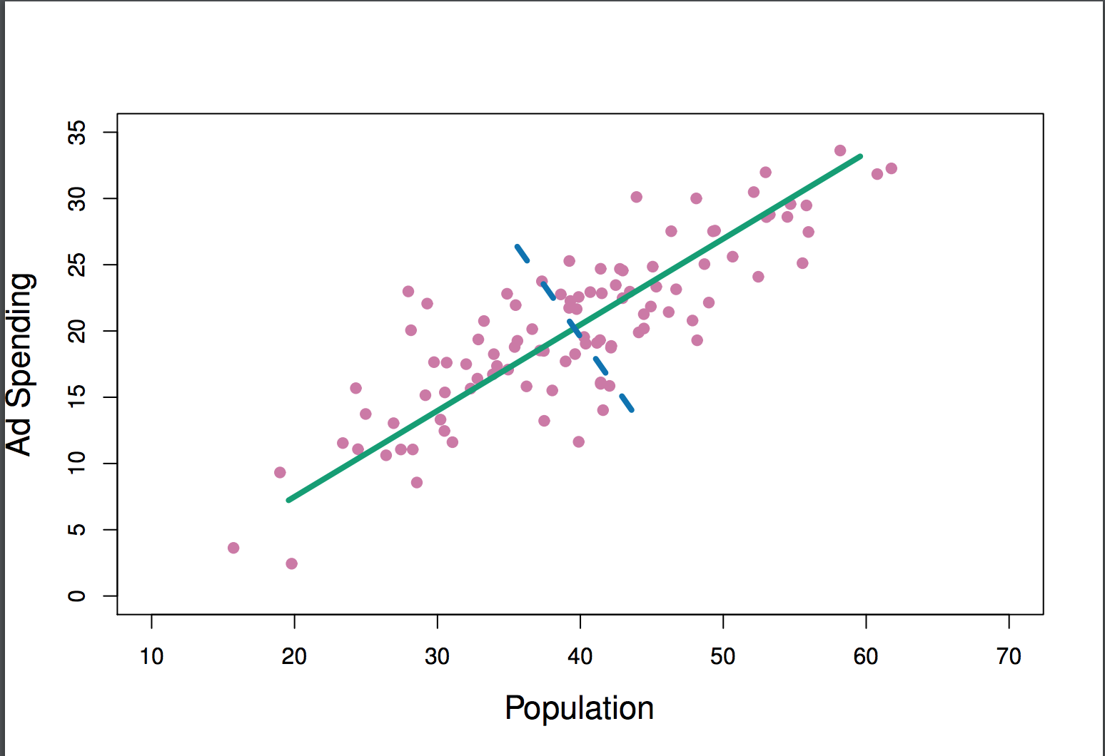
In other words: how does the green line both maximize variance and fit the data as closely as possible? Seems to me that projections onto the blue line would have higher variance.
For reference, here's the excerpt from the book and the example figures:
The first principal component direction of the data is that along which the observations vary the most. For instance, consider Figure 6.14, which shows population size (
pop) in thens of thousands of people, and ad spending for a particular company (ad) in thousands of dollars, for 100 cities.
The green solid line represents the first principal component direction of the data.
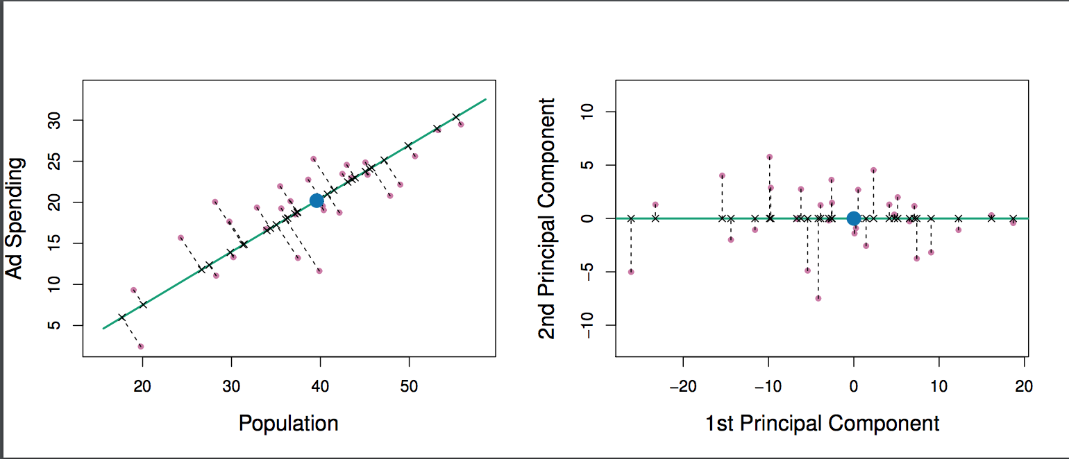
If we projected the 100 observations onto this line (as shown in the left hand panel of Figure 6.15), then the resulting projected observations would have the largest possible variance; projecting the observations onto any other line would yield projected observations with lower variance.
There is another interpretation for PCA: The first principal component vector defines the line that is as close as possible to the data. In Figure 6.14, the first principal component line minimizes the sum of the squared perpendicular distances between each point and the line. These distances are plotted as dashed line segments in the left-hand panel of 6.15, in which the crosses represent the projection of each point onto the first principal component line.


