15
$\begingroup$

I'm trying to plot a QQ-plot with two data sets of about 1.2 million points, in R (using qqplot, and feeding the data into ggplot2). The calculation is easy enough, but the resulting graph is painfully slow to load, because there's so many points. I've tried linear approximation to reduce the number of points to 10000 (this is what the qqplot function does anyway, if one of your data sets is bigger than the other), but then you lose a lot of the detail in the tails.

Most of the data points towards the centre are basically useless - they overlap so much that there's probably about 100 per pixel. Is there any simple way of removing data that is too close together, without loosing the more sparse data toward the tails?

$\endgroup$
1
  • $\begingroup$ I should have mentioned, I'm actually comparing one data set (climate observations) with an ensemble of comparable data sets (model runs). So I'm actually comparing 1.2m obs points, with 87m model points, hence the approx() function comes into play in the qqplot() function. $\endgroup$
    – naught101
    Commented Aug 29, 2012 at 1:09

5 Answers 5

12
$\begingroup$

Q-Q plots are incredibly autocorrelated except in the tails. In reviewing them, one focuses on the overall shape of the plot and on tail behavior. Ergo, you will do fine by coarsely subsampling in the centers of the distributions and including a sufficient amount of the tails.

Here is code illustrating how to sample across an entire dataset as well as how to take extreme values.

quant.subsample <- function(y, m=100, e=1) {
  # m: size of a systematic sample
  # e: number of extreme values at either end to use
  x <- sort(y)
  n <- length(x)
  quants <- (1 + sin(1:m / (m+1) * pi - pi/2))/2
  sort(c(x[1:e], quantile(x, probs=quants), x[(n+1-e):n]))
  # Returns m + 2*e sorted values from the EDF of y
}

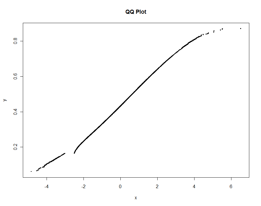
To illustrate, this simulated dataset shows a structural difference between two datasets of approximately 1.2 million values as well as a very small amount of "contamination" in one of them. Also, to make this test stringent, an interval of values is excluded from one of the datasets altogether: the QQ plot needs to show a break for those values.

set.seed(17)
n.x <- 1.21 * 10^6
n.y <- 1.20 * 10^6
k <- floor(0.0001*n.x)
x <- c(rnorm(n.x-k), rnorm(k, mean=2, sd=2))
x <- x[x <= -3 | x >= -2.5]
y <- rbeta(n.y, 10,13)

We can subsample 0.1% of each dataset and include another 0.1% of their extremes, giving 2420 points to plot. Total elapsed time is less than 0.5 seconds:

m <- .001 * max(n.x, n.y)
e <- floor(0.0005 * max(n.x, n.y))

system.time(
  plot(quant.subsample(x, m, e), 
       quant.subsample(y, m, e), 
       pch=".", cex=4,
       xlab="x", ylab="y", main="QQ Plot")
  )

No information is lost whatsoever:

QQ plot

$\endgroup$
9
  • $\begingroup$ Shouldn't you merge your answers? $\endgroup$ Commented Aug 28, 2012 at 19:23
  • 2
    $\begingroup$ @Michael Yes, normally I would have edited the first answer (the present one). But each answer is long and they use substantially different approaches, with different performance characteristics, so it seemed best to post the second as a separate answer. In fact, I was tempted to delete the first after the second (adaptive) one occurred to me, but its relative speed may appeal to some people, so it would be unfair to remove it altogether. $\endgroup$
    – whuber
    Commented Aug 28, 2012 at 19:31
  • $\begingroup$ This is basically what I wanted, but what's the rationale behind the use of sin? Am I right that a normal CDF would be a better function, if you assumed that the x was normally distributed? Did you just choose sin because it's easier to calculate? $\endgroup$
    – naught101
    Commented Aug 29, 2012 at 1:04
  • $\begingroup$ Is this supposed to be the same data as your other answer? If so, why are the plots so different? what happened to all the data for x>6? $\endgroup$
    – naught101
    Commented Aug 29, 2012 at 1:14
  • $\begingroup$ @naught I commented on the difference in data in my other answer: one number (unintentionally) got changed (from .0001 to .01), altering the amount of contamination. Because the seed is explicitly set, you can easily reproduce the data for this answer and apply the second solution to it if you want a direct comparison. The use of sine was just an ad hoc way to focus (in a quadratic fashion) on the endpoints. A polynomial like $(3-2x)x^2$ would have done about the same thing. I apologize for not explaining this earlier. $\endgroup$
    – whuber
    Commented Aug 29, 2012 at 11:44
11
$\begingroup$

Elsewhere in this thread I proposed a simple but somewhat ad hoc solution of subsampling the points. It is fast, but requires some experimentation to produce great plots. The solution about to be described is an order of magnitude slower (taking up to 10 seconds for 1.2 million points) but is adaptive and automatic. For large datasets, it ought to give good results the first time and do so reasonably quickly.

The idea is that of the Douglas-Peucker polyline simplification algorithm, adapted to the characteristics of a QQ plot. The relevant statistic for such a plot is the Kolmogorov-Smirnov statistic $D_n$, the maximum vertical deviation from a fitted line. Accordingly, the algorithm is this:

Find the maximum vertical deviation between the line joining the extrema of the $(x,y)$ pairs and their QQ plot. If this is within an acceptable fraction $t$ of the full range of $y$, replace the plot with this line. Otherwise, partition the data into those preceding the point of maximum vertical deviation and those after it and recursively apply the algorithm to the two pieces.

There are some details to take care of, especially to cope with datasets of different length. I do this by replacing the shorter one by the quantiles corresponding to the longer one: in effect, a piecewise linear approximation of the EDF of the shorter one is used instead of its actual data values. ("Shorter" and "longer" can be reversed by setting use.shortest=TRUE.)

Here is an R implementation.

qq <- function(x0, y0, t.y=0.0005, use.shortest=FALSE) {
  qq.int <- function(x,y, i.min,i.max) {
    # x, y are sorted and of equal length
    n <-length(y)
    if (n==1) return(c(x=x, y=y, i=i.max))
    if (n==2) return(cbind(x=x, y=y, i=c(i.min,i.max)))
    beta <- ifelse( x[1]==x[n], 0, (y[n] - y[1]) / (x[n] - x[1]))
    alpha <- y[1] - beta*x[1]
    fit <- alpha + x * beta
    i <- median(c(2, n-1, which.max(abs(y-fit))))
    if (abs(y[i]-fit[i]) > thresh) {
      assemble(qq.int(x[1:i], y[1:i], i.min, i.min+i-1), 
               qq.int(x[i:n], y[i:n], i.min+i-1, i.max))
    } else {
      cbind(x=c(x[1],x[n]), y=c(y[1], y[n]), i=c(i.min, i.max))
    }
  }
  assemble <- function(xy1, xy2) {
    rbind(xy1, xy2[-1,])
  }
  #
  # Pre-process the input so that sorting is done once
  # and the most detail is extracted from the data.
  #
  is.reversed <- length(y0) < length(x0)
  if (use.shortest) is.reversed <- !is.reversed
  if (is.reversed) {
    y <- sort(x0)
    n <- length(y)
    x <- quantile(y0, prob=(1:n-1)/(n-1))    
  } else {
    y <- sort(y0)
    n <- length(y)
    x <- quantile(x0, prob=(1:n-1)/(n-1))    
  }
  #
  # Convert the relative threshold t.y into an absolute.
  #
  thresh <- t.y * diff(range(y))
  #
  # Recursively obtain points on the QQ plot.
  #
  xy <- qq.int(x, y, 1, n)
  if (is.reversed) cbind(x=xy[,2], y=xy[,1], i=xy[,3]) else xy
}

As an example I use data simulated as in my earlier answer (with an extreme high outlier thrown into y and quite a bit more contamination in x this time):

set.seed(17)
n.x <- 1.21 * 10^6
n.y <- 1.20 * 10^6
k <- floor(0.01*n.x)
x <- c(rnorm(n.x-k), rnorm(k, mean=2, sd=2))
x <- x[x <= -3 | x >= -2.5]
y <- c(rbeta(n.y, 10,13), 1)

Let's plot several versions, using smaller and smaller values of the threshold. At a value of .0005 and displaying on a monitor 1000 pixels tall, we would be guaranteeing an error of no greater than one-half a vertical pixel everywhere on the plot. This is shown in gray (only 522 points, joined by line segments); the coarser approximations are plotted on top of it: first in black, then in red (the red points will be a subset of the black ones and overplot them), then in blue (which again are a subset and overplot). The timings range from 6.5 (blue) to 10 seconds (gray). Given that they scale so well, one might just as well use about one-half pixel as a universal default for the threshold (e.g., 1/2000 for a 1000-pixel high monitor) and be done with it.

qq.1 <- qq(x,y)
plot(qq.1, type="l", lwd=1, col="Gray",
     xlab="x", ylab="y", main="Adaptive QQ Plot")
points(qq.1, pch=".", cex=6, col="Gray")
points(qq(x,y, .01), pch=23, col="Black")
points(qq(x,y, .03), pch=22, col="Red")
points(qq(x,y, .1), pch=19, col="Blue")
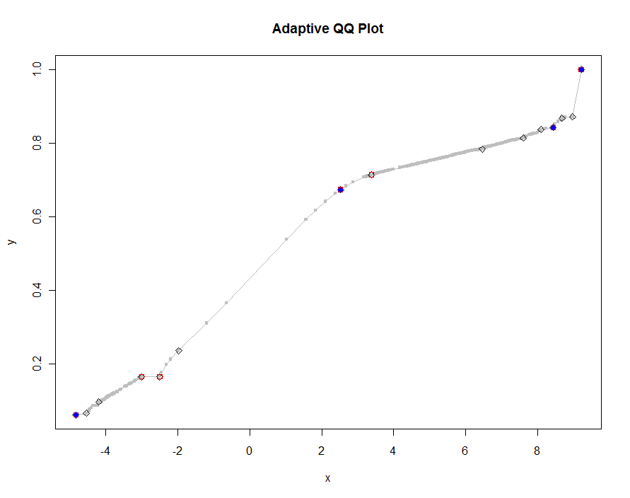
QQ plot

Edit

I have modified the original code for qq to return a third column of indexes into the longest (or shortest, as specified) of the original two arrays, x and y, corresponding to the points that are selected. These indexes point to "interesting" values of the data and so could be useful for further analysis.

I also removed a bug occurring with repeated values of x (which caused beta to be undefined).

$\endgroup$
1
  • $\begingroup$ How do I calculate qq's arguments for a given vector? Also, could you advise on using your qq function with ggplot2 package? I was thinking about using ggplot2's stat_function for this. $\endgroup$ Commented Jun 14, 2014 at 8:44
10
$\begingroup$

Removing some of the data points in the middle would change the empirical distribution and therefore the qqplot. This being said, you can do the following and directly plot the quantiles of the empirical distribution vs. the quantiles of the theoretical distribution:

x <- rnorm(1200000)
mean.x <- mean(x)
sd.x <- sd(x)
quantiles.x <- quantile(x, probs = seq(0,1,b=0.000001))
quantiles.empirical <- qnorm(seq(0,1,by=0.000001),mean.x,sd.x)
plot(quantiles.x~quantiles.empirical) 

You will have to adjust the seq depending on how deep you want to get into the tails. If you want to get clever you can also thin that sequence in the middle to speed up the plot. For example using

plogis(seq(-17,17,by=.1))

is a possibility.

$\endgroup$
3
  • $\begingroup$ Sorry, I don't mean removing the points from the data sets, just from the plots. $\endgroup$
    – naught101
    Commented Aug 28, 2012 at 7:38
  • $\begingroup$ Even removing them from the plot is a bad idea. But have you tried transparency alterations and/or random sampling from your data set? $\endgroup$
    – Peter Flom
    Commented Aug 28, 2012 at 10:07
  • 3
    $\begingroup$ What's the matter with removing redundant ink from overlapping points in the plot, @Peter? $\endgroup$
    – whuber
    Commented Aug 28, 2012 at 16:50
1
$\begingroup$

You could do a hexbin plot.

x <- rnorm(1200000)
mean.x <- mean(x)
sd.x <- sd(x)
quantiles.x <- quantile(x, probs = seq(0,1,b=0.000001))
quantiles.empirical <- qnorm(seq(0,1,by=0.000001),mean.x,sd.x)

library(hexbin)
bin <- hexbin(quantiles.empirical[-c(1,length(quantiles.empirical))],quantiles.x[-c(1,length(quantiles.x))],xbins=100)
plot(bin)
$\endgroup$
1
  • $\begingroup$ I don't know if that's really applicable to qq-plotted data (see also my comment on my question as to why this won't work for my specific case). Interesting point though. I might see if I can get it wo work on individual models vs obs. $\endgroup$
    – naught101
    Commented Aug 29, 2012 at 1:22
1
$\begingroup$

Another alternative is a parallel boxplot; you said you had two data sets, so something like:

y <- rnorm(1200000)
x <- rnorm(1200000)
grpx <- cut(y,20)
boxplot(y~grpx)

and you could adjust the various options to make it better with your data.

$\endgroup$
1
  • $\begingroup$ I've never been a big fan of discretising continuous data, but that's an interesting idea. $\endgroup$
    – naught101
    Commented Aug 28, 2012 at 12:05

Your Answer

By clicking “Post Your Answer”, you agree to our terms of service and acknowledge you have read our privacy policy.

Not the answer you're looking for? Browse other questions tagged or ask your own question.