1
$\begingroup$

I'm Having a ML problem where my data set contains 80 features labelled into 3 groups (0, 1, -1).

I want to plot the data on a 2D surface to see how "close" (similar) data with label x is to data with label y, how the data spreads, are the labels separable, etc.

I was thinking about using PCA and transform the data from 80D to 2D, but It only retain 40% of the variance!

  • Is this a good approach for the problem?
  • If so, does 40% suffice?
  • Are there any other/better approach for this?

EDIT:

Plotting is not the main issue. The transformation from 80D to 2D (for an easy visialization) is whats difficult.

Also, all of this is being made to know how much samples with label 1 differs from label 0 and label -1 and vice versa (based on those original 80 features).

If there's a different method, that is not visualizing the "answer", I'll also be happy to hear about it!

$\endgroup$
3
  • $\begingroup$ Whether 60% is enough is not something others can answer for you. What you could do is try different methods: MDS, ICA, multidimensional unfolding, etc. $\endgroup$ Commented Aug 21, 2018 at 10:18
  • $\begingroup$ I wonder if its even a good approach to shed clarity upon the problem (which is, are all the labeled example can be separated enough by the features describing them) $\endgroup$
    – Eran Moshe
    Commented Aug 21, 2018 at 10:20
  • $\begingroup$ You could try and calculate some distance metric, but I personally like the idea of trying to visualize the results. $\endgroup$ Commented Aug 21, 2018 at 10:22

2 Answers 2

2
$\begingroup$

You can try using T-SNE

https://lvdmaaten.github.io/tsne/

"which is a technique for dimensionality reduction that is particularly well suited for the visualization of high-dimensional datasets"

It transforms your data and allows easy visualisation. However, it is computationally heavy.

$\endgroup$
1
  • 1
    $\begingroup$ The t-SNE looks very solid, and shed a lot of information on my problem... I've been testing it for 2 days now $\endgroup$
    – Eran Moshe
    Commented Aug 23, 2018 at 4:48
2
$\begingroup$

2D graph visualization

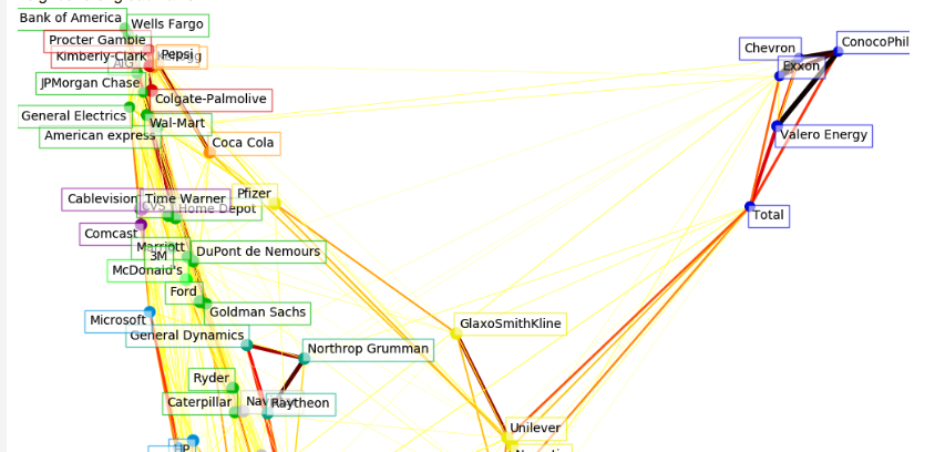
T-SNE is obviously the first thing to come to mind, but you could perhaps push the exercise further by applying 2D graph visualization. Here is a good example from Sklearn gallery applied to stock market variance.

http://scikit-learn.org/stable/auto_examples/applications/plot_stock_market.html

enter image description here

$\endgroup$

Your Answer

By clicking “Post Your Answer”, you agree to our terms of service and acknowledge you have read our privacy policy.

Not the answer you're looking for? Browse other questions tagged or ask your own question.