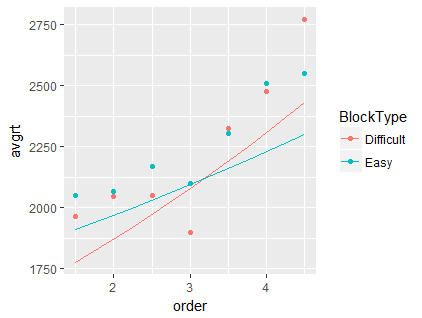
I've applied a linear mixed model to my data:
g1rfinal = lmer(log(trmLatency) ~ WMC + order + distance + DomSide + (1 + BlockType |
pno) + (1 + firstBlType | pno) + BlockType + (1 + distance | pno) + WMC:order + WMC:distance + WMC:DomSide + order:DomSide +
distance:DomSide + WMC:BlockType + distance:BlockType + DomSide:BlockType +
order:BlockType, data = g1Study)
"order" variable is a continuous predictor and "BlockType" is a factor with two levels. I want to plot predicted values to check the effects of "order: BlockType". (I've checked the effect with chi square test and it was significant). I've got two ways. One of them is predict() function. I added predicted values to my dataframe and averaged them to be grouped by order and BlockType:
g1Study = cbind(g1Study, predict = exp(predict(g1rfinal)))
g1test = g1Study %>% group_by(BlockType, order) %>% summarise(avgrt = mean(predict))
Then I plotted the values from g1test and the values from effects package:
ggplot() + geom_point(data = g1test, aes(x = order, y = avgrt, color = BlockType)) + geom_line(data = as.data.frame(effect("order : BlockType", g1rfinal)), aes(x = order, y =exp(fit), color = BlockType))
What I've done for averaging predicted values seem to be identical for what effect() function does. effect package help page
But I get different results:
 I can't get what's happening here.
