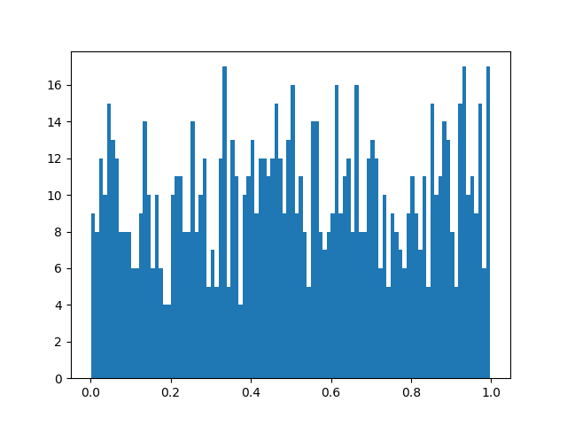
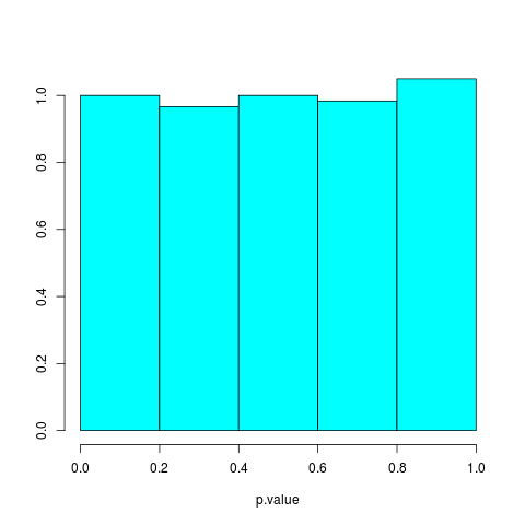
I used R with your setup and generated 300 p-values from a t-test under the same setting you used. Here is the histogram of the p-values:

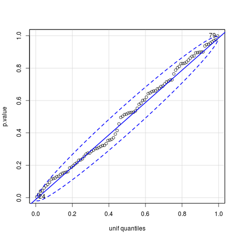
Here is the quantile-quantile plot which depicts the quantiles of the p-value distribution against uniform quantiles:

As expected, the distribution of the p-values looks uniform.
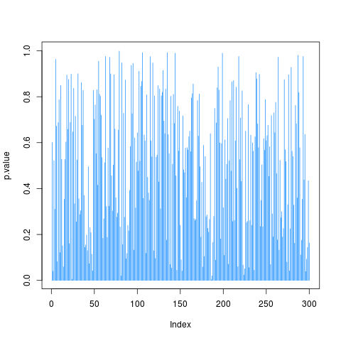
Finally, here are the p-values plotted against their index:

As you can see in this last plot, the p-values can be pretty much anything in the range 0 to 1.
In fact, as explained by Geoff Cumming in his fabulous video Dance of the p-values, when you replicate a study under similar conditions many times, you can't really use the p-value from the current replication to tell you something about the expected magnitude of the p-value from the next replication because the p-value from the current replication is simply not very informative that way - it gives extremely vague information about the
p-value from the next replication.
Towards the end of the video, Geoff Cumming lists 80% prediction intervals where you can expect the p-value from the next replication to be found when you know the p-value from the current replication. In particular:
P-value from current replication          80% Prediction interval for p-value for next replication

        0.05                                         0.00008 to 0.44
The video goes into more depth so watching it is worthwhile: https://youtu.be/5OL1RqHrZQ8.
If you wanted to see the R code I used, here it is:
set.seed(101)

p.value <- NULL

for (i in 1:300){

   a <- rnorm(100000, 0, 1)

   b <- rnorm(100000, 0, 1)

   t <- t.test(a,b, var.equal=TRUE)

   p.value <- c(p.value, t$p.value)

}

require(MASS)

truehist(p.value)

require(car)

qqPlot(p.value, distribution = "unif")

plot(p.value, type="h", col="dodgerblue")
If you use larger bin widths for your histogram, you should get a nicer looking histogram. The bin width you are currently using seems far too small.
