1
$\begingroup$

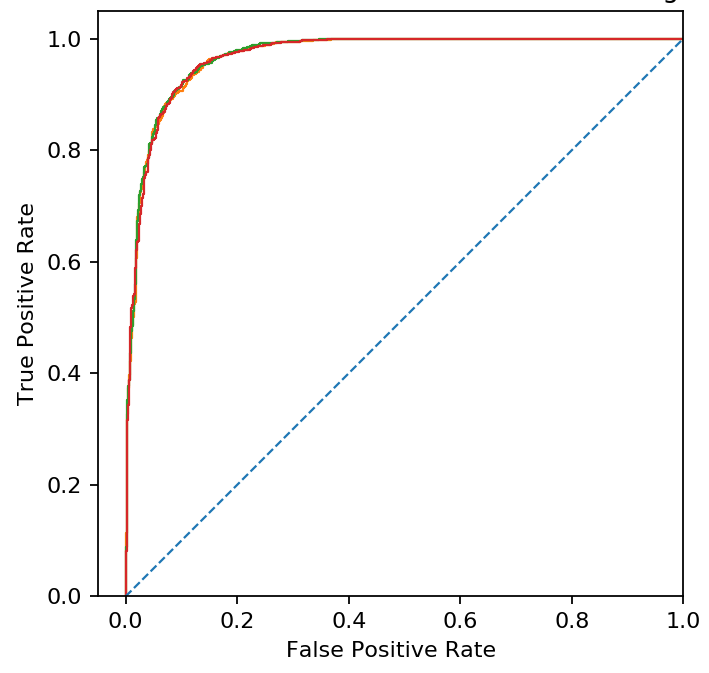
I have a model and the ROC curve it produces, I modified the model and it produced a second ROC curve that is very similar in shape to the first.

If I graph these ROC curves on the same plot, then it is difficult to tell the curves apart. Is there a way of plotting the difference curve 2 and 1, or another way to visualise this difference that is more clear?

3 ROC curve

Above is my plot in python, the original model is in orange, and the two improved models are green and red. It is difficult to see their minor differences.

$\endgroup$
1
  • 1
    $\begingroup$ Subtract the first ROC curve from the second and plot the differences? I don't know what you are trying to achieve here. $\endgroup$ Commented Jul 30, 2019 at 9:37

3 Answers 3

4
$\begingroup$

ROC curves are very poor methods for comparing models. The are insensitive, tempt one to make arbitrary dichotomizations, and do not provide hints of corrective actions. There are far better ways to measure the added predicted value of a set of features, as discussed and exemplified here. See also this.

$\endgroup$
2
$\begingroup$

If the plots are so similar as to be essentially indistinguishable, it calls into question your conclusion that the green and red models are improvements on the orange model. And I'm not sure there's much value in trying to show a difference between them where almost none exists.

There are cases where a plot of differences can be valuable, but I don't think they apply to ROC curves. It seems easiest to understand in the form you have shown here.

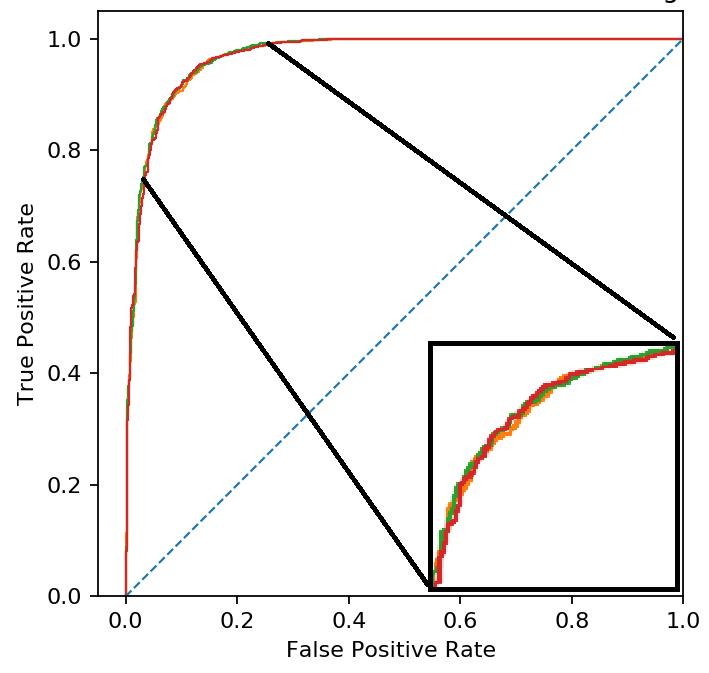
If you must, you can add a plot insert zooming in on a section of this plot where some small differences exist. Something like this:

enter image description here

$\endgroup$
0
$\begingroup$

If you want to plot the difference just take the same axis x and plot the series Roc1-Roc2 on the y. Probably your purpose is to give a graphical highlight of the fact that, zooming, one curve is “almost everywhere” better than the other (dominates the other), so that the difference in their AuROC is positive (where as per literature the AuROC is the area below the ROC curve for each). Remember however that, even if graphical representation of this concept may help visually, statistical tests on the significance of AuROC and differences are far better because they formalize the concept and can be interpreted more objectively than graphical representation. Zooming as per other answers is however what I have seen more frequently.

$\endgroup$

Your Answer

By clicking “Post Your Answer”, you agree to our terms of service and acknowledge you have read our privacy policy.

Not the answer you're looking for? Browse other questions tagged or ask your own question.