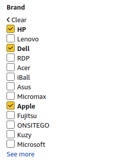
On any ecommerce website, you have options to apply filters to filter out products. For example:
So I have data of how many users applied what filters tuples on the website. Which is fetched from google analytics in this format:
Table 1

BRANDS              | USERS
---------------------------
HP, Dell, Apple     | 3
Dell, HP            | 5
Microsoft, Apple    | 5
Microsoft, Micromax | 1
HP, Dell, Acer      | 3
Dell, Apple         | 7
HP, Microsoft       | 3
This means for ex. that there were 3 unique users who applied HP,Dell,Apple triplet as a filter on the website
So this data represents that there is some corelation score between every pair of brand. I want to cluster the brands using this count. And also want to visualize the clusters with a plot.
So far, I converted the inputs to a weighed networkx object where nodes are the unique brands and weights of the edges are the sum of all the USERS where that vertices pair exist.
So the data becomes:
Nodes : Acer, Apple, Dell, HP, Micromax, Microsoft
Weighted Edges:
Table 2

Acer, Dell, 3
Acer, HP, 3
Apple, Dell, 10
Apple, HP, 3
Apple, Microsoft, 5
Dell, HP, 11
HP, Microsoft, 3
Micromax, Microsoft, 1
I'm planning to plot the graph with a Kamada Kawai layout. Another name thats popping up in my searches is Fruchterman Reingold visualization. However I believe that there must be some even better ways that I have not thought of or found out in my research.
I'm using python. My total no. of brands are of order of 200 and edges weights are in range approx 1-150
My total data points are around 3000 in the Table1 format.
Please guide me to cluster my data and visualize it. Would appretiate references to code snippets or blogs for similar problems. Thanks for the help!

