0
$\begingroup$

Just a quick example from Max Kuhn's book.

featurePlot(x = iris[, 1:4], 
            y = iris$Species,
            plot = "density", 
            ## Pass in options to xyplot() to 
            ## make it prettier
            scales = list(x = list(relation="free"), 
                          y = list(relation="free")), 
            adjust = 1.5, 
            pch = "|", 
            layout = c(4, 1), 
            auto.key = list(columns = 3))

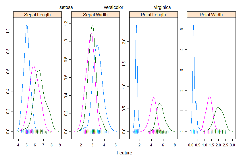
This adds the following plots

I'm just curious about how to interpret these plots as to me they look like simple distribution plots. Is it right to assume that for a variable to be important, one would expect the density curves to be significantly different for the 3 classes, both in terms of the height (kurtosis) and placement (skewness)?

So if one predictor variable is significantly different in its height and placement from the other two, then that means that it has a high impact on the class outcome? In this case the setosa species can be easily identified through its petal length and width?

$\endgroup$
0

1 Answer 1

4
$\begingroup$

?featurePlot describes this function as "a shortcut to produce lattice graphs". It looks like it calls function lattice::xyplot.

You are right, the graphs in the example are simple frequency density distribution plots.

As for some of your other questions:

  • the importance of a variable depends on the test you are planning to use. ANOVA assesses if at least one of your groups is significantly different from the others, not if all groups differ significantly from each other. In this light, if your goal is to select variables that can help you discern Iris species, all variables apart from Sepal.Width seem to be useful.
  • skewness measures the degree of asymmetry of a distribution, not its placement (that's what mean, median, and mode do).
$\endgroup$
2
  • $\begingroup$ To which can be added that kurtosis is not best described as measuring the height (peakedness) of a distribution. You can find that idea in the literature, but it's nearer wrong than right. Tail weight is usually a better term (some people would say "always"). $\endgroup$
    – Nick Cox
    Commented Jun 18, 2020 at 10:25
  • $\begingroup$ In fact, now that the plots can be seen, the best summary is that peak density just increases as the spread (dispersion) decreases. $\endgroup$
    – Nick Cox
    Commented Jun 18, 2020 at 14:16

Your Answer

By clicking “Post Your Answer”, you agree to our terms of service and acknowledge you have read our privacy policy.

Not the answer you're looking for? Browse other questions tagged or ask your own question.