For visualizing multilevel modelling results, I highly recommend following @tjmahr on Twitter.
For your visualizations, can you break things down into multiple steps to make it easier to convey what is going on? A multilevel model estimates multiple quantities, so you could use a divide and conquer approach in your visualization.
Step 1:
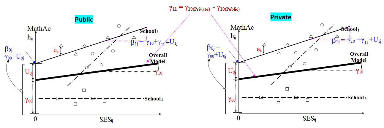
Show the estimated relationship between MathAc and SES in the same plot for both of your sectors. In other words, show the two thick black lines you call "Overall Model" in the same plot. Then make it clear what their intercepts and slopes are.
One of these lines has the intercept $\gamma_{00}$ and the other has the intercept $\gamma_{00} + \gamma_{01}$; one of the lines has the slope $\gamma_{10}$ and the other has the slope $\gamma_{10} + \gamma_{11}$.
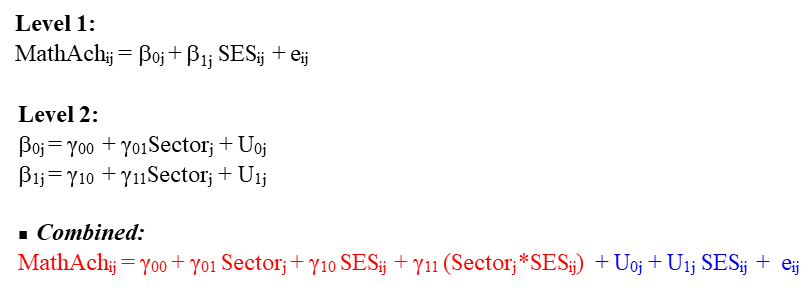
From your post, we can't tell which of the two sectors is treated as the reference sector against which the remaining sector is compared - if the reference sector is Public, the Public sector "Overall Model" line will have the intercept $\gamma_{00}$ and the slope $\gamma_{10}$, etc.
You will also need better terminology in your plot than "Overall Model" - if MathAc and SES are measured at the school level within each sector for multiple schools, say, you could use the terminology "Average School" or "Average Relationship Between MathAc and SES" (for schools represented by the ones in the relevant sector that were included in your study).
From your current plots, it is not clear how the intercepts and slopes of the two "Overall Model" lines differ from each other - this is an important aspect of your modelling which needs to be elucidated properly.
If possible, use a dark blue colour for the Public sector line and a dark red colour for the Private sector line to help the reader distinguish them by sector. Make both lines thick.
Step 2:
Construct a plot for the Public sector only in which to show the "Overall Model" line in thick dark blue and all the other lines for the entities in that sector on which you measured MathAc and SES in light blue.
Then explain that the intercept and slope of the "Overall Model" line are $\gamma_{00}$ and the slope $\gamma_{10}$ (which the reader already knows from the previous step/figure).
Furthermore, explain that the intercept of a light blue line is given by $\gamma_{00} + U_{0j}$ and the slope of that light blue line is given by $\gamma_{10} + U_{1j}$. You might even add a footnote to your graph explaining that the intercepts and slopes of the within-sector entities being measured vary randomly about the intercept and slope of the "Overall Model" (i.e., the intercept and slope of the "average" entity).
Step 3:
Construct a plot for the Private sector only in which to show the "Overall Model" line in thick dark red and all the other lines for the entities in that sector on which you measured MathAc and SES in light red.
Then explain that the intercept and slope of the "Overall Model" line are $\gamma_{00} + \gamma_{01}$ and $\gamma_{10} + \gamma_{11}$, respectively.
Also, explain that the intercept of a light red line is given by $\gamma_{00} + \gamma_{01} + U_{0j}$ and the slope of that light red line is given by $\gamma_{10} + \gamma_{11} + U_{1j}$.
Then you can assemble together the 3 plots suggested and show them in the same figure. This way, the viewer will know how to compare the "average" entities of interest across sectors (Step 1) and to look within each sector to understand how the within-sector entities vary in terms of the relationship of interest (Steps 2 and 3).


