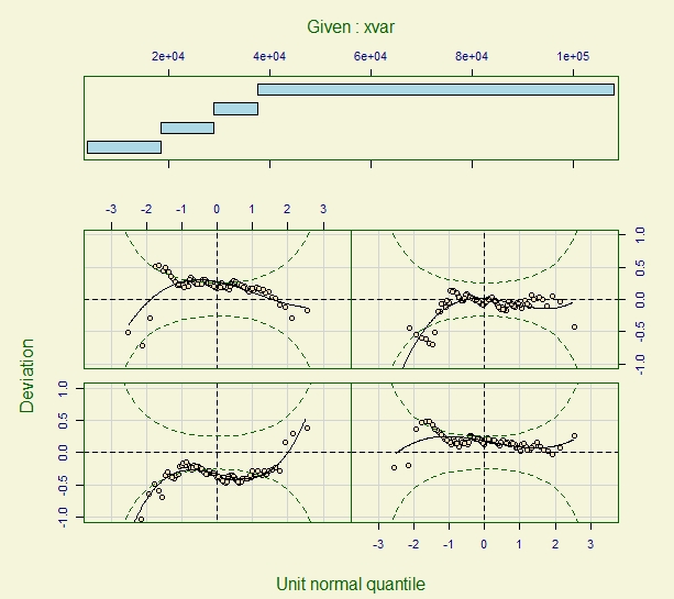
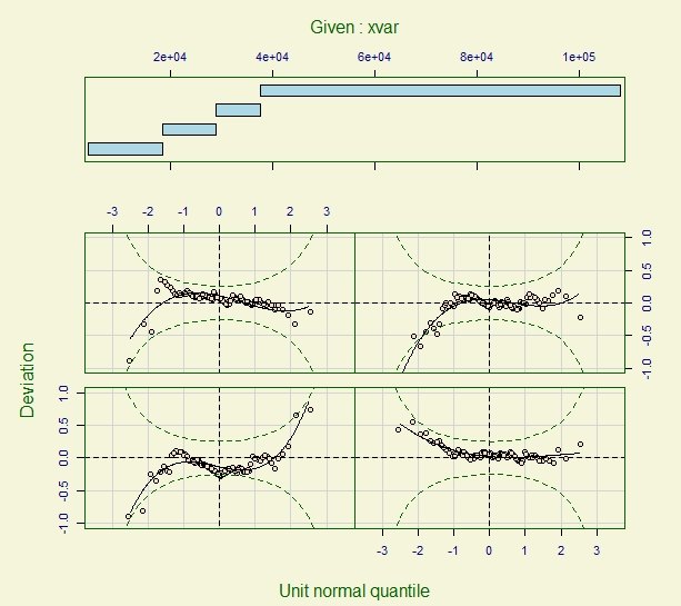
The overall and predictor-specific worm plots share the feature that "different shapes indicate different inadequacies in the model", as explained in the article Analysis of longitudinal multilevel experiments using GAMLSSs by Gustavo Thomas et al: https://arxiv.org/pdf/1810.03085.pdf.
Section 12.4 of the book Flexible Regression and Smoothing: Using GAMLSS in R. by Rigby et al. is worth a read, as it provides a comprehensive tour of how to interpret worm plots. The section concludes with these statements: "In general, it may not always be possible to build a model without areas of misfits." and "In any case, extra care is needed when a model with many areas of misfits is used to support conclusions.". However, calibration is mentioned as one solution to be used in order to minimize misfits.
How you correct the model misfit depends on the nature of the problems detected in the worm plots. If those problems suggest the need to consider nonlinear effects for one of your continuous predictor to improve model fit, than you would need to model the effect of that predictor nonlinearly rather than linearly. (Other types of corrections may involve specifying a different type of distribution for the response variable given the predictors and random effects in your model, omitting or including predictors from various parts of the model, transforming predictors, etc.)
Note that, according to the help file for the cs() function:
The function scs() differs from the function cs() in that allows cross validation of the smoothing parameters unlike the cs() which fixes the effective degrees of freedom, df. Note that the recommended smoothing function is now the function pb() which allows the estimation of the smoothing parameters using a local maximum likelihood. The function pb() is based on the penalised beta splines (P-splines) of Eilers and Marx (1996).
So you might want to consider using pb() in your model rather than cs().
Addendum:
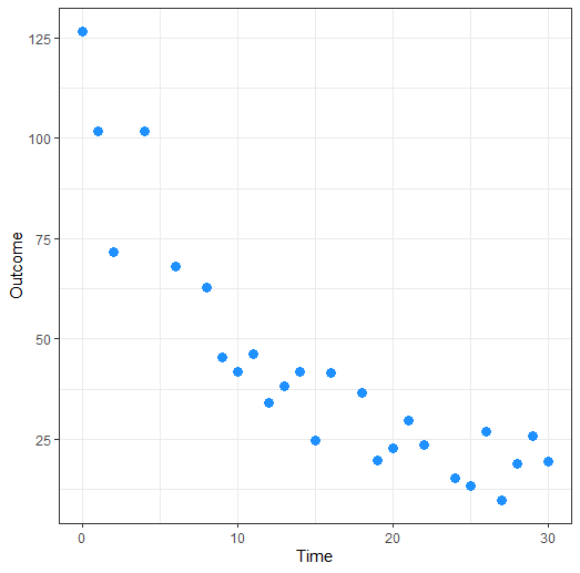
Here is some R code for generating data for a model where a quadratic fit would work better than a linear or even a smooth fit. It will help you build some intuition for what you can expect worm plots to look like. The data were generated according to https://www.theanalysisfactor.com/r-tutorial-4/.
14, 15, 16, 18, 19, 20, 21, 22, 24, 25, 26, 27, 28, 29, 30),
Outcome = c(126.6, 101.8, 71.6, 101.6, 68.1, 62.9, 45.5, 41.9,
46.3, 34.1, 38.2, 41.7, 24.7, 41.5, 36.6, 19.6,
22.8, 29.6, 23.5, 15.3, 13.4, 26.8, 9.8, 18.8, 25.9, 19.3)),
.Names = c("Time", "Outcome"),
row.names = c(1L, 2L, 3L, 5L, 7L, 9L, 10L, 11L, 12L, 13L, 14L, 15L, 16L, 17L, 19L, 20L, 21L, 22L, 23L, 25L, 26L, 27L, 28L, 29L, 30L, 31L),
class = "data.frame")

Data
The header of the data looks like this:
  Time Outcome
1    0   126.6
2    1   101.8
3    2    71.6
5    4   101.6
7    6    68.1
9    8    62.9```

The plot of the Outcome variable versus the predictor variable Time can be obtained with:

```library(ggplot2)
theme_set(theme_bw())

ggplot(Data, aes(x = Time, y = Outcome)) +
geom_point(size=3, colour="dodgerblue")

Now, fit the 3 possible models for these data within the gamlss framework:
linear.model <- gamlss(Outcome ~ Time, data = Data, family=NO)
quadratic.model <- gamlss(Outcome ~ Time + I(Time^2), data = Data, family=NO)
smooth.model <- gamlss(Outcome ~ pb(Time), data = Data, family=NO)

summary(linear.model)
summary(quadratic.model)
summary(smooth.model)
Compare the (generalized) AIC values of the 3 fitted models:
GAIC(linear.model, quadratic.model, smooth.model)
The quadratic model comes as the "winner" since it has the smallest AIC value:
                      df      AIC
quadratic.model 4.000000 197.0357
smooth.model    5.251898 197.8349
linear.model    3.000000 219.0893
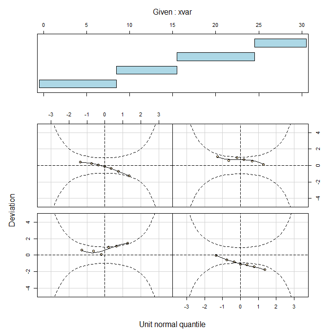
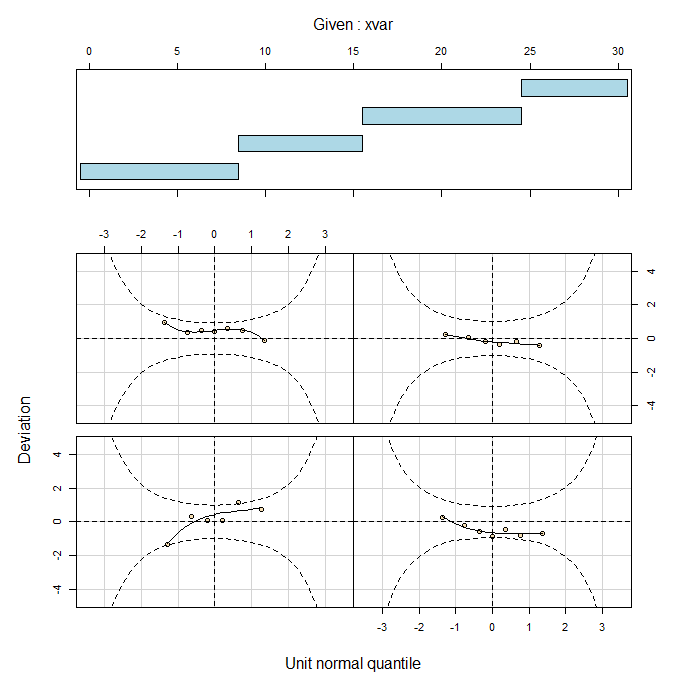
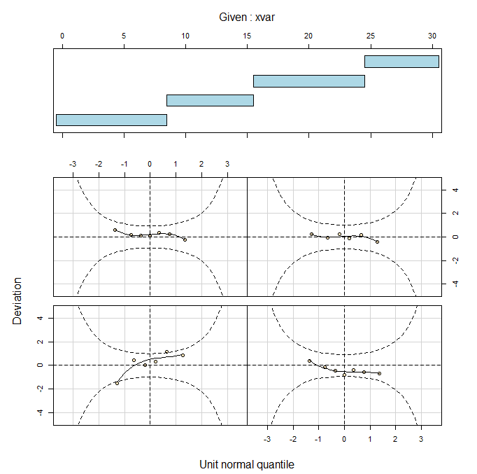
Now construct the worm plots for the Time predictor:
wp(linear.model, xvar=Time)
wp(quadratic.model, xvar=Time)
wp(smooth.model, xvar=Time)
The worm plot for the linear model fit shows some misfit problems:

The worm plots for the quadratic and smooth model fits look a bit better than the worm plot for the linear model fit.


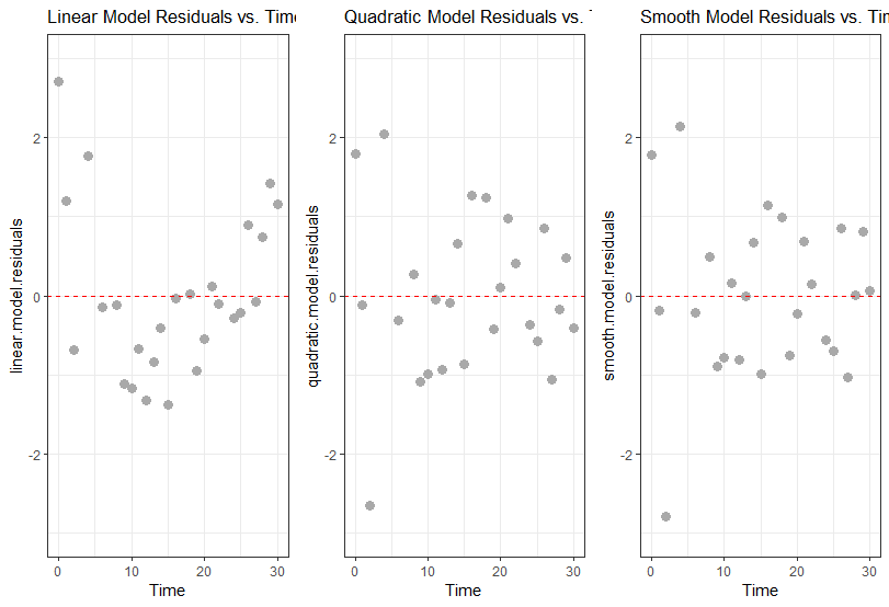
We can also plot the model residuals directly against the Time predictor:
Data$linear.model.residuals <- residuals(linear.model)
Data$quadratic.model.residuals <- residuals(quadratic.model)
Data$smooth.model.residuals <- residuals(smooth.model)

plot1 <- ggplot(Data, aes(x = Time, y = linear.model.residuals)) +
         geom_point(size=3, colour="darkgrey") +
         geom_hline(yintercept = 0, linetype=2, colour="red") +
         ggtitle("Linear Model Residuals vs. Time") +
         coord_cartesian(ylim=c(-3,3))


plot2 <- ggplot(Data, aes(x = Time, y = quadratic.model.residuals)) +
         geom_point(size=3, colour="darkgrey") +
         geom_hline(yintercept = 0, linetype=2, colour="red") +
         ggtitle("Quadratic Model Residuals vs. Time") +
         coord_cartesian(ylim=c(-3,3))


plot3 <- ggplot(Data, aes(x = Time, y = smooth.model.residuals)) +
         geom_point(size=3, colour="darkgrey") +
         geom_hline(yintercept = 0, linetype=2, colour="red") +
         ggtitle("Smooth Model Residuals vs. Time") +
         coord_cartesian(ylim=c(-3,3))

library(cowplot)

plot_grid(plot1, plot2, plot3, ncol=3)

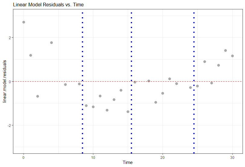
These last plots make it a bit easier to discern that there is a quadratic pattern present in the residuals for the linear model, which needs to be accounted for in the model.
If you wanted to, you could pull apart the plot of residuals versus Time for the linear model and examine the portions of the plot corresponding to the division of Time in intervals used in the corresponding worm plot:
w.linear <- wp(linear.model, xvar=Time, main="Given: Time")
w.linear
The cutpoints for the division of the range of observed values of Time is reported in the $classes portion of the R output for w.linear:
> w.linear
$classes
     [,1] [,2]
[1,] -0.5  8.5
[2,]  8.5 15.5
[3,] 15.5 24.5
[4,] 24.5 30.5

$coef
           [,1]        [,2]        [,3]        [,4]
[1,]  0.6061177  0.79644473  0.26190049 -0.29589027
[2,] -1.0467772 -0.54040972  0.08504976 -0.05550396
[3,] -0.1400464 -0.64524770 -0.15331613  0.02095304
[4,]  0.7161490 -0.03070935 -0.08930395 -0.19956330
These cutpoints are -0.5, 8.5, 15.5, 24.5 and 30.5. We can plot the residuals versus Time and draw vertical lines for only the "middle" cutpoints:
plot11 <- ggplot(Data, aes(x = Time, y = linear.model.residuals)) +
          geom_point(size=3, colour="darkgrey") +
          geom_hline(yintercept = 0, linetype=2, colour="red") +
          ggtitle("Linear Model Residuals vs. Time") +
          coord_cartesian(ylim=c(-3,3)) +
          geom_vline(xintercept = w.linear$classes[1,2],
                 colour="blue", linetype=3, size=1.5) +
      geom_vline(xintercept = w.linear$classes[2,2],
                     colour="blue", linetype=3, size=1.5) +
          geom_vline(xintercept = w.linear$classes[3,2],
                     colour="blue", linetype=3, size=1.5)

plot11
This allows us to zoom in on specific time intervals and determine how the model fit breaks down in those intervals:
