0
$\begingroup$

I ran a GLMM to check the increase or decrease of the dependent variable on two fixed effects (condition "Presence and condition "Absence") as:

model <- glmer(Variable ~ Condition + (1|ID), weights = Session,  
               family=binomial, data)

It gave something like the following

                  Estimate Std. Error z value Pr(>|z|)    
(Intercept)         -9.914      1.195   -8.30   <2e-16 ***
Presence             0.755      0.274    2.76   0.0058 ** 

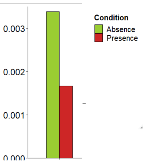
Looking at the positive z value, I would say that "Presence" increases in relation to "Absence" since. However, the visualization of the conditions frequencies shows the opposite:

enter image description here

Does someone have an idea of what is happening here?

$\endgroup$
4
  • $\begingroup$ What exactly are you showing us in the graph? The results of the model suggest that presence has a stronger relation to the outcome, compared to absence. $\endgroup$ Commented Oct 15, 2020 at 8:27
  • $\begingroup$ The graph shows us the mean frequency per condition. I would expect to see an increase in the frequency of "Presence" that explains why that relation. Otherwise, with a visual representation like this, I would then expect a negative z-score. Or perhaps I got it all wrong, and I have been reading this in the wrong way.... $\endgroup$
    – Sofia
    Commented Oct 15, 2020 at 8:35
  • $\begingroup$ You have weights as well, which may well complicate matters. $\endgroup$
    – Nick Cox
    Commented Oct 15, 2020 at 8:45
  • $\begingroup$ I also forgot to mention that I controlled for overdispersion, by multiplying the standard error by the square root of the dispersion factor2 and recomputing the Z- and p-values accordingly $\endgroup$
    – Sofia
    Commented Oct 15, 2020 at 12:46

0

Your Answer

By clicking “Post Your Answer”, you agree to our terms of service and acknowledge you have read our privacy policy.

Browse other questions tagged or ask your own question.