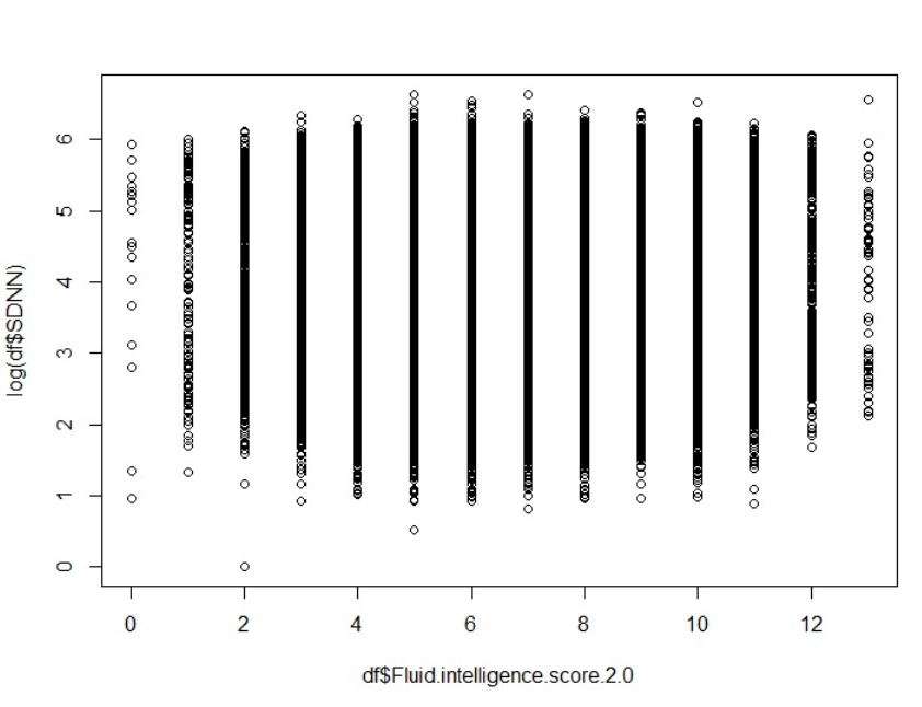
Can I conclude that there’s no linear relationship between these two variables because values are distributed all over the axis of the independent variable. With increase in the Intelligence score there is no visible increase/decrease in the log( SDNN )?

2 Answers
You cannot conclude much because the overlapping points may obscure trends.
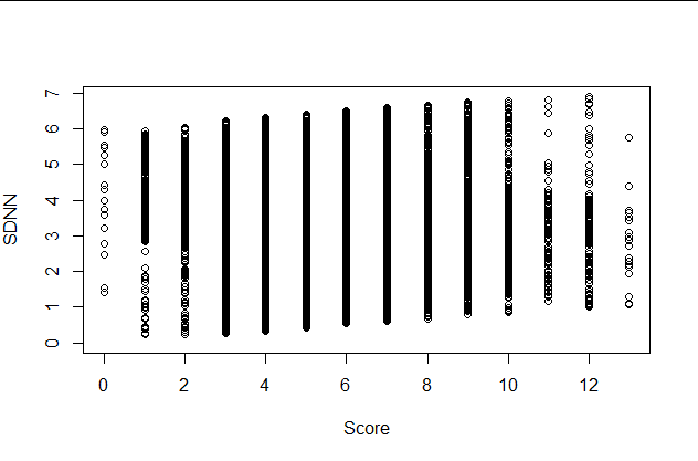
Here is a dataset whose scatterplot looks like yours. It, too, presents little visual evidence of any linear relation:
If anything, these 30,000 points look like they might be trending positively (sloped upwards a little from left to right).
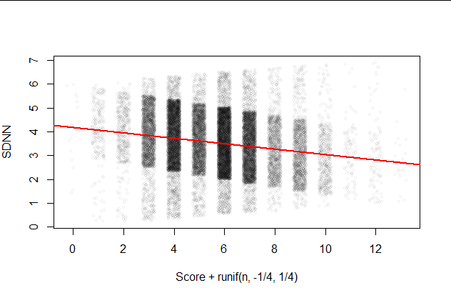
Use a visualization that resolves the overlaps. Many techniques are available, ranging from 2D density plots to binned plots to sunflower plots, but a quick and simple one is to jitter the points. This means to randomly and independently shift their positions just a little. Here, by shifting the horizontal positions (by up to 1/4) in each direction we retain all information about the discrete x coordinate: see the horizontal axis label in the next plot for the formula in R. Additionally, I have drawn the points with a high degree of transparency (alpha is just 1/16) to help show where most of the points are:
On this plot I have superimposed the least squares fit in red. It is significant (t = -33.57 with 29,998 df; the p-value is essentially zero).
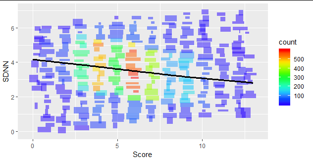
An even better exploratory technique is to fit a flexible robust regression curve to the data (using a GAM or, perhaps, Loess). Search our site (or the Web or your favorite software) for more about this. Here is a jittered, binned rendering of the data with a GAM superimposed (the black line):
-
$\begingroup$ Would be possible to share the r scrip? I cannot seem to observe the same output. Thanks. $\endgroup$ Commented Jan 27, 2021 at 15:13
-
3$\begingroup$ Using data in a data frame
Xand exploiting theggplot2library, I created the last plot with the commandggplot(X, aes(Score, SDNN)) + geom_bin2d(alpha=1/2, bins=25, position=position_jitter(width=0.25)) + scale_fill_gradientn(colors=rev(rainbow(13))[-(1:3)]) + geom_smooth(color="Black", size=1.25, se=FALSE)The first plot used baseRgraphics with three commandsplot(X, ylim=c(0, max(X$SDNN))); with(X, plot(Score+runif(n, -1/4, 1/4), SDNN, cex=0.5, col="#00000010")); abline(fit <- lm(SDNN ~ Score, X), col="Red", lwd=2)I examined the least squares fit usingsummary(fit). $\endgroup$– whuber ♦Commented Jan 27, 2021 at 15:16
you can fit a linear model:
model <- glm(df$SDNI, df$Fluid.intelligence.score.2.0)

summary(model)
which will provide information on the intercept and input (in this case x-axis). Generally if the standard error of your model is greater then 1/10 of your input coefficient it's a sign that your model does not fit well and I guess you can conclude that as a result of a poor linear regression model there is no correlation between the two variables.
-
$\begingroup$ Although fitting a model is helpful, the subsequent remarks about the standard error are vague and it is difficult to find an interpretation that would make them correct or useful. $\endgroup$– whuber ♦Commented Jan 26, 2021 at 15:10


jitter(x)andjitter(y)rather than justxandyor (2) usecol = scales::alpha("black", 0.5)to make the points 50% transparent. $\endgroup$