6
$\begingroup$

@ttnphns comments here that

there exist two expositions of the Cattell scree-plot rule: If the "elbow" is the m-th eigenvalue, (1) choose to extract m components; or (2) choose to extract m-1 components. Nobody knows which's better - because the whole rule is so much heuristic.

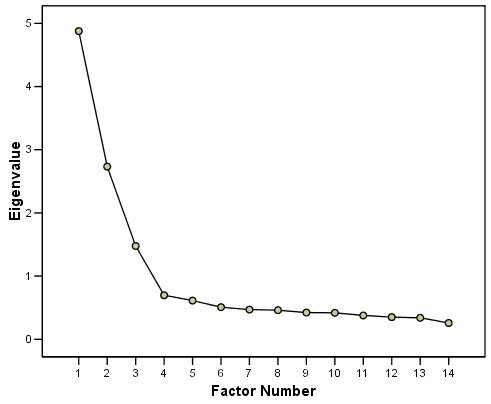
Even though it may well be the case that some 7 years later this question still remains not researched, I am curious about the matter. When I was in graduate school I was taught to take $m$ components, but it seemed intuitively strange to me since often we see plots like the following

Scree plot example

Since the fourth component is "with the rubble" this seems to support a 3-component solution, and the IBM website I took that plot from says "The scree plot confirms the choice of three components." However, the rule I've been taught would say the answer should be four.

What are the arguments for $m$ vs $m-1$, and vice-versa?

Does the answer change if we are using scree plots in relation to factor analysis (as is commonly done, since criteria from PCA are often used to select the number of factors in factor analysis)?

I am aware that other methods of selecting components/factors have a better reputation than scree plots. But still the question seems relevant since scree plots remain often used.

$\endgroup$
1
  • 1
    $\begingroup$ In the domain of PCA/FA the "m" rule seems somewhat prevailing. I.e. 4 components or factors in your case. To my observation, the "m-1" is more often mentioned in the context of MDS. But once again, other criteria should also be considered, especially in FA. If your pic is a correlation-based PCA scree, then Kaiser's "eigenvalue>1" rule votes for the 3-factor solution. But there are more criteria to try too (parallel anslysis, quality of restoration of correlations, interpretability, loading sig. tests or Confirmatory factor analysis). $\endgroup$
    – ttnphns
    Commented Mar 15, 2021 at 9:38

3 Answers 3

5
$\begingroup$

The following simulations show that the correct Cattell's scree-plot rule is "elbow minus one". That is, select the number of factors one less than the number corresponding to the "elbow" location. The scree-plot considered here is the "classic" one - dealing with eigenvalues of the nonreduced correlation or covariance matrix; that is, it is the eigenvalues output by the "preliminary PCA done before a factor analysis".

I was generating random factor loading matrices (like described here in section A follow-up to @amoeba's "Update 3") with 4 factors underlying 20x20 correlation matrices, and then observed their eigenvalue scree-plots.

The simulation was 4-fold (hence 4 scree-plots below).

Diffuse factor structure, 20 random population matrices

A diffuse factor structure is where factor loadings distribute smoothly; there is no bimodality of "high" vs "low" loadings. A factor does not have "favourites" among the items (variables), and an item can be loaded highly, moderately or slightly, by a factor.

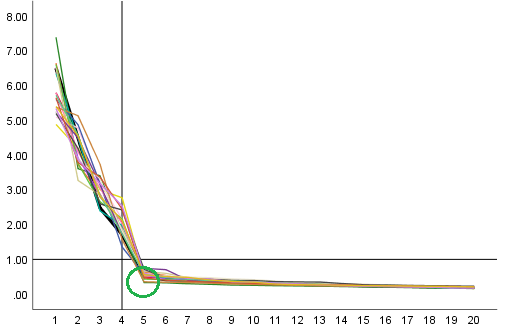
20 random sets of loadings (plus random uniquenesses) yielded, correspondingly, 20 covariance matrices with unit diagonal each, i.e. correlation matrices. These are labeled "population" matrices, because each was based on a different factor loading matrix. What they share though is the same number of factors 4 behind the same number of items 20. The 20 scree-plots superimposed on one chart:
enter image description here

We see that while the correct number of factors is 4, the principal (the last pronounced) "elbow" almost always corresponded to the 5th eigenvalue (pr. component). This eigenvalue was always below 1, in agreement the Kaiser's rule for a correlation matrix.

Diffuse factor structure, 20 random sample matrices

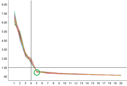
One matrix from the above 20 was chosen (you could discern its scree line above as the bold black one), and 20 random sample realizations of it under sample size 200 were produced out of Wishart distribution. Each of the sample covariance matrices was re-standardized to a correlation matrix. The 20 scree-plots superimposed on one chart:
enter image description here

We again see that the elbow is opposite the 5th eigenvalue (pr. component) which magnitude is below 1. The true number of factors was 4, as before.

Sharp factor structure, 20 random population matrices

A sharp factor structure is where factor loadings distribute bimodally: "high" vs "low" loadings. In my simulation design, each factor highly loaded exactly 5 items, and each item was loaded high by one factor only. This is a simulation of a most "simple structure" which you might expect factor-analyzing some developed and factor validated psychological questionnaire.

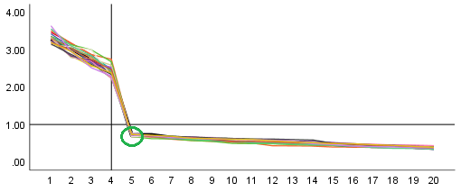
20 random sets of loadings (plus random uniquenesses) yielded, correspondingly, 20 covariance matrices with unit diagonal each, i.e. correlation matrices. Like in the first section, these are again labeled different "population" matrices sharing the same number of factors 4 for the same number of items 20. The 20 scree-plots:
enter image description here

What this picture differs by from the 1st one is just the effect of the sharpened factors: there are clearly 4 - no less no more - factors of approximately equal strength, what is seen by the emergence of the upward elbow opposite the 4th pr. component. The rest - and what interests us - is still the same as was on the previous pics.

Sharp factor structure, 20 random sample matrices

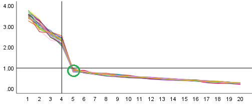
One matrix from the just above 20 was chosen, and 20 random sample realizations of it under sample size 200 were produced out of Wishart distribution, and standardized to correlations, - everything done analogously to the section 2. The scree-plots:
enter image description here

Same basic findings.

Conclusion

As far as the done simulations are relevant, and if on your scree-plot of eigenvalues of a correlation matrix you see a clear "elbow" (downward one, and followed by a sloping line) opposite the m-th component, consider m-1 factors to extract as the "Cattell's rule".

These above simulations pertain to the factor analysis of a correlation matrix (or of a covariance matrix with approximately equal diagonal elements). When covariance matrix with strongly unbalanced variances is input to exploratory FA, things may complicate. In particular, the Cattell's "elbow" itself can almost disappear.

Population noise added

One might remark that the population correlation matrices (e.g. the 1st and the 3rd pictures) were generated without a population noise. That is, the matrices, if you do FA on them properly, restore the loadings (20x4 matrices) by which they had been generated, precisely. One might remark that this is a bit ideal and that in real population there always exist common factors which are much weaker than the common factors considered in the model but may be numerous; in particularly, these factors can be responsible for surplus pairwise, partial associations. These noisy factors are ignored by a factor model but they meddle in the factor analysis.

Along with this reasoning, I added a small noise to off-diagonal correlations of each population matrix being created. (The noise was actually generated from Wishart distribution for the identity matrix, and the size of the random disturbancies was calibrated so that overall Kaiser-Meyer-Olkin MSA of a matrix would fall from about 0.8-0.9 to about 0.6-0.7 while the matrix still kept its positive definiteness. Diminishing of MSA is a symptom of strengthening of partial correlations.) So was a way to introduce to population noisy factors dismissed by the factor model.

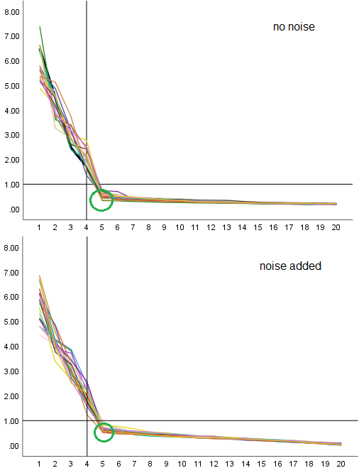
I wondered will the noise added to matrices affect the appearance of scree-plot, the position of Cattell's "elbow".
enter image description here

The upper graphic is the copy of 1st one in this answer. The lower one is where the noise was added. No change or shift of the elbow's location. It is still against the 5th pr. component. There is a tiny change in the shape of the scree, however. The whole "staple" became less bent: The scree is less steep to the left and is more steep to the right, than it was. Consequently, the elbow point is a little at raise. And that is the recognizable effect of the presense of junior common factors we'd introduced via the off-diagonal noise.

$\endgroup$
6
+50
$\begingroup$

Significant eigenvalues

You could use some sort of simulation to compute the probability for an eigenvalue exceeding a certain limit and base the selection on that. In the R-package psych, there is a function that does this (demonstrated below).

If you assume samples from a Gaussian distributed population without correlation, then you should expect a screeplot with all points/eigenvalues on a weak slope. (I do not know a formula for this slope but you could compute it by simulations, either based on a distribution as done below or by some sort of bootstrapping)

Applied to your plot

If we apply this loosely your plot (I do not have the data but we can imagine how the line would be): Your 4-th eigenvalue is on this weak slope/line, and there is a clear distinction between the rubble and the steep hill. So probably the 4-th eigenvalue is not very meaningful (or the variance is just not significant/noticeable or properly scaled; a prerequisite for interpreting PCA eigenvalues is that any potential sources of variance will be of the same order of scale). The 4-th component is indeed part of the rubble. The 4-th eigenvalue is barely different from the 5-th eigenvalue. So any argument to include the 4-th should count as strong as including the 5-th.

However, the significance is often not the issue

The m vs. m-1 issue is more the situation when the scree plot is not so obvious. But, in that less clear case the question is not about whether or not a component has a (statistical) significantly high eigenvalue (more about that in the example below). But instead, about whether the effect size is large enough or dominant.

The 'trick' in this case is to look for the most remarkable eigenvalues and then add 1 (Just to be sure. I guess. I do not understand this rule so well. But it isn't a very strict rule anyway.).

Example from psych package and manual plot

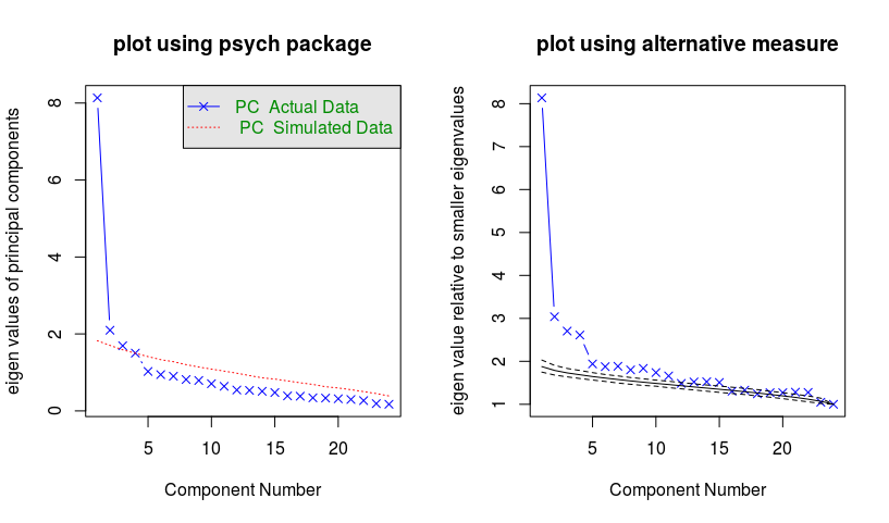
The R-code below generates the scree plots below for the example 7.4 from Harman.

  • The plot on the left is created with a single function fa.Parallel from the psych package. The plot gives the scree plot along with a line that relates to eigenvalues of a simulation with Gaussian distributed data that has the identity matrix as covariance.

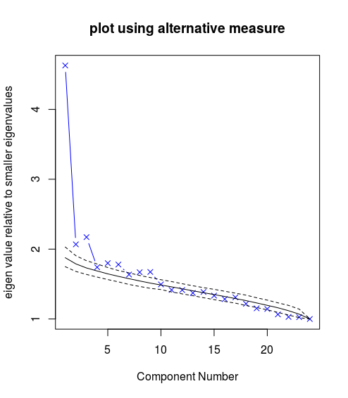
  • The plot on the right is created manually. You can use the code (which I hope is intuitive enough) to figure out how it works.

    In this plot, I have used a slightly different measure for the eigenvalues. I have scaled the eigenvalues based on the average of all the lower eigenvalues. The reason for this is because due to the presence of higher eigenvalues the eigenvalue that is being considered will be relatively lower than the random Gaussian data, which does not have these higher eigenvalues, that are used for the comparison.

    The result is that many more points are above the line and seem to be significant. Isn't that a lot? Well, maybe not. The comparison is made with a model for data that is entirely spherical and variances are equal in all directions. But in practice is it not strange that data has some variations in variance/eigenvalues. Even if there is no structure, clustering, or other variances in-between-groups that cause an increase in variance, then one may still have that the noise is not the same for all directions.

example

set.seed(1)
psych::fa.parallel(Harman74.cor$cov, n.obs = 145, fa = "pc",
                   main = "plot using psych package")

### compute eigenvalues for Harman74 data
### A correlation matrix of 24 psychological tests given
### to 145 seventh and eight-grade children in a Chicago
### suburb by Holzinger and Swineford
ev <- eigen(Harman74.cor$cov)$values

### simulate normal distributed data
### and compute the eigen values
sim_eigen <- function(n_var,n_points) {
  x <- matrix(rnorm(n_var*n_points), ncol = n_var)
  m <- cov(x) 
  sim_ev <- eigen(m)$values
  return(sim_ev)
}

### relative numbers 
### compute the eigenvalue relative to the mean of the lower values
f_rel <- function(x_in) {
  l <- length(x_in)
  x_out <- sapply(1:l, FUN = function(k) {
    x_in[k]/mean(x_in[k:l]) 
  })
  return(x_out)
}

### simulate 1000 times
sim <- replicate(1000,f_rel(sim_eigen(24,145)))

### compute mean and upper and lower 90% interval
ev_mu <- rowMeans(sim) ### compute the mean of thousand simulations
ev_up <- sapply(1:length(ev_mu), FUN = function(k) {
  quantile(sim[k,], probs = 0.95)
})
ev_low <- sapply(1:length(ev_mu), FUN = function(k) {
  quantile(sim[k,], probs = 0.05)
})

### plot alternative
plot(f_rel(ev), main = "plot using alternative measure", col = 4, pch = 4, type = "b",
     xlab = "Component Number",
     ylab = "eigen value relative to smaller eigenvalues")
lines(ev_mu)
lines(ev_up, col = 1, lty = 2)
lines(ev_low, col = 1, lty = 2)

Below is a simulation where we generate the data ourselves. Now we generate the data according to a Gaussian distribution.

x <- MASS::mvrnorm(145, mu = rep(0,24),
                   Sigma = diag(c(8,2,2,1.3,rep(1,20))))
cm <- cov(x)
ev <- eigen(cm)$values

The result is that you see the eigenvalues more closely within the simulated bandwidth. The vectors with eigenvalue 8, 2, 2 are picked out. The vector with eigenvalue 1.3 is too difficult.

more perfect example


Summary

The example above shows that you might get a nice clear scree plot like the last plot. But, this is only the case when all eigenvalues are the same except a few vectors/components (which you wish to detect and explore).

In many practical situations, the assumption of equal eigenvalues/variance will be invalid in any case. The scree plot will not look perfect and there is no distinct border between rubble and a steep hill. The analysis of the scree plot in such cases is not about finding statistically significant eigenvalues. But instead, the scree plot is to see the distribution of importance/variance for the different components.

Technically, all of the components can be important. The point of PCA is not to determine which ones are important, but it is to find some pragmatic cut-off value for the purpose of data reduction. The scree plot, if it is clear, can help you to categorize the different components, and determine a distinct group of large values.

$\endgroup$
0
$\begingroup$

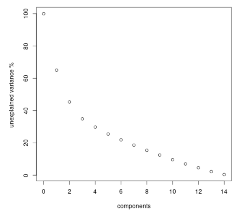
A recent related question (about the elbow method Where is the inflection point here in this elbow chart?) made me revisit this question here. And I notice that whereas the scree plot for pca with eigenvalues makes you select $m-1$ components. The plot of a cost function would make you select $m$ components. I thought this difference is worthwhile to mention here.

Below is a graph for the same pca but with unexplained variance on the vertical axis. In this representation it is more difficult to see the point where the slope changes, but you can see that the first $3$ steps there is a faster drop after which the additional steps make less improvement. So here the $m$ is your choice, but it also occurs at the 3th component instead of the 4th component. The scree plot from the question is the change from the plot here.

different representation now m is the point

$\endgroup$

Your Answer

By clicking “Post Your Answer”, you agree to our terms of service and acknowledge you have read our privacy policy.

Not the answer you're looking for? Browse other questions tagged or ask your own question.