1
$\begingroup$

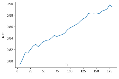
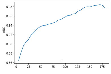
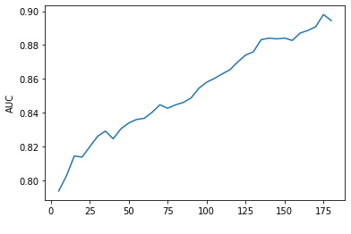
I have trained some models for survival forecast (only interested in ranking of observations). I obtained C-index values as well as dynamic AUC values for the three trained models (CPH, AFT -weibull- and a Random Survival Forest) implemented in scikit-survival. I then calculated out-of-sample (test set) AUC for all three models. This is the output plot:

AUC for CPH model COX PH.

AUC for AFT weibull AFT.

AUC for RSF RSF.

So the two questions are:

  1. How should I interpret this upward trend in the model's predictive performance?

  2. The AUC for the CPH and AFT looks almost the same. What situation could potentially explain this matching predictive performance for the two models?.

Thanks!


Edit for clarification:

The cumulative/dynamic AUC is defined by Lambert and Chevret as: \begin{equation} AUC^{CD} (t) = \dfrac{\sum_{i=1}^{n} \sum_{j=1}^{n} I(X_j > t) \, I(X_i \leq t) \, I(\hat{\lambda}_j \leq \hat{\lambda}_i) \, w_{i}}{(\sum_{i=1}^{n} I(X_i > t)) (\sum_{i=1}^{n} I(X_i \leq t) \, w_{i})} \nonumber \end{equation}

It is a measure of how well a model can distinguish subjects who fail by a given time $t_r \leq t$ from those that fail in $t_r > t$.

$\endgroup$
2
  • $\begingroup$ For those of us not familiar with "Ishwaran's formulation" could you please explain what is plotted along the horizontal axis of these plots? $\endgroup$
    – EdM
    Commented Dec 1, 2021 at 18:53
  • $\begingroup$ Hi, EdM. The phrase was wrongly formulated, thanks for pointing that out. My reference was to Ishwaran´s work on RSF (which is the bases for the models implemented in python's Scikit Surv an R's randomforestSRC libraries. The X axis is the time. $\endgroup$
    – BorisD
    Commented Dec 1, 2021 at 19:48

1 Answer 1

2
$\begingroup$

The Weibull model is unique in that it satisfies both the accelerated failure time assumption (multiplicative survival curves) as well as the proportional hazards assumption (multiplicative hazard curves). This should explain why the difference in performance between these models is essentially indiscernible. Can you elaborate on the x-axis in each of your plots? Is this the number of subjects or events in the model? If so then it should not be surprising that a model based on more events fits better than a model based on fewer events. If this is not the correct interpretation of the x-axis let me know.

$\endgroup$
3
  • $\begingroup$ Thanks! Regarding the X-axis, that's the time. $\endgroup$
    – BorisD
    Commented Dec 1, 2021 at 22:12
  • $\begingroup$ Does this mean that for an x-axis value of, say, 25 you are using all of the events up to time 25 to fit a model and investigate the out-of-sample fit? $\endgroup$ Commented Dec 1, 2021 at 22:41
  • $\begingroup$ The plots show the value of dynamic AUC for each time period. This AUC value is a ratio of correctly ordered pairs, given the output of the model (risk, CHF or S) and the real (observed) times. I added the formula used by the Python library I'm using and a link to the original paper. $\endgroup$
    – BorisD
    Commented Dec 2, 2021 at 1:28

Your Answer

By clicking “Post Your Answer”, you agree to our terms of service and acknowledge you have read our privacy policy.

Not the answer you're looking for? Browse other questions tagged or ask your own question.