8
$\begingroup$

Suppose a density function is

$$f_X(x)=\left\{\begin{aligned}\frac{1}{(1+x)^2} & \quad x \ge 0 \\ 0 & \quad \text{otherwise.}\end{aligned}\right.$$

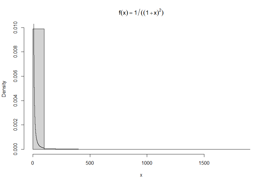
I am trying to write an algorithm to generate a sample of size $n = 10^4$ from this distribution by using the inverse transform method. Why does my histogram not look "nice" like the one below?

n <- 10^4
u <- runif(n)
x <- (-u)/(u-1)
# histogram
hist(x, prob = TRUE, main = bquote(f(x)==1/((1+x)^2))) #density histogram of sample
y <- seq(0, 100, .01)
lines(y, 1/((1+y)^2))    #density curve f(x)

Output: enter image description here

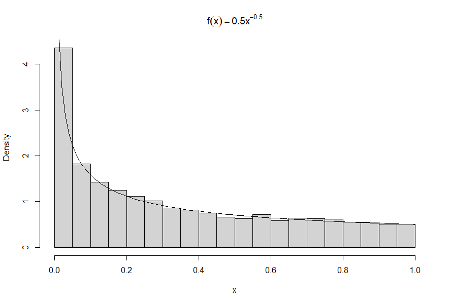
Nice histogram for another density: Nice graph

$\endgroup$
4
  • $\begingroup$ @Bruce Depending on how the histogram is initially drawn, inflating the values would either be incorrect or would represent the truncated distribution. Neither seems to be what is intended. Where does the value of $0.95$ come from? The 95th percentile of this distribution is $19$ and $10$ is the $10/11$ quantile. $\endgroup$
    – whuber
    Commented Feb 5, 2022 at 0:26
  • 1
    $\begingroup$ I intended the truncated distribution. I didn't see how to get a useful plot without a horizontal log scale otherwise. // The 95th percentile refers to the particular sample x I got, hence the word "about." // Some nuances got lost in the comment which I have now deleted because we have two useful answers. $\endgroup$
    – BruceET
    Commented Feb 5, 2022 at 2:46
  • $\begingroup$ Why do you plot the histogram? $\endgroup$ Commented Feb 5, 2022 at 12:38
  • 1
    $\begingroup$ I thought so too and after Whuber's comment I still did not see it directly. So I am gonna state it more explicitly: it is not a Cauchy distribution $\frac{1}{(1+x^2)}$ but a shifted Pareto distribution $\frac{1}{(1+x)^2}$. $\endgroup$ Commented Feb 5, 2022 at 14:39

2 Answers 2

15
$\begingroup$

This happens all the time with distributions that have infinite variance. (This one even has infinite expectation.) One or more extreme values can swamp all the others.

When all values are positive, a nice solution is to plot the histogram on a log scale.

Fortunately, you don't have to do the math to succeed with this.

The idea is that when the probability element of your distribution is $f_X(x)\mathrm{d}x,$ on a log scale $y = \log(x)$ we have $x=e^y,$ so the probability element becomes

$$f_Y(y)\mathrm{d}y = f_X\left(e^y\right)\,\mathrm{d}e^y = f_X\left(e^y\right)e^y\,\mathrm{d}y.$$

Notice this involves only (a) evaluating $f_X$ at $e^y$ and (b) multiplying that by $e^y.$

The changes to the code--which work in all such cases, regardless of $f$--are

  1. Make a histogram of the logarithms of the data.

    hist(log(x), prob = TRUE, main = bquote(f(x)==1/(1+x)^2), breaks=50, col=gray(.9))
    
  2. Overplot it with the adjusted function $f_Y:$

    f <- function(x) 1 / (1+x)^2 # The original density function
    curve(f(exp(y)) * exp(y), add=TRUE, n=201, xname="y", lwd=2, col="Red")
    

You can get a little fancier with (1) if you like. Here is a version of it with with the values shown on the axis rather than their logarithms.
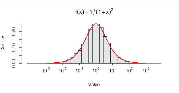
Figure

If you prefer this style, here's some R code for step (1) to get you started.

hist(log(x), prob = TRUE, main = bquote(f(x)==1/(1+x)^2), breaks=50, col=gray(.9),
     xaxt="n", xlab="Value")
i <- floor(range(log10(x)))
xlab <- seq(min(i), max(i))[-1]
rug(xlab * log(10))
for (x in xlab) mtext(bquote(10^.(x)), side=1, line=1/2, at=x * log(10))

An alternative approach is to break the histogram up into two or more pieces. Use a high quantile for a flexible choice; or inspect the initial histogram and choose the threshold(s) for splitting the data by eye.
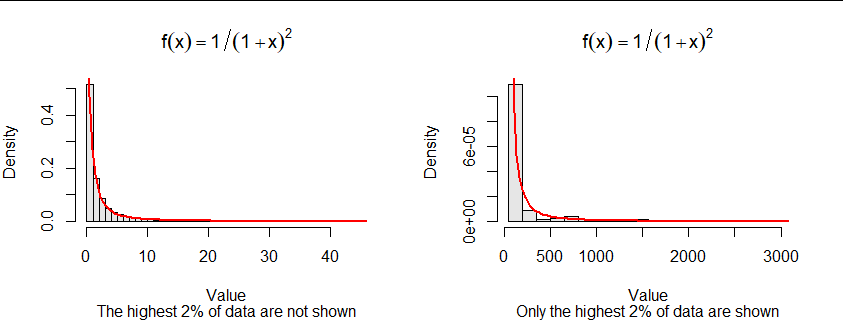
Figure 2

Watch out for a pitfall: when you feed only a part of the data to hist, it overestimates the densities. Multiply the densities by the fraction of data being shown. The code demonstrates how to do that in R: save the output of hist and simply scale its densities (making no other changes), and only then plot this object.

The code is starting to get a little fussy, though:

alpha <- 0.02
threshold <- quantile(x, 1 - alpha)
par(mfrow=c(1,2))
h <- hist(x[x <= threshold], breaks=50, plot=FALSE)
# h$density <- h$density * (1-alpha)
plot(h, freq=FALSE, main = bquote(f(x)==1/(1+x)^2), col=gray(.9), xlab="Value",
     sub=bquote(paste("The highest ", .(signif(100*alpha, 2)), "% of data are not shown")))
curve(f(x), add=TRUE, col="Red", lwd=2)
h <- hist(x[x > threshold], breaks=seq(threshold, max(x), length.out=21), plot=FALSE)
h$density <- h$density * alpha
plot(h, freq=FALSE, main = bquote(f(x)==1/(1+x)^2), col=gray(.9),
      xlab="Value",
     sub=bquote(paste("Only the highest ", .(signif(100*alpha, 2)), "% of data are shown")))
curve(f(x), add=TRUE, col="Red", lwd=2)
par(mfrow=c(1,1))

It can be interesting to use variable-width bins. This method can be combined with the previous ones. Here is an example of the lower part of the data.
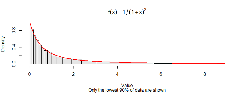
Figure 3

I broke the data by quantiles for this one. Again, the densities have to be adjusted when a subset of the data is being plotted.

b <- quantile(x, seq(0, 1, length.out=21))
k <- 2
n <- length(b)-k
h <- hist(x[x <= b[n]], plot=FALSE, breaks=b[-(n + seq_len(k))])
q <- sum(x <= b[n]) / length(x)
h$density <- h$density * q

plot(h, main = bquote(f(x)==1/(1+x)^2),  
     col=gray(.9), xlab="Value",
     sub=bquote(paste("Only the lowest ", .(signif(100*q, 2)), 
                "% of data are shown")))
curve(f(x), add=TRUE, col="Red", lwd=2)
$\endgroup$
10
$\begingroup$

I don't see anything wrong with the implementation of the inverse transform method.

The first distribution is strongly right-skewed. If you run your simulation, you should see that roughly 95% of observations will be smaller than 19 (=0.95/0.05), but the largest sample is typically much larger, say a few thousand.

So, most samples are small, but there is a small probability of very large samples. The bars on a histogram have a fixed width, so you end up with the first bar containing most observations, and then several other bars on the right that are just tiny slivers of rectangles.

For this specific distribution, since the support is the positive real numbers, you could plot the histogram on a log scale to see it better, but you'll need to derive the transformed density. If $X$ has density:

$$f_X(x) = \frac{1}{(1+x)^2}, \quad x \geq 0$$

Then you can check that $Y := \log(X)$ has density:

$$f_Y(y) = \frac{e^y}{(1+e^y)^2}, y \in \mathbb{R}$$

Then if you plot it:

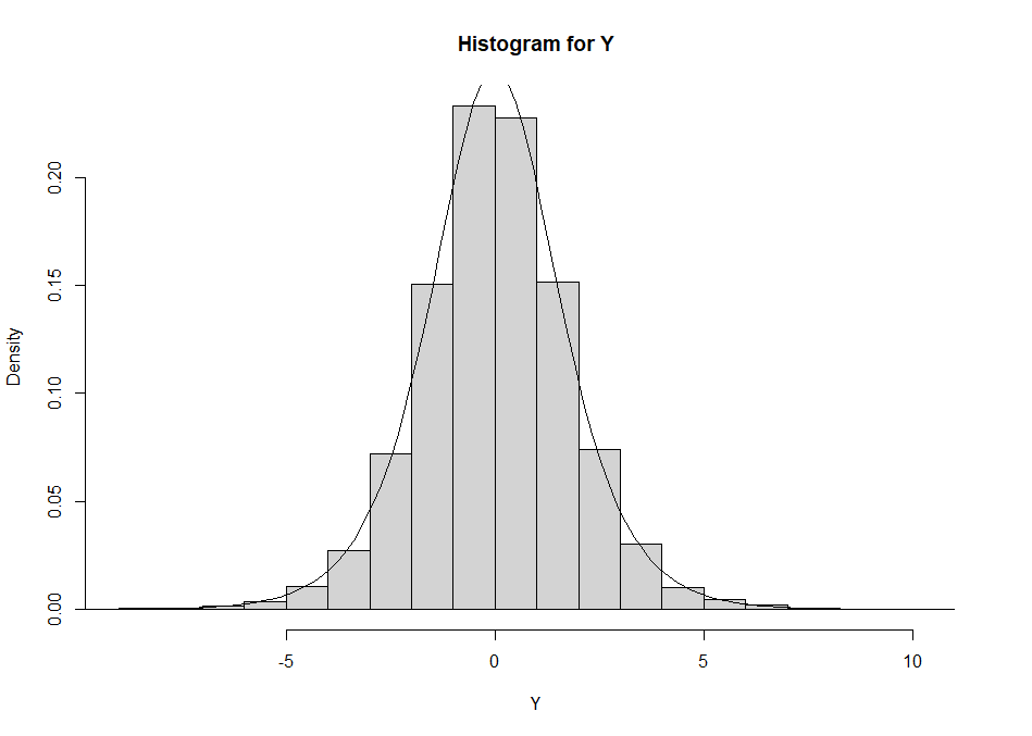
hist(log(x), prob = TRUE, main = "Histogram for Y", xlab = "Y")
z <- seq(-10,10,length.out = 100)
lines(z, (exp(z)/(1+exp(z))^2))

histogram

You can see that they are in fairly good agreement.

For reference, the distribution of $Y$ is called the logistic distribution, and $X$ has the log-logistic distribution.

$\endgroup$
1
  • 5
    $\begingroup$ Your answer is more complete than mine. (+1). Deleting mine and making it a comment. $\endgroup$
    – BruceET
    Commented Feb 4, 2022 at 22:56

Your Answer

By clicking “Post Your Answer”, you agree to our terms of service and acknowledge you have read our privacy policy.

Not the answer you're looking for? Browse other questions tagged or ask your own question.