Previously, I asked this question on StackOverflow and was directed here: https://stackoverflow.com/questions/71797502/need-help-interpreting-featureplot-legend
I am using the FeaturePlot command which is part of Seurat to compare the distribution of two genes. This is using non-scaled data. Can anyone help me interpret the legend? I do not know where the axis values are coming from.
I am not sure what else I can include to make this easier. If anyone needs additional details please let me know.
Thanks!
**Update 04/11 - more details
This is RNA seq data. I am exploring which genes are present in this cell population.
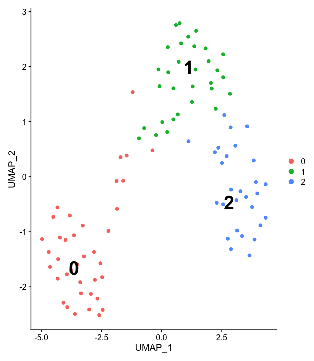
Seurat has a feature that allows you to cluster together similar populations of cells based on their features (I.E gene expression). The clustering here isn't great as I am working with a very small number of cells but we have 3 populations.
To get to this UMAP I have normalized and scaled my data using a command in the Seurat packaged called SCTransform.
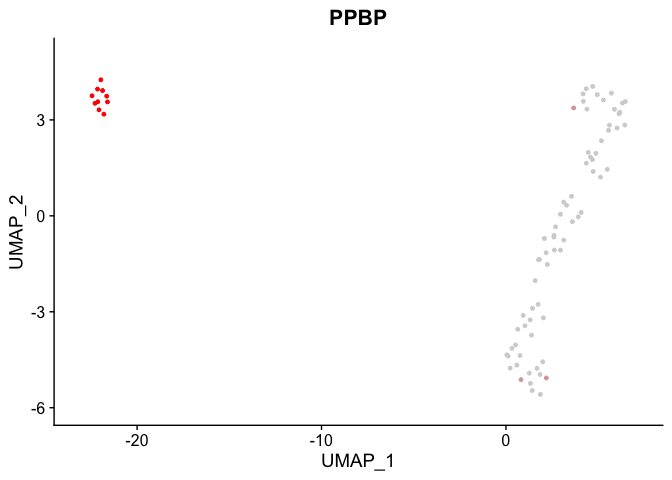
So going back to my earlier question, I have used this umap and overlayed the gene expression (here just SHH, SANT1) to better assess the relationship between the clustering and the genes being expressed in those clusters. Experimentally, I know some of these genes should be expressed most abundantly in a particular type of cell and I am checking if Seurat picks that up.
Going back to my original example. In the fourth plot, I do not know why the X and Y axis are both 10. In fact, they are always both 10 regardless of which genes I am looking at. It seems to me like they are measuring color? Or rather the intensity of the gene expression in a particular cell and this measurement happens to be static.
I hope this helps! If anything else is needed just ask.
Updated 04/15/22
Big thanks to dipetkov as their idea led me to the answer!
My original question was interpreting this kind of plot: 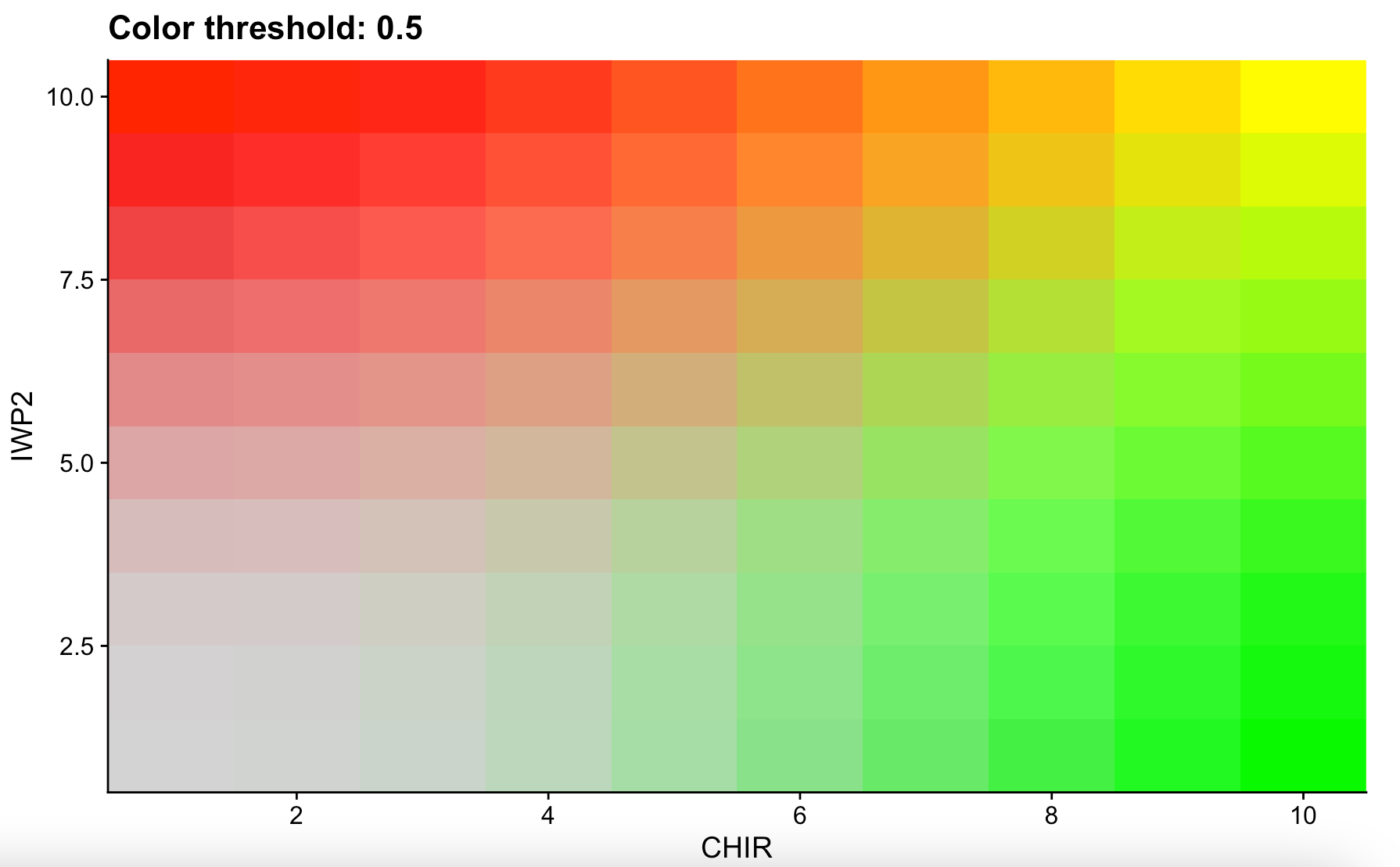
Seurat assigns values to cells based off their gene expression. When looking at a single gene these values can be 0, 4, and 9. When you're looking at a plot that features two genes overlapping, the expression can include 40, 44, 49, 90, 94, and 99.
This is what things look like in R when analyzing a single gene's (CHIR) expression: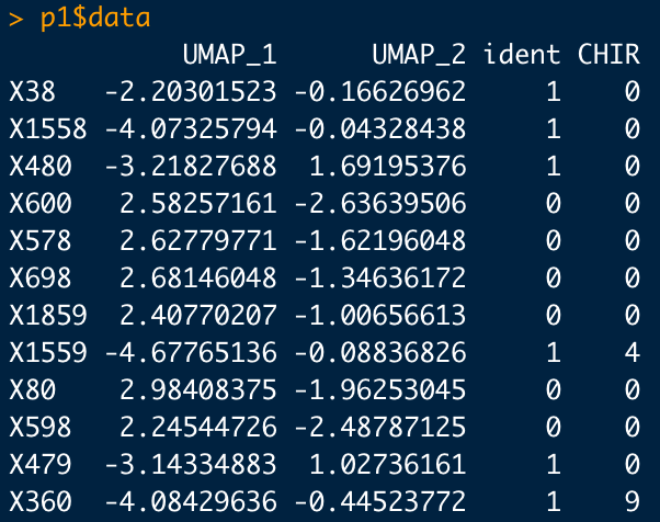
When we analyze two genes (CHIR & IWP2) the numbers look like this: 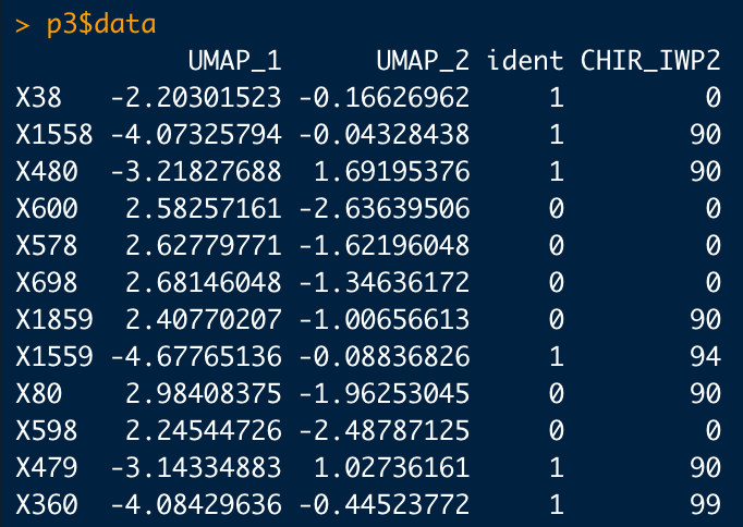
These values naturally relate to their corresponding color on the plot. The values 40, 44, 49, 90, 94, and 99 are actually just the expression of each gene in that particular cell side-by-side. A cell with a CHIR and IWP2 expression of 9 would then be 99 (yellow). Whereas a cell with a CHIR expression of 9 and a IWP2 expression of 0 would be 9 (09). This is because the first number represents red and the second number represents green. The opposite of the previous example, high IWP2 and no CHIR, would be 90.
Lastly, there does not seem to be any intermediate colors other than yellow. A cell expressing a low amount of CHIR and IWP2 (44) would be colored light green as green takes priority over red here.
TLDR: The X and Y axis are misleading. Seurat assigns values to cells based on their gene expression. These numbers can only be 0, 4, 9, 40, 44, 49, 90, 94, and 99. Numbers above 9 (excluding 90) are two gene colors combined.


