3
$\begingroup$

My wife is presenting a study at a conference poster session. She has a correlation of sorts [1] where kids' self-assessment of asthma ("I felt a lot better" or "I felt a little better or not better") matches doctors' assessments (0 to 6, low numbers are better). And we need a visual for the poster.

I'd have thought that a correlation graph would be the way to go, but the x- and y-values are both on discrete scales, so if you plot them, (1) there is no cloud of values to see and (2) there is no obvious trend.

Here are the buckets (value + count of occurrences) for people who felt a lot better:

>>> print(a_lot_better)
{0: 66, 1: 9, 2: 3, 3: 2}

And here are buckets for people who felt a little better or not better:

>>> print(a_little_better)
{0: 79, 1: 31, 2: 5, 3: 6, 6: 1}

If you sum up the numbers like this:

# python
def print_dict(d):
    total = float(sum(d.values()))
    composite = 0.0
    for k, v in sorted(d.iteritems())
        print("{0}: {1}".format(k, v / total))
        composite += (k * v) / total
    return composite

You get this:

>>> print_dict(a_lot_better)
0: 0.825
1: 0.1125
2: 0.0375
3: 0.025
0.2625

>>> print_dict(a_little_better)
0: 0.647540983607
1: 0.254098360656
2: 0.0409836065574
3: 0.0491803278689
6: 0.00819672131148
0.5327868852459017

And that is more obviously different, but I don't know how to present this visually (assuming even that this is a legitimate summary).

How should we present this data to be visually obvious that there is an interesting and significant relationship?

[1] As broadly understood by a statistics-civilian.

$\endgroup$
2
  • 5
    $\begingroup$ There are some good ideas here: stats.stackexchange.com/questions/56322/… $\endgroup$
    – dimitriy
    Commented Apr 29, 2013 at 19:55
  • $\begingroup$ @Dimitriy Masterov: Thanks, this is great. Much of the search relies on having the correct domain terminology for the search. If I'd described this as a relationship of ordinal variables, I might have stumbled on this link earlier. $\endgroup$
    – hughdbrown
    Commented Apr 30, 2013 at 2:42

2 Answers 2

4
$\begingroup$

The heading "negative binomial regression" is a puzzle here as the distribution is defined only on the grades 0, ..., 6, so can't be negative binomial on that ground alone.

However, your calculation of the discrete probability distribution strikes me as exactly right and that suggests showing two histograms, which is only a step away from your probability distributions. It would be widely conventional to show bars with a little space between them to show that the scale is discrete. In fact some would go further and prefer the bars to be shrunk to spikes.

In the thread pointed to by Dimitriy Masterov, the proposals of table-like plots are essentially identical in spirit.

A Mann-Whitney test is quite encouraging here.

This isn't, in my view, a correlation problem at all. You have two distributions of ordinal (graded) variables.

$\endgroup$
2
  • $\begingroup$ Excellent, thank you. We are not working with stata or R, but are instead shoehorning this into Powerpoint with Excel using bar charts of the two series' discrete probability distribution. Not quite so sexy but still passable. Thanks very much! $\endgroup$
    – hughdbrown
    Commented Apr 30, 2013 at 2:41
  • $\begingroup$ Sorry about the misleading "negative binomial regression." I gather my wife was describing some other problem at the same time and I was confused into believing it was the same topic. $\endgroup$
    – hughdbrown
    Commented Apr 30, 2013 at 2:42
3
$\begingroup$

Most important is to figure out what the message you want to communicate is and try to find a graph whose message is close to that.

Some graphs that might spur some ideas:

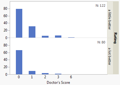
Comparing bar charts (aka discrete histograms) shows the different distributions but perhaps misleads since score=0 has a higher bar for "little better" than "lot better", though it's relatively less common.

comparing bar charts

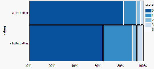
A mosaic plot (aka spine plot) makes the population difference and the relative sizes clearer but it's harder to make out the distribution shape.

mosaic plot

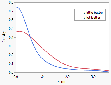
Overlaid smooth distribution curves emphasizes the different distribution shapes but with a loss of detail.

compare densities

$\endgroup$
6
  • 1
    $\begingroup$ Density estimation seems a real stretch here. Nice mosaic plot. The histograms can show proportions rather than raw counts. $\endgroup$
    – Nick Cox
    Commented May 1, 2013 at 15:04
  • $\begingroup$ Good point, I thought about going into whether the 0-6 score should really be modeled ordinal or just more of a rounded continuous measure, which might allows means comparisons, etc., but that's far beyond my expertise. (And of course I chopped off the negative scores from the axis :) ) $\endgroup$
    – xan
    Commented May 1, 2013 at 15:16
  • $\begingroup$ There is plenty of stuff on density estimation respecting the support in e.g. Silverman's book. That's in my experience typically not implemented; you have to fix things yourself. $\endgroup$
    – Nick Cox
    Commented May 1, 2013 at 15:46
  • $\begingroup$ Thanks a lot for this. I appreciate that you put in the effort to produce graphs. The spine plot is my personal favorite but my wife's adviser on this overruled. So it goes. FWIW, I think you have the "a little better" and "a lot better" labels reversed in the first graph (though the counts of patients are correct). $\endgroup$
    – hughdbrown
    Commented May 2, 2013 at 2:36
  • $\begingroup$ @hughdbrown why do you say the first graph has the wrong labels. The Y axis is count and the first two bars are at about 80 and 30 which agrees with the "little better" data values of 79 and 31. Perhaps you were expecting percents on the Y axis, which would probably be better as Nick mentions. $\endgroup$
    – xan
    Commented May 2, 2013 at 12:47

Your Answer

By clicking “Post Your Answer”, you agree to our terms of service and acknowledge you have read our privacy policy.

Not the answer you're looking for? Browse other questions tagged or ask your own question.