1
$\begingroup$

I was running a model to check the survival rate among different treatments. Basically, the treatment has four groups. I firstly plot a K-M curve and noticed clear interactions among the four treatment groups over the time. So, in the cox regression model, I put the interaction between treatment and time in the model: such as treat1 * log(time) treat2 * log(time) treat3*log(time). And treatment 1 was used as the reference group. I obtained the result like belows:

variable Estimate Hazard ratio P value
treatment 2 0.29 1.36 <.0001
treatment 3 -1.20 0.35 <.0001
treatment 4 -1.41 0.38 <.0001
treat2*time -0.25 0.84 <.0001
treat3*time 0.37 1.21 <.0001
treat4*time 0.28 1.25 <.0001

How can I interpret these results? I thought I could explain it like this, for example, treatment 2 increases the risk of death by 36% in the early stage, and reduces the risk of death by 16% in the late stage. Only treatment 2 seems consistent with the K-M plot, but for the rest of the two treatments, when compared with treatment 1, they don't seem to reduce the risk of death so much in the early stage, and they don't seem to increase the risk of death so much comparing to treatment 1 in the late stage. But if I explain the result like this: treatment 2 increases the risk of death by 36% before interaction, and also increases the risk of death by 14%(1.36*0.74=1.14), it totally wrong.

So I am wondering if there is an appropriate way to explain the interaction results? Or should I run a model without the interaction, and compare it with the interaction model? Thank you!

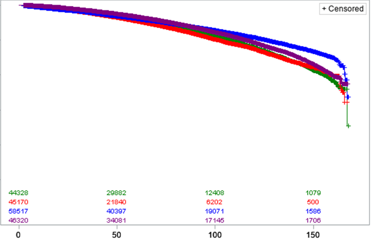
And below is the K-M plot, the K-M plot seems different from the Cox-regression estimate. For example, blue line is treatment 2, and in the KM plot, it seems have better survival rate than red. But in the Cox table, it increased the risk of death by 36%, and after interaction, the risk of death also increased 14%(1.36*0.84). Is it normal or something wrong with the analysis? K-M plot
$\endgroup$
4
  • $\begingroup$ It's hard to see what's going on from the plot. It looks like some survival curves cross, in which case it can be very hard to interpret Cox models; the proportional hazards assumption then doesn't hold. The HR you get is a sort of "average" over the event times. The blue curve looks like it had worse survival at early times, when most of the events probably occurred. That might explain your observation. Also remember that your Cox model with the trt*time terms was probably incorrect and can't be trusted, anyway; see my answer. $\endgroup$
    – EdM
    Commented Aug 2, 2022 at 0:17
  • $\begingroup$ So the HR is sort of average over the event times, even though after the interaction the HR shows it might increase the risk of death, it might still show have better survival in the K-M, right? Yeah, I also wanted to check if the interaction part by using tt, but I can't get the result because it always said that cannot allocate vector of size. I have tried everything online, including memory.limit(size=), it still didn't work. I have 64 bit R, and 16G RAM, I don't know why. Do you have some ideas about that? $\endgroup$
    – NewRUser
    Commented Aug 2, 2022 at 1:47
  • $\begingroup$ The tt() function makes an additional copy of each individual's data for all other individuals' event times while at risk. That leads to an extremely large data set when you have nearly 200,000 individuals in the study. When I made that suggestion I didn't know how large your data set is. I'll have some more suggestions in a day or so, in an edited answer. $\endgroup$
    – EdM
    Commented Aug 2, 2022 at 18:56
  • $\begingroup$ The data is like 17.5 Mb, and with about 200,000 observations, and besides the tt() function, I am still using weight which probably make a even larger data set? I have no idea how to make it work, I searched all solutions online, all didn't work. And I don't have another computers or Linux interface. Really desperate. $\endgroup$
    – NewRUser
    Commented Aug 2, 2022 at 19:22

1 Answer 1

2
$\begingroup$

Unless you took special precautions to extend your data set to include separate rows for each individual at each time the individual was at risk (which your coding doesn't seem to have done), your attempt at creating an interaction between treatment and time isn't correct.

If the time value is the event or censoring time for a subject, then as the R survival time dependence vignette says your interaction term is just a:

time-static value for each subject based on their value for the covariate time...This variable most definitely breaks the rule about not looking into the future, and one would quickly find the circularity: large values of time appear to predict long survival because long survival leads to large values for time.

In R the tt() function allows you to model these types of interactions with time correctly. Otherwise there really is nothing that can be interpreted meaningfully.

In response to comments and updated question

You need to decide what you want to study and report. As the Kaplan-Meier plots clearly cross, the proportional hazard (PH) assumption with respect to treatment (as a single predictor) does not hold. There is no single answer to which group has "better survival." The blue group might have the best survival at late times, but it seems to have the worst survival at early times. The overall survival curves might be enough to report on their own.

The tt() function and a related method for SAS deal with the time-varying coefficient problem by translating it to a time-varying covariate problem. At each event time, a new time-varying covariate is generated for each individual at risk, equal to the product of the individual's covariate value and the (function of) that event time value (not the individual's own event/censoring time, which is what your code did). That becomes unwieldy and fills up a computer when you have 200,000 individuals: at early times you have hundreds of thousands of new data points generated for each of tens to hundreds of thousands of event times.

If there is reason to think the there are different "early" or "middle" or "late" effects of the treatments on survival, you might make the analysis feasible by using step functions instead of continuous functions of time for the coefficients. That's illustrated in Section 4.1 of the R survival time dependence vignette. Instead of having to duplicate all cases at risk at each event time, you only have to do that for each time period that you choose for the step functions.

Instead of using treatment as the sole predictor in your Cox model, you might find better results if you included all potentially outcome-associated covariates in your model. You certainly have enough data to allow for very flexible modeling, and your use of propensity score weighting (as stated in a comment) indicates that you have other covariates available. If your propensity score model isn't well specified, then you might make up for that with a "doubly robust" model that also includes outcome-associated covariates in the Cox model.

Also, instead of trying to fit a particular function form for the coefficients as a function of time, you might just let smoothed scaled Schoenfeld residual plots illustrate how the association of each treatment with outcome changes over time. With this large a data set you almost certainly will find some violation of PH; those plots can let you and your audience know how big those violations are, over what time courses.

$\endgroup$
9
  • $\begingroup$ I used the SAS to do the analysis because the data is secondary dataset, and I used the propensity score weight to make the data more like quasiexperimental data. If I use tt() in the R, is there a code to apply propensity score weight? Thank you! $\endgroup$
    – NewRUser
    Commented Jul 29, 2022 at 14:51
  • $\begingroup$ @NewRUser the coxph() function, which is designed to handle the tt() function, can accommodate a vector of case weights via the weights parameter. See the manual for that function; the manual for coxph() also includes the description of the tt() function. See the time-dependence vignette for examples of how to use tt(). It's possible that SAS handled your interaction properly, but you'd have to check its manual as I don't use SAS. $\endgroup$
    – EdM
    Commented Jul 29, 2022 at 16:01
  • $\begingroup$ Thank you so much, I will check it carefully. But if the interaction was correct, do you know how to interpret it? Or I don't need to interpret the hazard ratio of interaction, I only need to read the HR without interaction as an average result, and tell the reader the treatment changes over time with the significant interaction p value? $\endgroup$
    – NewRUser
    Commented Jul 29, 2022 at 16:23
  • $\begingroup$ @NewRUser if the interaction is specified properly, then the HR for the interaction is the extra hazard ratio associated with a unit increase in your specified function of time for that treatment. You shouldn't just ignore it. For display, plots of smoothed scaled Schoenfeld residuals over time, from the model without the time interaction, can be more informative than just reporting your (somewhat arbitrary) choice of a function of time for the interaction. See Section 4.2 of the time-dependence vignette. $\endgroup$
    – EdM
    Commented Jul 29, 2022 at 16:31
  • $\begingroup$ Thank you! Just wanna make sure that if I understand, since the treatment 1 is reference, could I interpret like treatment 2 increases the risk of death by 36% (1.36 HR for main effect) in the early stage, and reduces the risk of death by 16% (0.84 HR for interaction) in the late stage comparing to treatment 1? Or after the interaction, comparing to the treatment 1, treatment 2 has 1.36*0.84=1.14? $\endgroup$
    – NewRUser
    Commented Jul 29, 2022 at 19:14

Your Answer

By clicking “Post Your Answer”, you agree to our terms of service and acknowledge you have read our privacy policy.

Not the answer you're looking for? Browse other questions tagged or ask your own question.