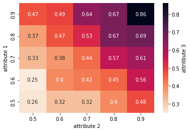
If I understand correctly what your dataset looks like, you could use a heatmap. It allows you to plot your data on three dimensions: horizontal, vertical, and color.
Here's an example with the Python's seaborn library:
import seaborn as sns
import pandas
import random
#creating the dataset
random.seed(42)
df = pandas.DataFrame()
df["attribute 1"] = [0.5,0.6,0.7,0.8,0.9] * 5
df["attribute 2"] = [0.5]*5 + [0.6]*5 + [0.7]*5 + [0.8]*5 + [0.9]*5
#assuming attr3 = attr1 * attr2 + some random noise
df["attribute 3"] = df["attribute 1"] * df["attribute 2"] + [round(random.uniform(-0.05,0.05),2) for i in range(25)]
#tranforming if in a crosstable
crosstab = pandas.crosstab(df["attribute 1"], df["attribute 2"], df["attribute 3"], aggfunc=sum)
crosstab = crosstab.reindex(index=crosstab .index[::-1])
#creating the heatmap
cmap = sns.cm.rocket_r
sns.heatmap(crosstab, annot=True, cmap = cmap,
        cbar_kws={'label': 'attritbute 3'})

This heatmap shows that as attr1 and attr2 increase, attr3 tends to darker colors (which represent higher values of attr3). The code above assumed that your data was such as $attr3 = attr1 \times attr2 +ϵ$.
You'll probably want to customize this heatmap, by changing colors, adding some title, legend, or comments, etc. But you get the general idea.
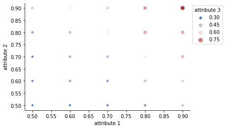
I initially thought about a bubble chart, but it may be difficult to display the exact values of attr3 on it, and I find that with your data the difference of sizes between points (i.e. the values of attr3) is not immediately visible. The heatmap is more eye-catching to me. It might have been more relevant to use a bubble chart if attr3 had a wider range of values or if attr1 and attr2 had a lot of different values. But even in this case, I suspect that a heatmap would remain a good or even better option.
Anyway, below is an example of what a bubble chart would look like with your data, using size and color to show attr3 values. You can see that with your data, the result is very akin to a heatmap:
ax = sns.scatterplot("attribute 1", "attribute 2", size="attribute 3",
                     hue="attribute 3", data=df,
                     hue_norm=(df["attribute 3"].min(),

                               df["attribute 3"].max(),),
                      palette=sns.color_palette("vlag", as_cmap=True)
                     )
sns.move_legend(ax, "upper left", bbox_to_anchor=(1, 1))
sns.despine()


