My core problem is trying to visualize the workload of a customer support team throughout the week. Specifically, I want to see what the load looks like hour by hour on each day for each agent throughout the week.
The best source of data that I can think of is our ticketing system, which can tell me when an agent replies to a case. Thus, with each reply, I get a point in time that work was done (I understand this doesn't accurately reflect the time it took to work on the case). My source data might look like this:
Agent   Day     Hour
Ben     Monday  0.2
Ben     Monday  0.4
Ben     Monday  1
Ben     Monday  1.2
Ben     Monday  2
Ashley  Monday  1
Ashley  Monday  3
Ashley  Monday  3.7
Ashley  Monday  6
Ben     Tuesday 0.5
Ben     Tuesday 1.4
etc...
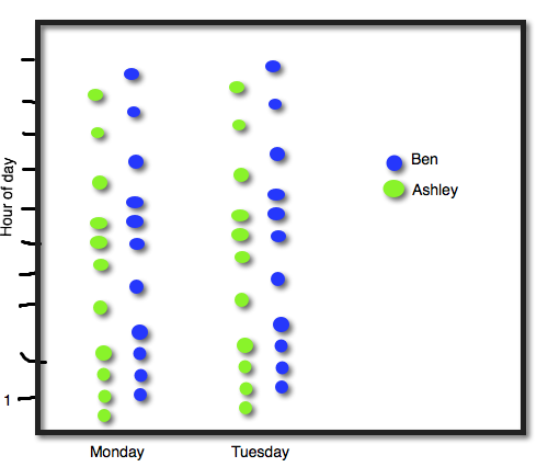
I was trying to mock this up in Excel and couldn't figure out how to do it (or even if it is possible). This is a crude drawing I made to demonstrate:
My first problem is that I'm not even sure what kind of chart this is, and along with that, is this what I ought to use to visually represent this data?
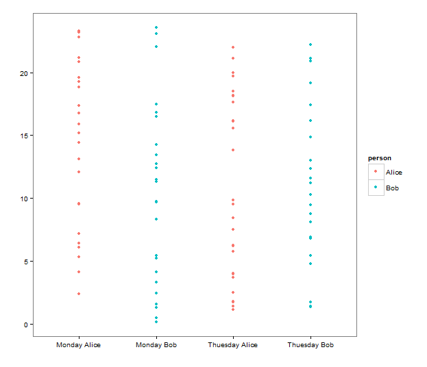
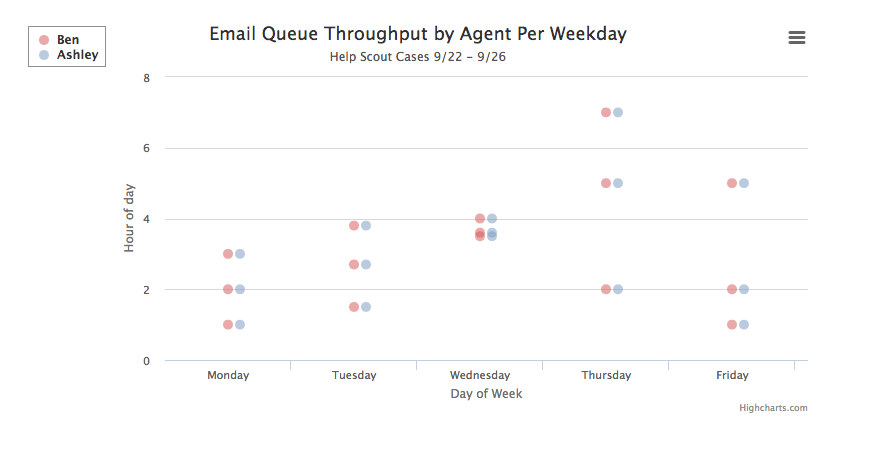
Looking around on the internet, I came across this Super User question, which suggests this wouldn't be possible in Excel, but may be possible in PyPlot (or is it matplotlib?). I'm comfortable in Python and would like to try it out, but I'm stuck in that I don't know the proper name of the visualization I'm trying to make.


