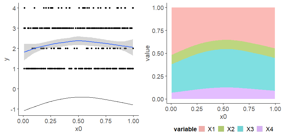
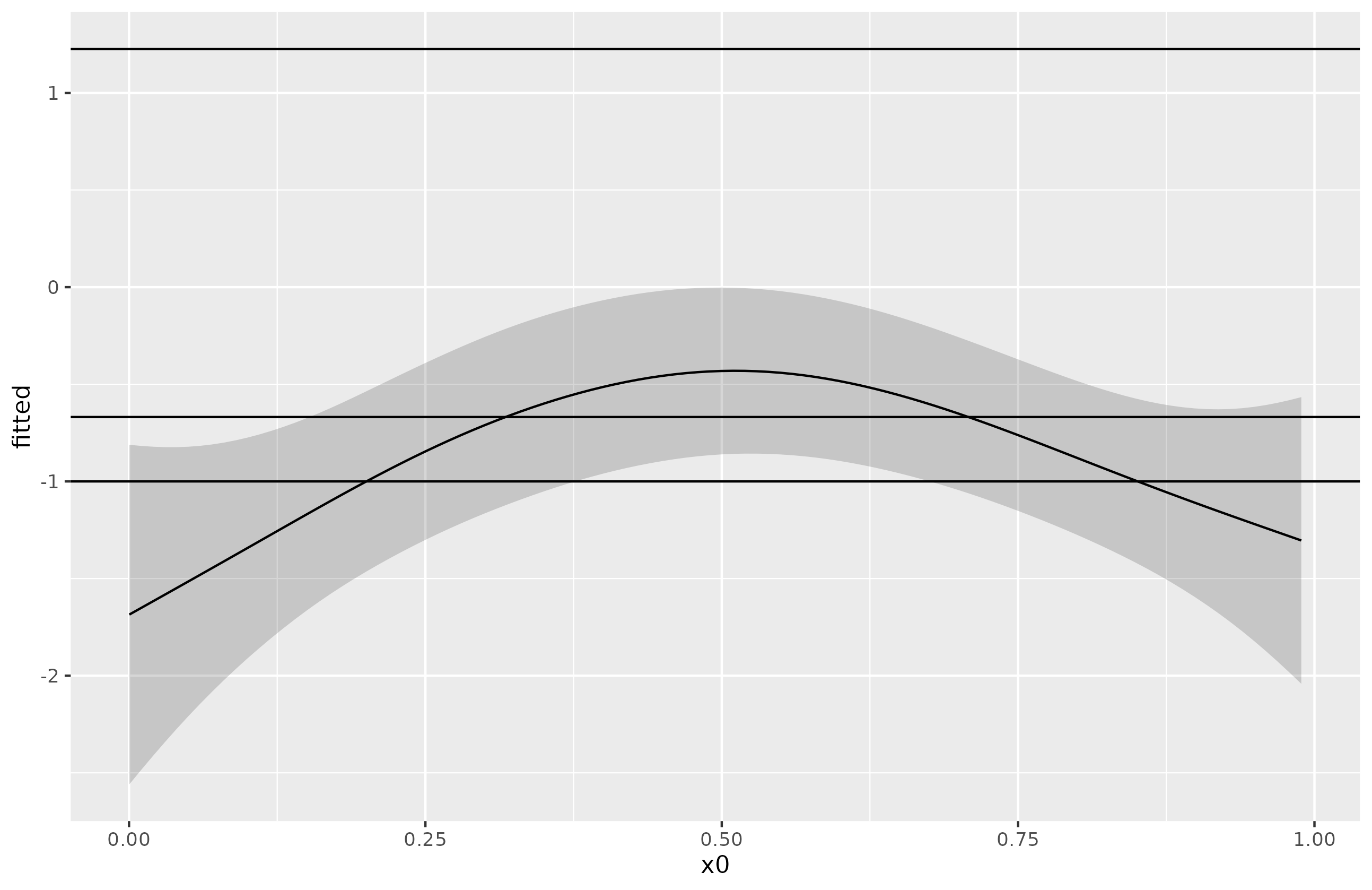
Your expectation is wrong; the smooth that is estimated in the model is not for some continuous axis you are forming based on the number line containing the integers for the categories. The linear predictor in the ocat() model is for a latent variable on the logit scale. The smooth in the linear predictor estimates how values on this latent variable vary as a smooth function of the covariate. The model also estimates thresholds for the cut points on the latent variable that predict the groups on the latent variable. By default, the first threshold is set to -1 in ocat(), which defines the threshold between categories 1 and 2. Later thresholds define the boundaries on the latent variable between the other categories, if any. if there are $c$ categories, there are $R = c - 1$ thesholds, and of those only $R-1$ of them are estimated from the data.
To visualise this on the linear predictor scale you can do this:
library("gratia")
library("ggplot2")
library("mgcv")

# Ordered categorical model ocat()
n_categories <- 4
df <- data_sim("eg1", n = 200, dist = "ordered categorical",
  n_cat = n_categories, seed = 42)

m1 <- gam(y ~ s(x0),
  family = ocat(R = n_categories), data = df, method = "REML")

# data slice over x0
ds1 <- data_slice(m1, x0 = evenly(x0, n = 100))
fv1 <- fitted_values(m1, data = ds1, scale = "link") # <- link scale

# extract the thresholds on the linear predictor from the model
thresh <- gratia::theta(m1) |>
  tibble::as_tibble() |>
  setNames(c("threshold"))

fv1 |>
  ggplot(aes(x = x0, y = fitted)) +
  geom_ribbon(aes(ymin = lower, ymax = upper), alpha = 0.2) +
  geom_line() +
  geom_hline(data = thresh, aes(yintercept = threshold))

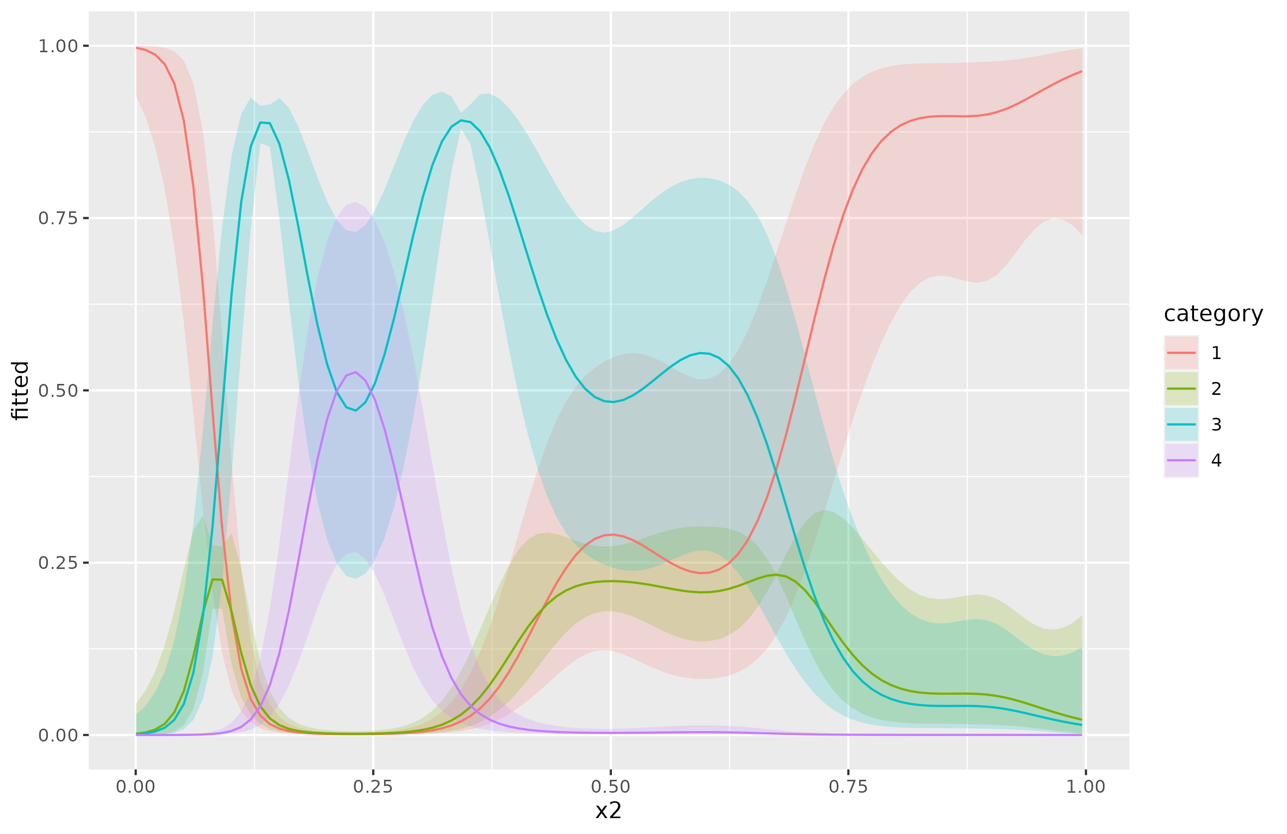
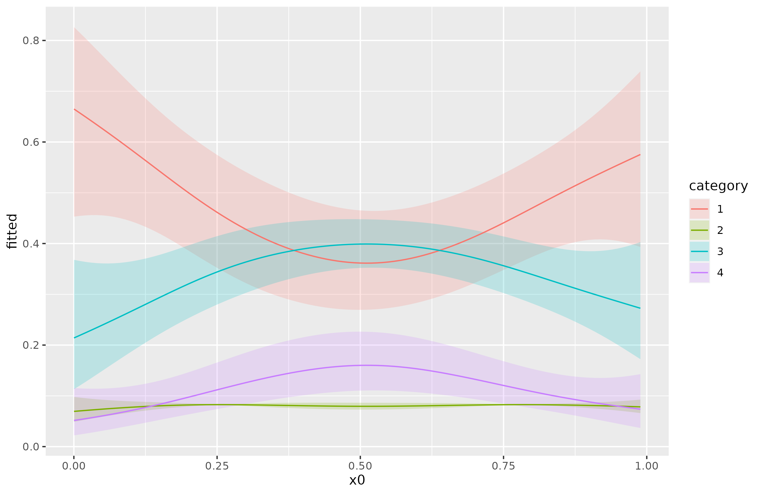
The model doesn't define 1 smooth line on the response scale, it defines $c$ of them, one per category. if you want a plot like the left-hand panel in your question, you should be plotting the predicted probabilities for each class.
Here's how I do this in {gratia} with it's fitted_values():
# data slice over x0 - repeated
ds1 <- data_slice(m1, x0 = evenly(x0, n = 100))
fv1 <- fitted_values(m1, data = ds1)

fv1 |>
  ggplot(aes(x = x0, y = fitted, group = category)) +
  geom_ribbon(aes(ymin = lower, ymax = upper, fill = category),
              alpha = 0.2) +
  geom_line(aes(colour = category))

Note I think I might be scrambling the categories as right now, this plot doesn't make sense when we look at the linear predictor plot from above.
Or for a model with multiple smooths, where we need to specify values for the other smooths that we wish to condition on when predicting:
m2 <- gam(y ~ s(x0) + s(x1) + s(x2) + s(x3),
  family = ocat(R = n_categories), data = df, method = "REML")

# data slice over x2(!) holding other covariates at median values
ds2 <- data_slice(m2, x2 = evenly(x2, n = 100))
fv2 <- fitted_values(m2, data = ds2)

fv2 |>
  ggplot(aes(x = x2, y = fitted, group = category)) +
  geom_ribbon(aes(ymin = lower, ymax = upper, fill = category),
              alpha = 0.2) +
  geom_line(aes(colour = category))
