1
$\begingroup$

I have a number of distance matrices that are related to different elements. Each of these matrices represent a specific distance between these elements. I want to perform a Self-Organizing Map technique on them in R and get a Heatmap or something that could present the data well. But the SOM function does not create something that is easily interpretable. I made a sample matrix of 1000*1000 and the SOM function of kohonen library gave me this: (which I am not sure what does it mean) a busy cat The code that I used for R is:
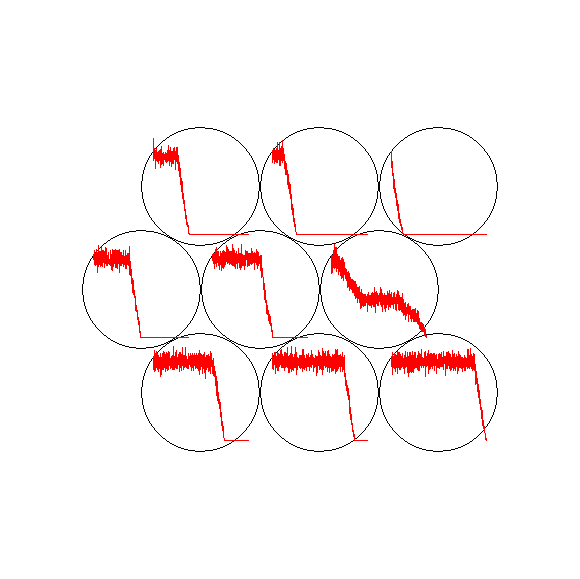
test.som <- som( data = mat , grid = somgrid(3,3,"hexagonal"))

and then I plotted the test.som. My question is how do I include more that one distance matrix in the SOM function and is there a better visualization for this data? P.S. The distance matrices are not Euclidean matrices, they should be calculated one by one.

$\endgroup$
4
  • $\begingroup$ You have a number of distance matrices, but is your question how represent just one of these at a time, or all of them together? In other words, is this a question about visualising a single distance matrix, which you can then apply to each one at a time, or of multiple matrices? $\endgroup$ Commented Jul 22, 2013 at 6:31
  • $\begingroup$ @PeterEllis I have to cluster all of these elements together. I believe that combining all of these matrices together and performing a clustering analysis would be more acceptable than clustering each of matrices and then combining them. Although I am open to suggestions. $\endgroup$
    – POD
    Commented Jul 22, 2013 at 6:44
  • $\begingroup$ ok, but in your example graphic you have just one distance matrix, right? It seems to me a first step is to get that visualisation right (or at a minimum, understood and interpretable) and then deal with the more complex situation. If you could fix and understand this graphic, the solution might be as simple as faceting it in the style of ggplot or lattice. Alternatively if this graphic is on completely the wrong basis (your data doesn't seem to resemble that in the example in the help file) you may need a new start. $\endgroup$ Commented Jul 22, 2013 at 6:54
  • $\begingroup$ @PeterEllis I only clustered one of the matrices. I have made a random case and feed it to the SOM, but the results are stupid!! they seem like wave lines to me. Can I get a heatmap or something that reperesent the data better? $\endgroup$
    – POD
    Commented Jul 22, 2013 at 7:50

1 Answer 1

1
$\begingroup$

The result is not stupid. You asked SOM to work with continuous variables (distances) and there are lots of them (1000 vars). The line traces are the "spectra"; which, in this case, means the position on the horizontal axis indicates the "variable" (in your case each column of the distance matrix) and the height in y indicates the importance of those "variables" for each of the prototypes that represents each grid in your SOM.

What you are doing doesn't make much sense, at least for som(). It should be provided with the raw data that you used to generate the distance matrix.

I suppose there could be some use for this - what the plotted results are trying to show you graphically is that the upper-left cell contains those observations that are very dissimilar to the first few observations (rows) in the matrix.

I'm not convinced it is useful however. I would have proceeded, if using SOM, by providing the raw data.

If you just want a heatmap, try

heatmap(mat)
$\endgroup$

Your Answer

By clicking “Post Your Answer”, you agree to our terms of service and acknowledge you have read our privacy policy.

Not the answer you're looking for? Browse other questions tagged or ask your own question.