7
$\begingroup$

I used BIRCH and HAC to do clustering on my data.

I want to now what type of information I can include in reports that my users can generate to get more insights on the clusters. I would have to dumb down the statistical terms and represent them as much as possible visually in these reports for my users.

$\endgroup$
1
  • 1
    $\begingroup$ Do you mean you want to highlight cluster structure (i.e., its characteristics features wrt. external subject-specific variables, for example) or to provide insight into how clusters differ between the two methods? $\endgroup$
    – chl
    Commented Mar 3, 2011 at 12:36

3 Answers 3

9
$\begingroup$

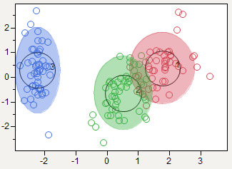
I like a 2D plot that shows the clusters and the actual data points so readers can get an idea of the quality of the clustering. If there are more than two factors, you can put the principle components on the axes, as in my example:

JMP K-Means 2D Cluster Report

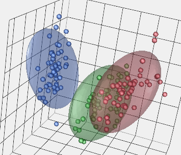
The equivalent 3D plots are only good if the viewer can interact with it get a sense of depth and obscured pieces. Here's a 3D example with the same data.

JMP K-Means 3D Cluster Report

$\endgroup$
4
  • $\begingroup$ +1 for most of your post. I do think 3D plots can be very effective, as I described in stats.stackexchange.com/questions/6763/… Clustered boxplots are an alternative worth looking at, too, as are Ralph's bubble plots. $\endgroup$
    – rolando2
    Commented Mar 3, 2011 at 17:01
  • 1
    $\begingroup$ Thanks. Yes, 3D can be effective, but often it's not obvious what the 3D representation is when it's been projected onto a static 2D computer screen, unless you can grab it and rotate it yourself. I have a 3D version of the above plot, which I'll add to the answer. $\endgroup$
    – xan
    Commented Mar 3, 2011 at 17:57
  • $\begingroup$ Kindly, in the 2D plot. What are the x and Y axis referring to? $\endgroup$
    – goro
    Commented Feb 12, 2016 at 12:21
  • 1
    $\begingroup$ @goro They are the dimensions of greatest variation, found from a principle components analysis (PCA). X is PC1 and Y is PC2. $\endgroup$
    – xan
    Commented Feb 12, 2016 at 15:44
3
$\begingroup$

Bubble Charts are a good visual device that you can use to represent your cluster. Pick your 4 most important variables and plot each cluster using the x and y axis, size and color of bubble to represent the 4 factors. If you have many variables you can perform a principal components analysis first to reduce them to 4 factors.

http://www.google.com/images?um=1&hl=en&rlz=1I7GGLD_en&tbs=isch:1&aq=f&aqi=g6&oq=&q=bubble%20chart

-Ralph Winters

$\endgroup$
2
$\begingroup$

The best method I have found for a non-technical audience is to present a table or plots of the centroids of each cluster along with a description of that cluster. It helps in the business world (not sure your domain) to give a name to each cluster describing it's principle characteristics. Example when clustering customers would be: "Long time loyals" for that cluster that is generally comprised of long tenured customers.

$\endgroup$

Your Answer

By clicking “Post Your Answer”, you agree to our terms of service and acknowledge you have read our privacy policy.