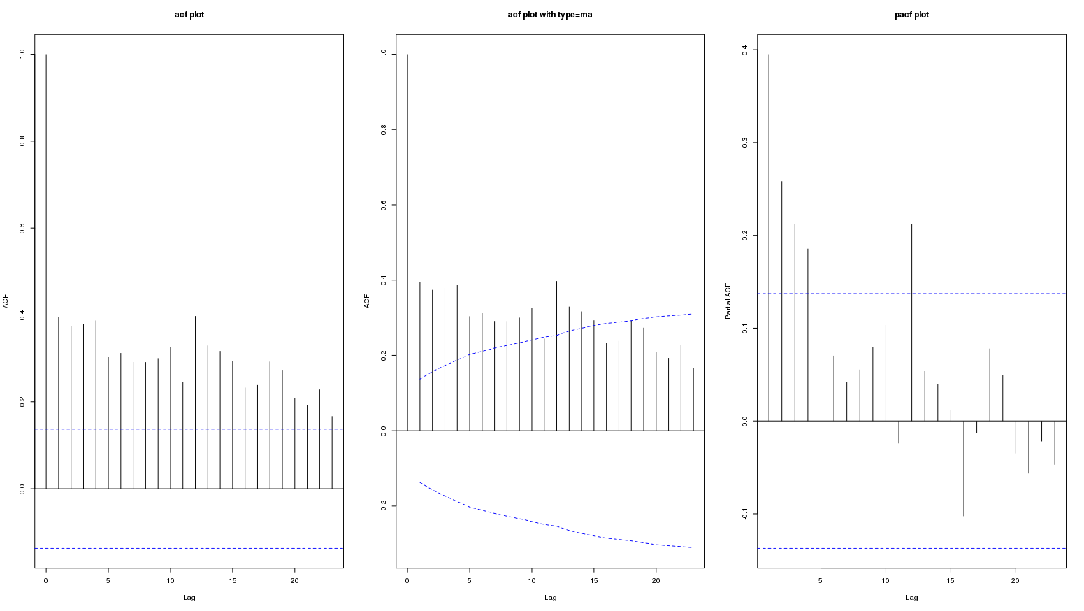
Following are acf and pacf plots of a monthly data series. The second plot is acf with ci.type='ma':

The persistence of high values in acf plot probably represent a long term positive trend. The question is if this represent seasonal variation?
I tried to see different sites on this topic but I am not sure if these plots show seasonality.
Help interpreting ACF- and PACF-plots
Understanding the blue dotted lines in an ACF from R
Autocorrelation and partial autocorrelation interpretation
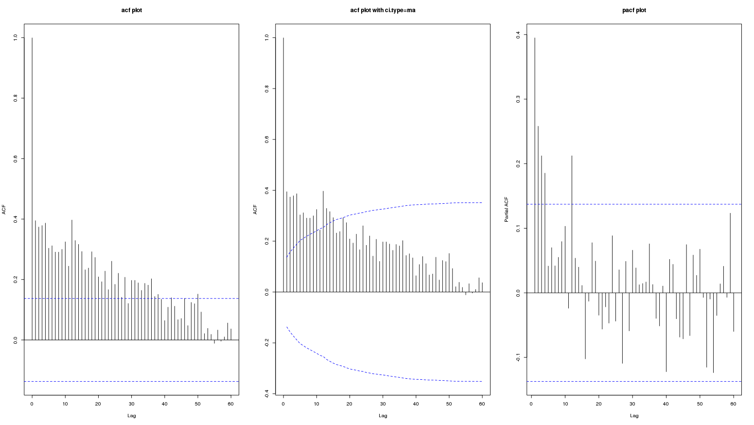
Edit: following is the graph for lag upto 60:

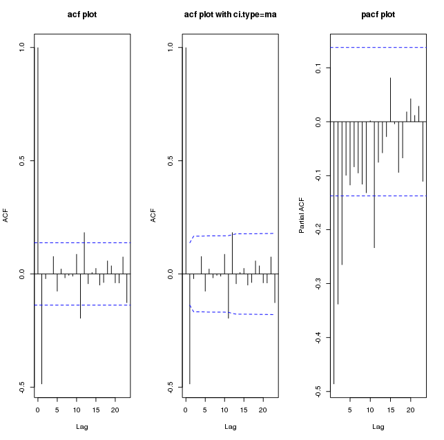
Following are plots of diff(my_series):

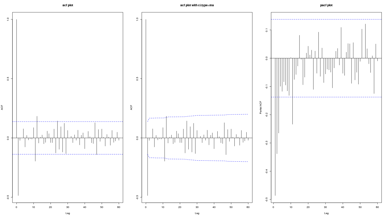
And upto lag 60:

Edit: This data is from: Is this an appropriate method to test for seasonal effects in suicide count data? Here the contributors did not consider acf and pacf plot of original or differenced series worth mentioning (so it must not be important). Only acf/pacf plots of residuals was referred to in a couple of places.
