In the documentation for the R compositions package, and in reference to ternary diagrams, it is stated that:
However the ternary diagram can only display compositions of three parts. In case of more parts a scatter plot matrix like matrix of ternary diagrams is displayed which selects two components against some sort of margin of the rest:
plot(acomp(sa.lognormals5))
plot(acomp(sa.lognormals5), margin = "rcomp")
plot(acomp(sa.lognormals5), margin = "Cu")
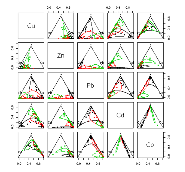
In here the author presents this (tantalizingly beautiful) plot:
... without the code!
So I've been trying to get this, and understand it, with just partial results (including an uproar of closing requests and downvotes from the folks at the sister programming community - see, I thought it was code-specific...).
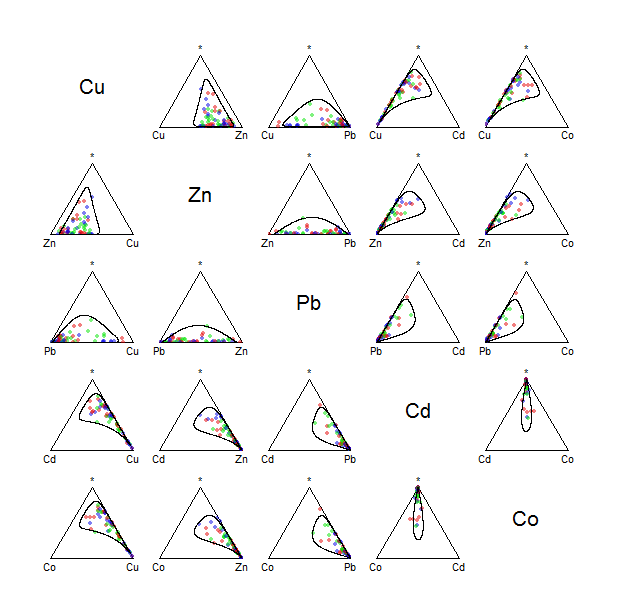
For instance I am having trouble calling the multiple plots with the ellipses around points of the same variable. Here is my code and the output:
library(compositions)
data(SimulatedAmounts)
colors = c(rgb(red=0, green=0, blue=.9, alpha=0.5),
           rgb(red=0, green=.9, blue=0, alpha=0.5),
           rgb(red=0.9, green=0, blue=0, alpha=0.5))
tt = acomp(sa.lognormals5)
plot(tt, col = rgb(0,0,0,0), bg = colors, pch = 21, cex = .8)
ellipses(mean(tt), var(tt), r = 2)
I know... the aesthetics are improved... more airy, and the palette... But only one lasso per ternary diagram... Sad!
So, hoping for a better reception, I'm resorting to my favorite community to ask:
1. What is the asterisk (*) default marginal in the plot output that makes the ternary diagrams at all possible with only two variables?
2. If you happen to know how to produce the 3 ellipses per plot... as bonus...


