In the documentation for the R compositions package, and in reference to ternary diagrams, it is stated that:
However the ternary diagram can only display compositions of three parts. In case of more parts a scatter plot matrix like matrix of ternary diagrams is displayed which selects two components against some sort of margin of the rest:
plot(acomp(sa.lognormals5))
plot(acomp(sa.lognormals5), margin = "rcomp")
plot(acomp(sa.lognormals5), margin = "Cu")
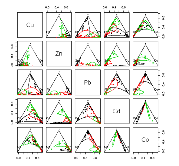
In here the author presents this (tantalizingly beautiful) plot:
... without the code!
The "mystery" asterisk $(*)$ is clarified in this passage in Analyzing Compositional Data with R By K. Gerald van den Boogaart, Raimon Tolosana-Delgado
margin = "acomp" (or nothing, the default) computes the third part as the geometric of all components except those two from row and colum (symbolized with "*").
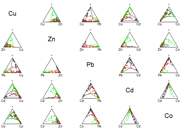
I've been trying to reproduce this matrix scatter plots, and understand them. For instance, I had trouble calling the multiple plots with the curves around points of the grouping categorical variable:
> levels(sa.groups.area)
[1] "Lower"  "Middle" "Upper"
Finally, though, I got a practically identical plot with this code:
library(compositions)
data(SimulatedAmounts)
colors = c(rgb(red=0.3, green=0.3,  blue=.3, alpha=1),
           rgb(red=0.9, green=0,    blue=0, alpha=0.7),
           rgb(red=0,   green=.9,   blue=0, alpha=0.7))

tt = acomp(sa.groups5)
plot(tt, col = rgb(0,0,0,0), bg = colors[as.numeric(sa.groups.area)], pch = 21, cex = .9)

strata = sa.groups5.area
temp = cbind(sa.groups5,strata)

a = acomp(temp[temp[ , 6] == 1, ][,1:5])
ellipses(mean(a), var(a), r = 2, col = colors[1])

b = acomp(temp[temp[ , 6] == 2, ][,1:5])
ellipses(mean(b), var(b), r = 2, col = colors[2])

c = acomp(temp[temp[ , 6] == 3, ][,1:5])
ellipses(mean(c), var(c), r = 2, col = colors[3])
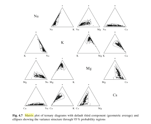
In Analyzing Compositional Data with R By K. Gerald van den Boogaart, Raimon Tolosana-Delgado the following plot can be found with a telling caption:
and (minimally) paraphrasing:
in which the radius of the lines contain 95% of the probability assuming a normal model for the composition and a known variance.
The code of this latter plot likely includes the lines:
r = sqrt(qchisq(p = .095, df = 2))
mm = mean(tt)
vr = var(tt)
ellipses(mean = mm, var = vr, r = r)
... and ?ellipses describes the r parameter in the function ellipses as:
r a scaling of the half-diameters
The remaining question is:
What are the meaning and mathematics behind these deformed circles (lines or curves) generated by the function
ellipses?


