In the documentation for the R compositions package, and in reference to ternary diagrams, it is stated that:
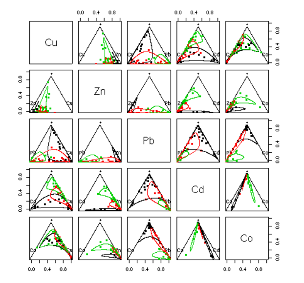
However the ternary diagram can only display compositions of three parts. In case of more parts a scatter plot matrix like matrix of ternary diagrams is displayed which selects two components against some sort of margin of the rest:
plot(acomp(sa.lognormals5))
plot(acomp(sa.lognormals5), margin = "rcomp")
plot(acomp(sa.lognormals5), margin = "Cu")
In here the author presents this (tantalizingly beautiful) plot:
... without the code!
The "mystery" asterisk $(*)$ is clarified in this passage in Analyzing Compositional Data with R By K. Gerald van den Boogaart, Raimon Tolosana-Delgado
margin = "acomp" (or nothing, the default) computes the third part as the geometric of all components except those two from row and colum (symbolized with "*").
The question is:
What are the meaning and mathematics behind these deformed circles (lines or curves) generated by the function
ellipses, and how to generate them?

