In general, when you have ordinal categories, it is appropriate to use the median to describe the center of the sample, and thus estimate the center of the population of opinions. However, the definitions given in the questionnaire for your categories are numerical. So you might use the mean, if you are careful about its interpretation.
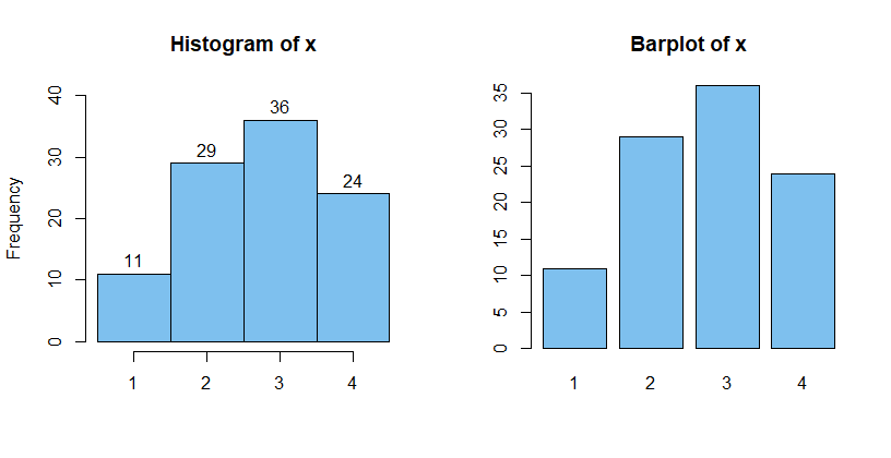
Ordinal categorical variable. For example, suppose you have data from 100 students (simulated in R) as follows, using numbers "1", "2", "3", "4" to label the four categories. We have frequencies $f_1 = 11, f_2= 29, f_3= 36, f_4= 24.$
It would be wrong to say that the mean of this sample is $2.73$ because the labels "1", "2", "3", "4" are labels for categories, not actual numbers.
But it would be OK to say that the median category is "3" because less than half of the 100 responses were below "3" and less than half above. The labels are not actual numbers but they do have order---higher labels indicate more classroom discussion.
In terms of percentages, many of my (simulated) students seem to be saying that the percentage of classes with discussion was somewhere in the interval $[51, 75],$ with some saying less discussion and some saying more.
set.seed(531)
x = sample(1:4, 100, rep=T, p=c(.2,.3,.3,.2))
tabulate(x)
[1] 11 29 36 24
mean(x)
[1] 2.73   # nonsense mean of ordinal labels
median(x)
[1] 3      # median of ordinal labels
Graphical displays. Treating labels as if they were numbers, you can use R to make a "histogram" of the data (left panel below). I have 'fudged' bin boundaries to be $.5, 1.5, 2.5, 3.5, 4.5$ in order to make the R procedure hist work properly.
A more natural graphical display for categorical data is the barplot (right panel below). [In your question, I don't know what you mean by "bars between the options." I did not encounter these in my graphical displays.]
par(mfrow=c(1,2))
  hist(x, br=cut, ylim=c(0, 40), label=T, col="skyblue2", xlab="")
  barplot(table(x), col="skyblue2", main="Barplot of x")
par(mfrow=c(1,1))
Viewing categories as intervals for grouped numerical data. If we look at how categories are defined on the questionnaire, we have four intervals, on a percentage scale: 0-25, 26-50, 51-75 and 76-100. The centers of these four intervals are $m_1 = 12.5, m_2 = 38,$ $m_3 = 63,
m_4 = 88,$ on the percentage scale. Taking the data to give frequencies of intervals with these
midpoints, we can approximate the mean using a standard formula:
$$\bar X \approx \frac{\sum_{i=1}^k f_im_i}{\sum_{i=1}^k f_i},$$ where $k$ is the number of intervals. So the 'grouped data' formula gives $\bar X \approx 56.2.$
If we suppose all of the 100 students could give their own individual numerical recollections of the percentage of classes with discussion, this would be the approximate average of their responses.
f = c(11, 29, 36, 24)
m = c(12.5, 38, 63, 88)
sum(f*m)/sum(f)
[1] 56.195
As a practical matter, I wonder how accurately students can guess the true percentage of classes with discussion when they just have to choose one of four intervals on a questionnaire. It seems best to take this approximate mean as saying "Roughly, 56% of classes (slightly more than half) had discussion," rather than as saying, "Exactly 56.195% of classes had discussion."

