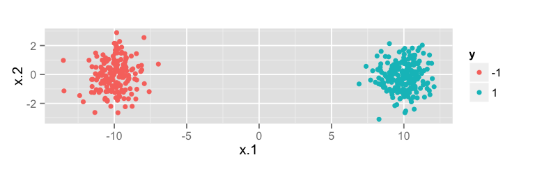
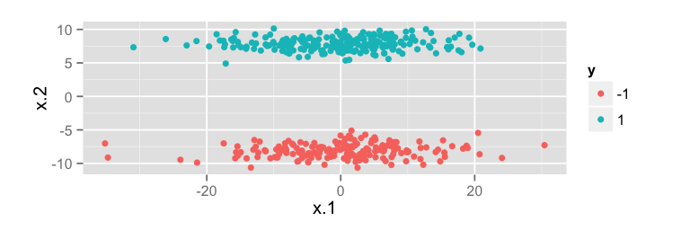
There is a simple geometric explanation. Try the following example in R and recall that the first principal component maximizes variance.
library(ggplot2)

n <- 400
z <- matrix(rnorm(n * 2), nrow = n, ncol = 2)
y <- sample(c(-1,1), size = n, replace = TRUE)

# PCA helps
df.good <- data.frame(
    y = as.factor(y),
    x = z + tcrossprod(y, c(10, 0))
)
qplot(x.1, x.2, data = df.good, color = y) + coord_equal()

# PCA hurts
df.bad <- data.frame(
    y = as.factor(y),
    x = z %*% diag(c(10, 1), 2, 2) + tcrossprod(y, c(0, 8))
)
qplot(x.1, x.2, data = df.bad, color = y) + coord_equal()
PCA Helps

The direction of maximal variance is horizontal, and the classes are separated horizontally.
PCA Hurts

The direction of maximal variance is horizontal, but the classes are separated vertically
