3
$\begingroup$

I have seen this type of plots in a couple of articles, like this one (Figure 3): enter image description here
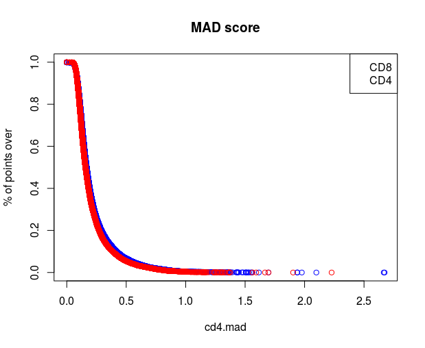
The x axis is a value, and the y axis is the proportion of values above or below that value. (y axes label is incorrect as pointed in the comments)

What can be the interpretations of this plots? What are they useful for?

I can just think that the main reason is to compare the distributions of two samples or experiments, but in one article it seem to be used for filtering the values above or below the inflection point.

$\endgroup$
2
  • 1
    $\begingroup$ It's the sample (empirical) survivor function $\endgroup$
    – Glen_b
    Commented Jun 30, 2016 at 15:59
  • 1
    $\begingroup$ Note that the vertical axis shows proportion (or probability); the label % is incorrect. $\endgroup$
    – Nick Cox
    Commented Jun 30, 2016 at 17:45

1 Answer 1

2
$\begingroup$

Such a plot is a plot of the empirical distribution function in reverse. (Edit: as Glen_b mentions, a reversed CDF is called a survival function.) Hence it is one way to visually represent a whole variable. I think dot plots and density plots are better choices for this purpose.

$\endgroup$
1
  • 1
    $\begingroup$ Such plots are utterly standard in survival analysis. One key feature is that they require no arbitrary decisions on bin width, bin origin, kernel type or kernel width. $\endgroup$
    – Nick Cox
    Commented Jun 30, 2016 at 17:46

Your Answer

By clicking “Post Your Answer”, you agree to our terms of service and acknowledge you have read our privacy policy.

Not the answer you're looking for? Browse other questions tagged or ask your own question.