I strongly recommend quantile plots, here in the first instance plots of the data in rank order (observed quantiles) against cumulative probability. Many quantile plots are explicitly plots against some other quantiles, and may be called quantile-quantile plots or QQ-plots. A plot against cumulative probability is not an exception as values on the horizontal axis are quantiles of a uniform (rectangular, flat) distribution on the unit interval. Although quantiles in statistics are often (usually!) particular summary points, such as quartiles, deciles, or percentiles, in this graphical context quantiles are simply all the ordered data, or equivalently the order statistics of several values on some variable.
Quantile plots entail no arbitrary decisions about binning or smoothing and represent the data as they arrive, showing level, spread, and shape (including outliers, gaps, spikes and other detail as it occurs). A convention to show data points as points is just that; for a large sample the pattern of points often blurs into a line, which is genuine whenever it is observed and not a limitation. Line representations are also possible.
Here I echo a previous answer and use the Iris data from E.S. Anderson, as made famous by R.A. Fisher.
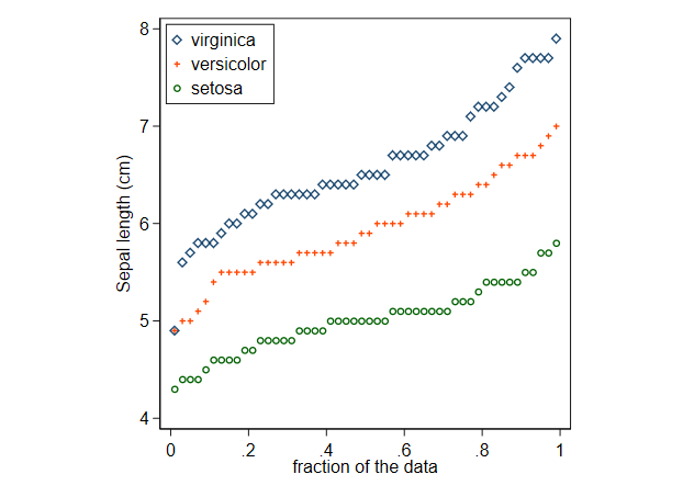
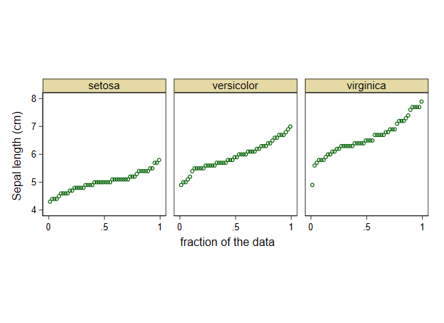
The choice between superimposed and juxtaposed should always be one of which works best. In this example superimposition works well, although with other datasets it can lead to tangled spaghetti. The picture for these data is mostly that the subsets differ in level, with loosely similar spread and shape, although extra detail can be spotted (e.g. conventional rounding in reporting results and a mild outlier on virginica).
Quantile plots can be smoothed, although this seems rarely done. Conversely, it can be argued that reducing data to a smaller set of say letter values preserves most of the information on each distribution. This paper is a gateway to older literature. Although named by John W. Tukey, letter values go back at least to Francis Galton.
Quantile plots can even be used for categorical data so long as they have numerical codes. The stepped nature of the resulting plots is realistic and if the point is to compare the same variable for different subsets, or for similar variables, the essential is just that values are coded consistently, which is hardly demanding.
A default quantile plot just plots observed values against an associated cumulative probability, in this context often called a plotting position.
In many cases it will be a good idea to plot against some theoretical quantile, essentially the result of pushing a plotting position through a quantile function. This is natural if a particular distribution is in mind, or at least a particular distribution may serve as a reference distribution. As many authors have noted, taking a normal (Gaussian) distribution as reference may be quite widely convenient. It is exactly the right thing to do if comparisons with normal distributions are of direct concern, and not absurd even if they aren't. The use of normal distribution as reference no more implies that data are, or should be, normally distributed, than does comparing shapes with circles or spheres, comparing altitudes with sea level, or comparing temperatures with the freezing point of water. If some other family of distributions is a better reference, say gamma or exponential, then use it. Similarly, monotonic transformations of the observed quantiles (e.g. a logarithmic scale) may often help, the essential being that such transformations preserve order.
The same information in principle is encoded in (empirical (cumulative)) distribution function plots (ECDF plots) or in survival function plots. In practice, quantile plots can make it easier to look at tail behaviour closely, while ECDF plots perhaps make comparisons of middles of distributions slightly easier. The choice often comes down to tribal habits as much as personal taste or comparisons of which work best in some sense.
This is, or should be, very easy in R, and indeed in your favourite statistical or mathematical software if different. If not, you need a new favourite.



hist; smoothed densities,density; QQ-plotsqqplot; stem-and-leaf plots (a bit ancient)stem. In addition, the Kolmogorov-Smirnov test might be a good complementks.test. $\endgroup$