23
$\begingroup$

I'm interested in learning how to develop a geographic approximation of some kind of epicenter based on the data from the John Snow Cholera outbreak. What statistical modeling could be used to solve such a problem without prior knowledge of where wells are located.

As a general problem, you would have available the time, location of known points, and the walking path of the observer. The method I'm looking for would use these three things to estimate the epicenter of the "outbreak".

$\endgroup$
3
  • 2
    $\begingroup$ Kriging models are used for geographic prediction. That might be a place to start. To include time information you'll need to go one step further and use a spatio-temporal model (I haven't used these though). $\endgroup$ Commented Aug 11, 2017 at 19:39
  • 4
    $\begingroup$ @Great Kriging would be tough to apply here: it's not intended for estimating extrema, nor is it well-suited to the geometry of walking time along roads that is relevant, nor is it well adapted to controlling for important covariates such as population density or numbers of workers in buildings. $\endgroup$
    – whuber
    Commented Aug 11, 2017 at 20:58
  • $\begingroup$ This R package may be of interest github.com/lindbrook/cholera. $\endgroup$ Commented Aug 21, 2017 at 16:29

2 Answers 2

25
+50
$\begingroup$

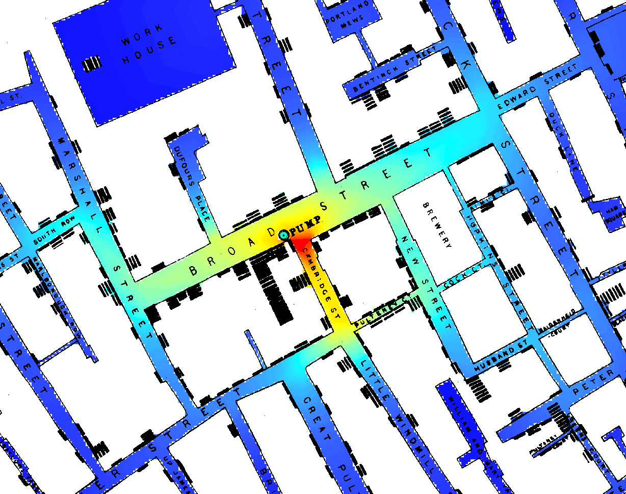
Not to give a complete or authoritative answer, but just to stimulate ideas, I will report on a quick analysis I made for a lab exercise in a spatial stats course I was teaching ten years ago. The purpose was to see what effect an accurate accounting of likely travel pathways (on foot), compared to using Euclidean distances, would have on a relatively simple exploratory method: a kernel density estimate. Where would the peak (or peaks) of the density be relative to the pump whose handle Snow removed?

Using a fairly high-resolution raster representation (2946 rows by 3160 columns) of Snow's map (properly georeferenced), I digitized each of the hundreds of little black coffins shown on the map (finding 558 of them at 309 addresses), assigning each to the edge of the street corresponding to its address, and summarizing by address into a count at each location.

Dot map of input data

After some image processing to identify the streets and alleyways, I conducted a simple Gaussian diffusion limited to those areas (using repeated focal means in a GIS). This is the KDE.

The result speaks for itself--it scarcely even needs a legend to explain it. (The map shows many other pumps, but they all lie outside this view, which focuses on the areas of highest density.)

Snow's map showing density with color.

$\endgroup$
8
  • $\begingroup$ WOW. So to summarize; 1. linearize the traveling path, 2. perform smoothing in one dimension, 3. extend the smoothing in two dimensions, 4. average the kde across path trips? $\endgroup$
    – cylondude
    Commented Aug 11, 2017 at 21:56
  • 1
    $\begingroup$ The smoothing was performed in 2D, but restricted to the region shown in color. There are other ways to do it, too, akin to your description. However, there's no need to average over "path trips" (whatever those might be). This map is interesting in part because it shares properties of both one- and two-dimensional geometries. $\endgroup$
    – whuber
    Commented Aug 11, 2017 at 22:58
  • $\begingroup$ For each point A on the streets, count the number of steps to each other point B among the address locations. Plug that number of steps into a Gaussian density, and multiply that value by the number of deaths at B. Add up all those products (i.e. over all address points B) to get the kernel density at point A. Do that for all points A on the streets. That's the density we're seeing at each point on the map. Yes? $\endgroup$
    – Hatshepsut
    Commented Aug 15, 2017 at 19:25
  • 2
    $\begingroup$ @Hatshepsut That's a reasonable proposal. What I did was just a tiny bit different. For each point $B$ on the address (source) locations, I created a Gaussian function of walking distance from that point as you describe, and then I normalized it so its integral on the street grid would be equal to the count at that source location. In this fashion each death was "spread" into its neighborhood. These values were summed over all source locations to produce the image shown. $\endgroup$
    – whuber
    Commented Aug 15, 2017 at 19:56
  • 2
    $\begingroup$ @Hat It is not the case that the Gaussian has a unit integral when it is constrained to the roads and walkways! It is thereby truncated and has to be renormalized. $\endgroup$
    – whuber
    Commented Aug 15, 2017 at 21:17
19
+100
$\begingroup$

In [1,§3.2], David Freedman suggests an essentially negative answer to your question. That is, no (mere) statistical model or algorithm could solve John Snow's problem. Snow's problem was to develop a critical argument supporting his theory that cholera is a water-borne infectious disease, against the prevailing miasma theory of his day. (Chapter 3 in [1], titled “Statistical Models and Shoe Leather,” is also available in previously published form [2] here.)

In these few short pages [1, pp.47–53], much of which is an extended quote from John Snow himself, Freedman argues that "what Snow actually did in 1853–54 is even more interesting than the fable [of the Broad Street Pump]." As far as marshalling statistical evidence (other preliminaries such as index case identification, etc., are discussed besides), Snow exploited natural variation to effect a truly remarkable quasi-experiment.

It turns out that at an earlier time, there was a vigorous competition among water supply companies in London, and this resulted in spatial mixing of the water supply that was (in Snow's words) "of the most intimate kind."

The pipes of each Company go down all the streets, and into nearly all the courts and alleys. A few houses are supplied by one Company and a few by the other, according to the decision of the owner or occupier at that time when the Water Companies were in active competition.

...

As there is no difference whatever in the houses or the people receiving the supply of the two Water Companies, or in any of the physical conditions with which they are surrounded, it is obvious that no experiment could have been devised which would more thoroughly test the effect of water supply on the progress of cholera than this, which circumstances placed ready made before the observer.

—John Snow

Another critically important bit of 'natural variation' John Snow exploited in this quasi-experiment was that one water company had its water intake on the Thames downstream of sewage discharges, whereas the other had a few years before relocated its intake upstream. I'll let you guess which was which from John Snow's data table!

                     | Number of | Cholera | Deaths per
Company              |    houses |  deaths | 10,000 houses
----------------------------------------------------------
Southwark & Vauxhall |    40,046 |    1263 |    315
Lambeth              |    26,107 |      98 |     37
Rest of London       |   256,423 |    1422 |     59

As Freedman notes witheringly,

As a piece of statistical technology, [the above table] is by no means remarkable. But the story it tells is very persuasive. The force of the argument results from the clarity of the prior reasoning, the bringing together of many different lines of evidence, and the amount of shoe leather Snow was willing to use to get the data. [1, p.51]

One further point of natural variation exploited by Snow occurred in the time dimension: the abovementioned water intake relocation occurred between two epidemics, enabling Snow to compare the same company's water with and without added sewage. (Thanks to Philip B. Stark, one author of [1], for this info via Twitter. See this online lecture of his.)


This matter also provides an instructive study in the contrast between deductivism and inductivism, as discussed in this answer.

  1. Freedman D, Collier D, Sekhon JS, Stark PB. Statistical Models and Causal Inference: A Dialogue with the Social Sciences. Cambridge ; New York: Cambridge University Press; 2010.

  2. Freedman DA. Statistical Models and Shoe Leather. Sociological Methodology. 1991;21:291-313. doi:10.2307/270939. Full text

$\endgroup$
6
  • 2
    $\begingroup$ +1 for pointing out that merely identifying an epicenter would have been insufficient to solve "John Snow's problem" as stated. Miasma theory was one such prevailing theory at the time as David points out. To falsify the miasma theory, one would have to show that geographic rates do not raise with proximity to the river. A modern approach to this problem might have utilized kriging. $\endgroup$
    – AdamO
    Commented Aug 23, 2017 at 17:49
  • $\begingroup$ Thanks, @AdamO; but I wonder how Kriging would accomodate the "intimate" spatial mixing in this case, which almost seems an affront to the continuity necessary for applying an interpolation technique (such as I understand Kriging to be). $\endgroup$ Commented Aug 23, 2017 at 17:56
  • $\begingroup$ Perhaps I misunderstood Snow's words: my presumption was that the "intimate mixing [of water pumps' supply sources]" referred to a nearly perfect block design where, stratified by distance from the river, each concentric stratum of city blocks had at least a few pumps of suppliers A, B, C... this has to do with supporting the theory that the contaminated water causes cholera. Kriging would reject the miasma hypothesis by showing that proximity to the river is not associated with increased cholera incidence. This is supported by people watering at the pumps: miasma doesn't travel by pipe. $\endgroup$
    – AdamO
    Commented Aug 23, 2017 at 18:07
  • 5
    $\begingroup$ @AdamO Actually, William Farr had studied mortality rates for cholera (from 1849) and compared them to elevation above the Thames River. The correspondence between those variables is striking and almost perfectly in line with predictions from the miasma theory. See Langmuir AD. Bacteriological Review 25, 174, 1961 (bmj.com/content/323/7327/1469.full#B4). This article notes that even by the time of Dr. Snow's death in 1858, his theory was "not accepted in official circles." $\endgroup$
    – whuber
    Commented Aug 24, 2017 at 14:22
  • 2
    $\begingroup$ Many thanks for those references, @whuber. By way of curation, I note the Langmuir article is open access. $\endgroup$ Commented Aug 24, 2017 at 14:47

Your Answer

By clicking “Post Your Answer”, you agree to our terms of service and acknowledge you have read our privacy policy.

Not the answer you're looking for? Browse other questions tagged or ask your own question.