UPD2 question for @scherm
Although you mention looking at the plot, but I was going for a more automated solution..
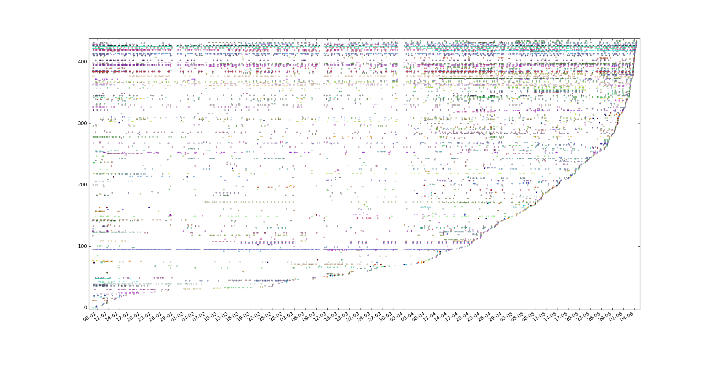
I have 22 tracked variables that has >100 values, 57 with >50 values, 192 with >10 values and a bunch more with less values over 5 months period that the data was gathered, 12500 manually logged events/measurements total, 435 variables total(some of them were abandoned of course, but only a small part).
Not a lot of data for statistical analysis but a lot in terms of logging it manually.
Thanks for pointing me towards filling missing data package. Also co-occurence is definitely present. In the end I was looking to build a tool where I'll be able to pick a tracked variable and it will tell me something like picked_event is correlated with event1(n1 steps delay), event2(n2 steps delay), event3(n3 steps delay). But your answer fits my asked question.
I have a question about making a scatter plot thing, I've added a scatter plot of all data points (not interval splitting, each strand is a variable) to my post above, it's sorted by last time tracker was used. I'm not sure what I can gather from it and I'm not sure how would I plot average values for each of the variables as you describe, could you elaborate more on your 3rd point?


