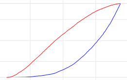
The plot below shows the ecdf of the p-values from to different statistics, let us identify the blue graph as vector x and the red graph as vector y. Now I execute a ks.test for x and y compare these vectors with a uni distribution in a small range.
ks.test(x[x<=0.2],function(x){punif(x,0.01,0.2)},alternative = "two.sided")
ks.test(y[y<=0.2],function(x){punif(x,0.01,0.2)},alternative = "two.sided")
Now I get better values for the blue-line but it's obviously that the red-line should be a better fit. If I watch closer to the values in x and y I get only 26 values in x and more than 1500 in y. So I think, the reason why the ks.test gives a better p-value for the blue-line depends on the low number of relevant points in x.
The values in x and y comes from a simulation. Schould I increase the number of simulated experiments?

