1
$\begingroup$

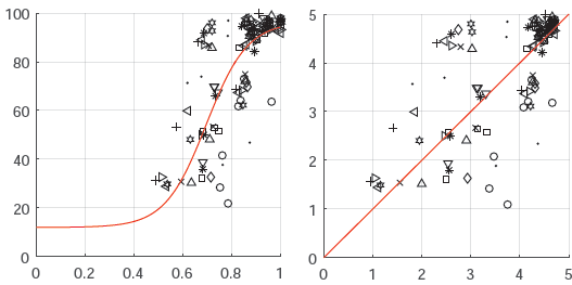
There's a figure attached to this post. The left hand side of the figure shows a graph with a polynomial fitting the data. The right hand side shows the same data plotted on a different scale but using the polynomial fit. I'm looking for the name of this process or graph produced by fitting a polynomial. I'm not referring to polyfitting or polynomial regression but rather the process or type of figure where the curved line has now become the central straight line and the values are scaled around it.

Secondary question that doesn't need to be answered: how can you produce these scaled values given a polynomial? (I plan to figure this out once I know the name of that kind of graph.)

enter image description here

$\endgroup$
4
  • $\begingroup$ The polynomial is alarming. How do it know to be flat for values of the argument less than about 0.4? I doubt you'll get that kind of behaviour without fitting an implausibly high degree of polynomial. $\endgroup$
    – Nick Cox
    Commented Jun 27, 2016 at 13:26
  • $\begingroup$ I know. It certainly seems wrong to me. Still, it's a good illustration of the type of figure I'm referring to. $\endgroup$ Commented Jun 27, 2016 at 15:40
  • $\begingroup$ On your question, I don't understand the correspondence between your scales. Where does 0-5 come from? Why is the red line as high as any observed value on the right when that's not true on your left? Without knowing how the graphs relate to one another, it is hard to suggest terminology for a mysterious process. $\endgroup$
    – Nick Cox
    Commented Jun 27, 2016 at 15:44
  • $\begingroup$ Where does this come from? What makes you call it a polynomial? $\endgroup$
    – Glen_b
    Commented Jun 29, 2016 at 22:56

1 Answer 1

2
$\begingroup$

This looks like an "actual vs. predicted" plot, with the x axis showing the predicted value and the y axis showing the actual value.

I think your "polynomial" in really a logistic regression fit, but the idea is the same no matter what the model is.

To construct the actual vs predicted plot given input data A, response data B and a model function f, you plot the line y=x and the points {x,y} = {f(A),B}.

More details:

$\endgroup$

Your Answer

By clicking “Post Your Answer”, you agree to our terms of service and acknowledge you have read our privacy policy.

Not the answer you're looking for? Browse other questions tagged or ask your own question.