66
$\begingroup$

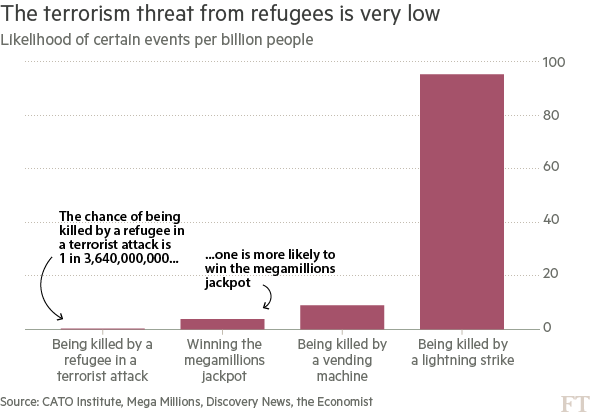
I'm seeing this image passed around a lot.

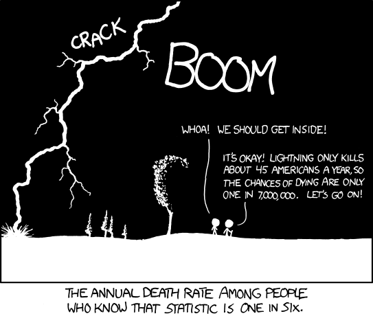
I have a gut-feeling that the information provided this way is somehow incomplete or even erroneous, but I'm not well versed enough in statistics to respond. It makes me think of this xkcd comic, that even with solid historical data, certain situations can change how things can be predicted.

What it do baby

Is this chart as presented useful for accurately showing what the threat level from refugees is? Is there necessary statistical context that makes this chart more or less useful?


Note: Try to keep it in layman's terms :)

$\endgroup$
24
  • 21
    $\begingroup$ This is a good question, but note that such questions cannot logically be answered without specifying useful for what? $\endgroup$ Commented Feb 1, 2017 at 17:13
  • 31
    $\begingroup$ This chart is propaganda. To see why, try to answer questions such as "over what period of time?" and "chance to whom?" and "to which population do these statistics apply?" Then consider just how specific some of the events are (which is one way to make the chances seem extraordinarily small). Why not "chance of being killed by a white teenager from the American south who lives with a single mother?" $\endgroup$
    – whuber
    Commented Feb 1, 2017 at 19:28
  • 13
    $\begingroup$ That plot seems to show unconditional probabilities. Presumably, the probability of being killed by a refugee in a terrorist attack would be even lower for an astronaut while in space. By the same token however, an astronaut in space is also at lower risk of lightning strikes, though probably at higher risk of being killed by vending machines, if the definition of vending machine is expanded to automatic food delivery systems generally. $\endgroup$ Commented Feb 1, 2017 at 19:55
  • 36
    $\begingroup$ Though it makes a compelling case for legislation banning lightning. Particularly lightning from countries with whom our president doesn't have business dealings. $\endgroup$ Commented Feb 1, 2017 at 19:57
  • 7
    $\begingroup$ The chart is useful for questioning whether certain particular actions to avert terrorist strikes are likely to have the intended effect. The popular view seems to be that a lot of terrorism is caused by refugees, so america should keep them out. The chart, crude though it is, suggests that however much a refugee ban makes people feel good, it isn't dealing with a real historic problem in the USA. $\endgroup$
    – matt_black
    Commented Feb 1, 2017 at 22:42

9 Answers 9

79
$\begingroup$

Imagine your job is to forecast the number of Americans that will die from various causes next year.

A reasonable place to start your analysis might be the National Vital Statistics Data final death data for 2014. The assumption is that 2017 might look roughly like 2014. You'll find that approximately 2,626,000 Americans died in 2014:

  • 614,000 died of heart disease.
  • 592,000 died of cancer.
  • 147,000 from respiratory disease.
  • 136,000 from accidents.
  • ...
  • 42,773 from suicide.
  • 42,032 from accidental poisoning (subset of accidents category).
  • 15,809 from homicide.
  • 0 from terrorism under the CDC, NCHS classification.
  • 18 from terrorism using a broader definition (University of Maryland Global Terrorism Datbase) See link for definitions.

    • By my quick count, 0 of the perpetrators of these 2014 attacks were born outside the United States.

    • Note that anecdote is not the same as data, but I've assembled links to the underlying news stories here: 1, 2, 3, 4, 5, 6, 7, 8, and 9.

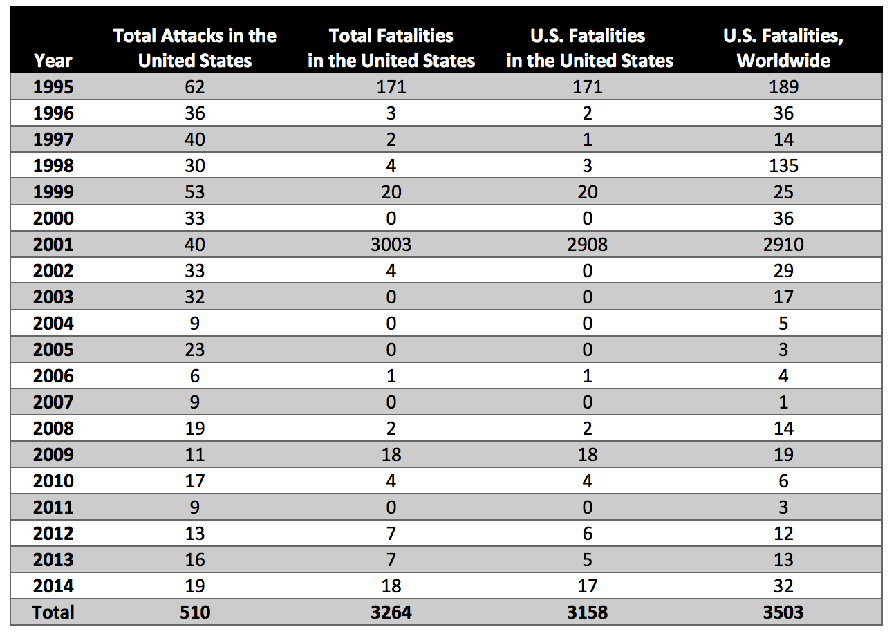
Terrorist incidents in the U.S. are quite rare, so estimating off a single year is going to be problematic. Looking at the time-series, what you see is that the vast majority of U.S. terrorism fatalities came during the 9/11 attacks (See this report from the National Consortium for the Study of Terrorism and Responses to Terrorism.) I've copied their Figure 1 below:

 National Consortium for the Study of Terrorism and Responses to Terrorism, "American Deaths in Terrorist Attacks Fact Sheet"

Immediately you see that you have an outlier, rare events problem. A single outlier is driving the overall number. If you're trying to forecast deaths from terrorism, there are numerous issues:

  • What counts as terrorism?
    • Terrorism can be defined broadly or narrowly.
  • Is the process stationary? If we take a time-series average, what are we estimating?
  • Are conditions changing? What does a forecast conditional on current conditions look like?
  • If the vast majority of deaths come from a single outlier, how do you reasonably model that?
    • We can get more data in a sense by looking more broadly at other countries and going back further in time but then there are questions as to whether any of those patterns apply in today's world.

IMHO, the FT graphic picked an overly narrow definition (the 9/11 attacks don't show up in the graphic because the attackers weren't refugees). There are legitimate issues with the chart, but the FT's broader point is correct that terrorism in the U.S. is quite rare. Your chance of being killed by a foreign born terrorist in the United States is close to zero.

Life expectancy in the U.S. is about 78.7 years. What has moved life expectancy numbers down in the past has been events like the 1918 Spanish flu pandemic or WWII. Additional risks to life expectancy now might include obesity and opioid abuse.

If you're trying to create a detailed estimate of terrorism risk, there are huge statistical issues, but to understand the big picture requires not so much statistics as understanding orders of magnitude and basic quantitative literacy.

A more reasonable concern... (perhaps veering off topic)

Looking back at history, the way huge numbers of people get killed is through disease, genocide, and war. A more reasonable concern might be that some rare, terrorist event triggers something catastrophic (eg. how the assassination of Archduke Ferdinand help set off WWI.) Or one could worry about nuclear weapons in the hands of someone crazy.

Thinking about extremely rare but catastrophic events is incredibly difficult. It's a multidisciplinary pursuit and goes far outside of statistics.

Perhaps the only statistical point here is that it's hard to estimate the probability and effects of some event which hasn't happened? (Except to say that it can't be that common or it would have happened already.)

$\endgroup$
9
  • 7
    $\begingroup$ Very informative, as always (+1). In the same vein of background information I like to keep in mind that the site of the very first confirmed outbreak of the so-called Spanish flu was at Camp Funston, within Fort Riley in Kansas, USA. :-) $\endgroup$ Commented Feb 1, 2017 at 19:45
  • 3
    $\begingroup$ @AntoniParellada I remember the very first time I saw a long time series of period life expectancy (eg. something like this) and how I was shocked by the 1918 flu pandemic. $\endgroup$ Commented Feb 1, 2017 at 20:03
  • 48
    $\begingroup$ Bruce Schneier was interviewed after 9/11, and asked what he recommended New Yorkers do to keep safe in light of the attack. His answer? "Seatbelts." $\endgroup$
    – Cort Ammon
    Commented Feb 2, 2017 at 4:14
  • 4
    $\begingroup$ Just because you mentioned some statistics about 0 of the perpetrators of any 2014 attack being born outside US: According to the Cato Institute between 1975 and 2015 there have been zero (0) killed Americans in terrorist attacks on US soil by the seven countries that were recently suspended from entering US because of national security reasons. $\endgroup$
    – usεr11852
    Commented Feb 4, 2017 at 2:42
  • 1
    $\begingroup$ @CortAmmon Reference to Schneier response here $\endgroup$
    – r_31415
    Commented Feb 5, 2017 at 20:27
26
$\begingroup$

Problems with the chart:

  1. It implies refugees are more likely than other groups of people to commit acts of terror. Why not frame it in terms of migrants in general? And what about acts of terror committed by a country's own citizens?

  2. How does it define a refugee?

  3. The comparative groups don't make sense. If we are going to look a killings why not compare it to other forms of killing, such as those killed in gun related crimes. Comparing to lightening strikes (which man cannot control) or lottery wins (which would be a positive rather than negative thing) makes little sense.

  4. It's very very generalised. Expressed as a percent per billion people would suggest these probabilities are universally true.

  5. The information would be more useful if we were to make use of other prior knowledge such as geographic location, comparative volume of people moving cross country over a period in time, the level of integration of refugees at the destination country, etc. Conditional probabilities are often more useful than general probabilities. (For example, we know that there are more lightening strikes in Venezuela, where the Catatumbo River meets Lake Maracaibo (the most lightening struck place on earth apparently) than in the south of the United Kingdom.) As the question states, relying on general probabilities unconditionally can cause the wrong conclusion to be made:

enter image description here

$\endgroup$
6
  • 2
    $\begingroup$ Who uses percent per million? $\endgroup$
    – Carsten S
    Commented Feb 1, 2017 at 20:36
  • $\begingroup$ You miss the wood for the trees and apparently conclude the opposite of what the chart says. Refugees are more likely than other groups to commit acts of terror WTF? The public perception of the popular Trump ban on refugees says that: the chart says exactly the opposite. The primary purpose of the chart is to put those numbers in perspective. The comparison groups are there only to emphasise how small the refugee terrorism risk is not to make meaningful comparisons. $\endgroup$
    – matt_black
    Commented Feb 3, 2017 at 8:17
  • 1
    $\begingroup$ The chart says nothing about whether refugees are more or less likely than anyone else to commit acts of terror because the comparative groups are poorly chosen. But the implication of choosing them as a group in the chart would suggest there there is some relationship between refugees and terror acts. Where is the evidence for this assumption? Better a chart comparing different groups of people. $\endgroup$ Commented Feb 3, 2017 at 9:00
  • 1
    $\begingroup$ Why not frame it in terms of migrants in general - because that would make data look bad. Even people who equivocally would be called refugees (like asylum seekers) who have committed acts of terror are excluded from it. $\endgroup$ Commented Feb 3, 2017 at 15:00
  • 4
    $\begingroup$ @MorganBall You ignore the context. The chart was produced in response to a policy specifically targeting refugees and claiming they were a terror risk. It isn't trying to make a general point about which groups are risky just the very specific point that, historically, refugees were not a notable source of terrorism in the USA. $\endgroup$
    – matt_black
    Commented Feb 5, 2017 at 10:11
19
$\begingroup$

This chart is definitely incomplete without at least the following information: how "terrorism" is defined for these purposes, how "refugee" is defined for these purposes, what time-span this data covers, and which people are included--for instance, does the lighting strike data include people who live in nursing homes and never go outside?

Presumably (hopefully) at least some of these points are covered in articles and essays that employ this graphic. I'm also going to assume that the specific numbers are reasonably accurate.

Is this chart as presented useful for accurately showing what the threat level from refugees is?

Not really. It tells us what the threat level from refugee terrorism is compared to the threat level from lighting strikes and vending machine accidents. If we were trying to decide whether to devote resources to restricting refugee entry or to overhauling vending machine design, that could be useful information. But we're not.

Is there necessary statistical context that makes this chart more or less useful?

Absolutely! People are using this chart to argue that "refugees aren't dangerous," but that's misleading, because no one really cares whether refugees are dangerous compared to lightning.

Well, you could argue that because other things are more dangerous, we should all just stop worrying about less-dangerous things at all. Don't worry about refugees, because lightning is more dangerous! Don't worry about plane crashes, because cars are more dangerous! Personally, I think this a stupid argument, especially since sometimes less-likely bad outcomes are easier to prevent, and so in some sense more worth spending resources to prevent. Also, I haven't seen anyone making this argument about refugees or terrorism lately.

If we're going to talk about whether it makes sense to restrict refugee entry to prevent terrorism, there are more useful things to look at. (Whether there's reliable data available for them is a different question, but even if there isn't, that's no excuse to look at useless data and pretend it's useful.)

  1. We could compare the likelihood of being killed in a terrorist attack by a refugee with the likelihood of being killed in a terrorist attack by a non-refugee.

    • If, hypothetically, the first is four times as likely, that would mean that 4/5 of terrorism deaths are caused by refugees, so if we banned refugees it could cut terrorism deaths by 80%, other factors held constant. What other ramifications such a policy would have, and whether it would be a good idea on balance, has nothing to do with lightning deaths.
    • Maybe the second is 1000 times as likely. I have no idea, and I can't tell from this chart.
    • Side note: overall deaths from terrorism in the US are pretty low to begin with, so we might not be able to draw strong inferences.
  2. We could also compare the likelihood of a refugee being a terrorist with the likelihood of a non-refugee immigrant being a terrorist, or with the likelihood of a non-immigrant being a terrorist.

  3. We could look at how any of these probabilities has changed over time, and how they're related to other factors, such as global conflict levels, which might give us some clues as to how much whatever past data this chart is based on is actually likely to tell us about the future.

  4. We could look at the likelihood of being killed by a refugee, a vending machine, or a lightning strike controlled for how frequently you interact with each of them.

    • Because people have way more contact with vending machines than with refugees, there could be more deaths from vending machines even if a random refugee/non-refugee interaction was more likely to result in death than a random vending machine/person interaction. Is it more likely? I have no idea, and I can't tell from this chart.
    • Even saying that "refugees are less dangerous than vending machines" based on this chart is misleading. It's like saying that a rare disease is "less dangerous" than a common disease without looking at which disease has a higher fatality rate. It's true for a certain meaning of "less dangerous," but it's totally irrelevant to discussions of what preventative measures to take against a potential outbreak of the usually rare disease.

Pretty much any of these statistics would be more useful for discussing and making policy about refugee entry than the ones in this chart, but they'd probably be less cute and shareable.

$\endgroup$
7
  • 3
    $\begingroup$ (+1) Welcome to our site! Thank you for taking the time and effort to craft this thoughtful reply. $\endgroup$
    – whuber
    Commented Feb 2, 2017 at 21:18
  • 4
    $\begingroup$ Like many others you miss the key point of the chart. The only point of the comparison stats is to show the risk of other things people don't worry about. This puts the risk from refugees in context. Public perception says they are a big risk and, therefore, banning them is a good policy. By collating the actual numbers (if the number are right) the chart demolishes the pubic perception. There is no way to go from the number presented to a high risk no matter how many of the adjustments you suggest should be made. $\endgroup$
    – matt_black
    Commented Feb 3, 2017 at 8:23
  • 1
    $\begingroup$ @matt_black I addressed the point about "other things people don't worry about" (in the spoiler text). I'm not saying any of these other data would show a high risk. I'm saying they'd be a more useful context. $\endgroup$ Commented Feb 3, 2017 at 13:27
  • 1
    $\begingroup$ You are NOT safe anywhere outdoors in a lightning storm. $\endgroup$
    – Carl
    Commented Mar 17, 2017 at 1:00
  • 1
    $\begingroup$ @matt_black "This puts the risk from refugees in context." It takes it completely out of context; policy can't influence the number of lightning strikes or other random events. It can influence what populations with a significant proportion of people sympathetic to violent ideologies move to where. $\endgroup$
    – G. Bach
    Commented Aug 5, 2017 at 21:43
9
$\begingroup$

On the Frequency of Severe Terrorist Events

This paper attempts to model the likelihood that a terrorist attack of any given severity occurs. The conclusion is that terrorist events follow a power law distribution, which is 'tail heavy'. What this means is that most terrorism related deaths happen due to things like 9/11, which appear to be outliers, or, as the author puts it

The regular scaling in the upper tails of these distributions immediately demonstrates that events orders of magnitude larger than the average event size are not outliers, but are instead in concordance with a global pattern in the frequency statistics of terrorist attacks.

The chart likely does not account for this - it seems to be simply counting the number of people who have been killed by terrorists. By way of analogy, the vast majority of earthquake deaths in California came from a single quake in 1906. Modelling the threat posed by earthquakes has to take into account the risk of really big earthquakes, modelling the risk of terrorism has to take into account the risk of really big terrorism.

$\endgroup$
2
  • 2
    $\begingroup$ Fair point. But the chart was making a narrower point about terrorism caused by refugees. Historically almost no-one has died at the hands of refugees in terror attacks but both americans and legal immigrants have committed large acts of terror. Maybe the risk of large attacks by refugees is something to worry about but there is no historic basis for targeting them specifically as the public seems to assume. $\endgroup$
    – matt_black
    Commented Feb 5, 2017 at 10:32
  • 2
    $\begingroup$ I think that's right that the legitimate concern is about events in the extreme tail. Consistent with that, academia, the Bush administration and the Obama administration did significant work on understanding and reducing threats from biologic and nuclear weapons. In contrast, it's hard to see any significant nexus between Trump's attempted travel ban and the tail risk one is concerned about. $\endgroup$ Commented Feb 21, 2017 at 5:05
6
$\begingroup$

This chart is only useful if you want to know the probability of being killed by a person with a particular status in particular circumstances over the time of the study, which is 35 years (1975 to 2015). What it's useless for includes:

  • knowing how probable it is to be killed by a refugee. Cases of homicide performed by refugees which didn't count as terrorism (example) are excluded.
  • knowing how probable it is to die in a terrorist attack by what you think are refugees. For example, Boston Marathon bombing is excluded from this study, because the terrorists applied for asylum (so they stopped being refugees and became asylum seekers) before the attack.

Also, results of this study cannot be easily extrapolated into the future, especially considering that the study is designed to to advocate the policy of letting more refugees in. A study in relative numbers (normalized by the total number of refugees) would make more sense.

As a side note, the danger of vending machines is only real when you try to steal food or money from them. So far all vending machine related deaths involved people rocking or tilting these machines.

$\endgroup$
11
  • 1
    $\begingroup$ +1 Just to add a related thought--the study purposely distorts the data by including a time period when terrorist attacks were virtually unknown. And for a long time, there wasn't much regulation on vending machine safety. The composite statistics from that 40 yr period are nothing like the relative risks today. $\endgroup$
    – fixer1234
    Commented Feb 4, 2017 at 10:30
  • $\begingroup$ The chart isn't advocating a policy of letting more refugees in. It is criticising a policy that argues none should be let in (compared to the 10s of thousands typical in recent US history) and the claimed rationale for that policy that refugees are a big terrorist risk. $\endgroup$
    – matt_black
    Commented Feb 5, 2017 at 10:17
  • $\begingroup$ @fixer1234 The chart doesn't purposely distort data by including a a time period where terrorism was low. That period includes the two larges terror attacks in US history, the first of which was committed by a right wing US native; the other of which was committed by arabs who were not refugees (or indeed from any of the specifically banned countries on Trump's list). $\endgroup$
    – matt_black
    Commented Feb 5, 2017 at 10:23
  • $\begingroup$ @matt_black, 1) Nobody has suggested stopping all refugees, or even stopping refugees forever from specific countries. 2) The underlying logic is not to react after the fact to where previous terrorists have come from. It is to be proactive about countries that are a future threat because they are hotbeds of terrorism and we don't have the means to vet people. 3) If the point of the chart is risk from refugee terrorist attack, non-refugee attack is a competing risk, not part of the same risk. So going back to before there is relevant comparative data is a distortion. $\endgroup$
    – fixer1234
    Commented Feb 5, 2017 at 18:58
  • 1
    $\begingroup$ @matt_black As far as I can see asylum seeker and refugees are synonymous - they are to me as well, yet people killed in Boston Marathon bombing are not included in the data above. $\endgroup$ Commented Feb 6, 2017 at 11:58
5
$\begingroup$

Your intuition is correct that the statistic above doesn't tell the whole story. Yes, past refugee terrorist behaviour isn't necessarily a good indicator of future refugee terrorist behaviour, but that isn't the problem. The problem is that even one or two large-scale terrorist attacks would be awful, and statistics isn't appropriate for dealing with such small numbers of things. If we only consider mass murder refugee terror attacks, there have never been any, at least not in the past fifteen years. The figure in the graph comes from the fact there were 3 murders by refugees in terror attacks since 1975[1], which is essentially zero compared to the terror attacks everyone is scared of. But on the basis of statistics alone, that data isn't enough to rule out the chance that a huge terror attack is coming. We can't say "the threat is low", because statistics can't tell us if the threat is low enough.

First off, imagine how upset you would be if a refugee committed a horrible terrorist attack that killed 100 innocent people. Now imagine how much you would hate the idea of a 20% chance of that happening. We would want to put safegaurds into the refugee program. Now, let's look at the statistics. How can you prove the probability of a refugee terrorist attack next year is less than 20%? Well, the probability of a terrorist attack went up after the awful September 11 attacks, so you could say there haven't been any attacks in 15 years. If the probability of an attack was 20%, then no attacks in 15 years would be pretty unlikely (p=3.5%). So we can be pretty certain the chance of a major terrorist attack next year by a refugee is less than 20%. But now suppose we're interested in the chance of a terrorist attack within five years. Then we only have three independent samples since 2001 (2001-2006, 2006-2011, and 2011-2016). We can't say with any confidence that the probability of a terrorist attack within five years is less than 20%. And a 20% risk within 5 years of a tragic terrorist attack by a refugee where 100 people die is awful, and would certainly justify changes to the refugee program if it were real. And even a 1% chance of a major attack in ten years would be afwul. In terms of probability, one devastating attack the same size as the September 11 attacks, done by refugees, would turn the chance per year of being killed in a terror attack by refugees into 1 in 1 million, which is almost as bad as the odds of being killed by lightning.

But notice that the logic I used there could be applied to anything where the odds of it changed 15 years ago. We failed to disprove a threat of something happening, based only off the fact that it happened zero times. It would be equally hard to say the threat of a terrorist attack by a refugee named Tim was less than 20% in five years, but it wouldn't make sense to stop all refugees named Tim. It would be equally hard to prove the threat of a terrorist attack by an astronaut was less than 20% in five years, but you don't see anyone saying we should stop letting astronauts in. Statistics is the wrong approach to dealing with extreme events. If you want to be certain that something won't happen once in ten years, you can't use past experience to convince yourself of the fact. That's why it's wrong to say the graph shows the terrorism threat from refugees is very low. If we're only using history and a single major incident is unacceptable, then no threat is very low.

$\endgroup$
5
  • 5
    $\begingroup$ even a 1% chance of an attack in ten years would be awful, that's an expectation value of one casualty per ten years, in a country with 300 million+ inhabitants, which is very close to the statistic described by the Financial Times. And what do you mean by your final sentence the no threat is very low? $\endgroup$
    – gerrit
    Commented Feb 2, 2017 at 12:12
  • $\begingroup$ A 1% chance of an attack that kills one person is close to the FT statistic. But terrorist attacks can kill terrible, large numbers of people. In the case of a terrorist attack as bad as the September 11 attacks, the statistic would be 1 in 30 million, which is an order of magnitude better than your odds of winning Mega Millions according to Wikipedia. I am updating the post to clarify. $\endgroup$
    – user7868
    Commented Feb 3, 2017 at 5:59
  • $\begingroup$ It is updated now. $\endgroup$
    – user7868
    Commented Feb 3, 2017 at 6:08
  • $\begingroup$ "statistics isn't appropriate for dealing with such small numbers of things". I am sorry, but I have to contest that. :) A branch of statistics is called extreme value theory. I don't know much about that subject, but they do focus on such small, rare events. Quantile statistics are also useful for these kind of things. $\endgroup$ Commented Feb 8, 2017 at 9:32
  • $\begingroup$ :) I don't know much about extreme value theory either, but the Wikipedia page focuses on things where there are lots of samples. For example, it talks about floods, and once-in-100-year floods. To get information about once-in-100-year floods, they look not only at the worst flood in each 100 year period, but at (for example) annual maximum floods. For well-understood processes like floods, you can get useful information that way. But for terrorism, we can't. Matthew Gunn's fatalities in the US data for years other than 2001 doesn't tell us anything useful about 2001. $\endgroup$
    – user7868
    Commented Feb 13, 2017 at 6:43
2
$\begingroup$

Others have answered in a great deal more detail than I will, but here's my 2 cents:

The details just don't matter. You can quibble about the definition of terrorism, migrants, etc, but when the deaths due to terrorism are multiple orders of magnitude smaller than other causes of death, the difference between the broad and narrow definitions is vanishingly insignificant.

The situation gets even more absurd when you look at it as an economic optimisation problem: given finite resources, how many lives can you save per dollar by investing in terrorism prevention versus, say, heart disease prevention? Again, you can quibble over the details of this-or-that spending, but given that the USA's spending in response to 9/11 is trillions of dollars, you don't need to be too precise about it to draw your conclusions as to whether or not it's a comparatively good investment (hint: it's not).

Your chances of being killed by terrorists are effectively zero. In this situation, competing models of the process are more or less interchangeably useless because the anomalies are so proportionally large.

$\endgroup$
9
  • 2
    $\begingroup$ The fundamental (and obviously incorrect) premise behind this response is that the US spending had no effect. It's like concluding that incorporating engineering safety tolerances into bridge designs is worthless because bridges don't collapse. (I'm not necessarily disagreeing with your conclusions, but only with how you appear to misinterpret these data in order to reach those conclusions.) $\endgroup$
    – whuber
    Commented Feb 3, 2017 at 0:22
  • 2
    $\begingroup$ @whuber I agree that you want to avoid statements on cost-benefit analysis of existing measures because you don't know what the counterfactual is. You perhaps could question the benefit of additional measures by questioning what the additional measures would be reducing (we appear to be fairly effective in disrupting plots...). $\endgroup$ Commented Feb 3, 2017 at 6:45
  • 1
    $\begingroup$ That's not quite right; you have an average vs. marginal issue. Let $\alpha$ be the statistical value of life. Let $f(x)$ be the number of expected deaths when $x$ is spent (where $f$ is a decreasing convex function). Cost-benefit analysis would lead you to solve $\max_x -\alpha f(x) - x$. Solution is $-\alpha f'(x) = 1$. The average benefit of your spending is $\frac{\alpha \left(f(0) - f(x) \right) }{x}$, the marginal benefit is $-\alpha f'(x)$. And your notion of the average $\frac{f(x)}{x}$ is something else too. $\frac{f(x)}{x}$ small doesn't necessarily imply that $-\alpha f'(x)<1$ $\endgroup$ Commented Feb 3, 2017 at 13:18
  • 1
    $\begingroup$ Your assumption that $f$ is a decreasing function is wrong. And to the extent that your analysis is correct, $\frac{f(x)}{x}$ small doesn't necessarily imply anything, but nevertheless it is quite apparent to me that, in the world in which we actually live, the US spends epic sums of money on the premise of fighting terrorism, to negligible or even negative benefit. Do you honestly think we couldn't save more lives by diverting some of those dollars to healthcare? $\endgroup$
    – spraff
    Commented Feb 3, 2017 at 14:29
  • 1
    $\begingroup$ We should not worry disproportionately about terrorism, and we shouldn't invest disproportionate resources into it. What we're doing at the moment is ridiculous. You may have a brilliant grasp of statistics, probably better than mine, but you're displaying a lack of understanding about how security works. $\endgroup$
    – spraff
    Commented Feb 3, 2017 at 17:51
2
$\begingroup$

My feeling is that the question is about blatant political activism, is not evidence of anything relevant, and my concern is that such things should not be posted on this site. The chart shown, is propaganda, and propaganda is problematic no matter who is presenting it for whatever reason.

Does that mean that we should neglect the application of statistics to a problem because the propaganda problem itself is absurd? Actually the need is striking. Lies, damned lies, and statistics is a historical reference to this, and underlines the magician's trick of misdirection to use our own preconceptions to fool us en mass.

Can we find any stable data concerning terrorism? Sure, but we really have no motive for doing so. For example, let's take the number of US attacks from @MatthewGunn's Table, above and plot that.
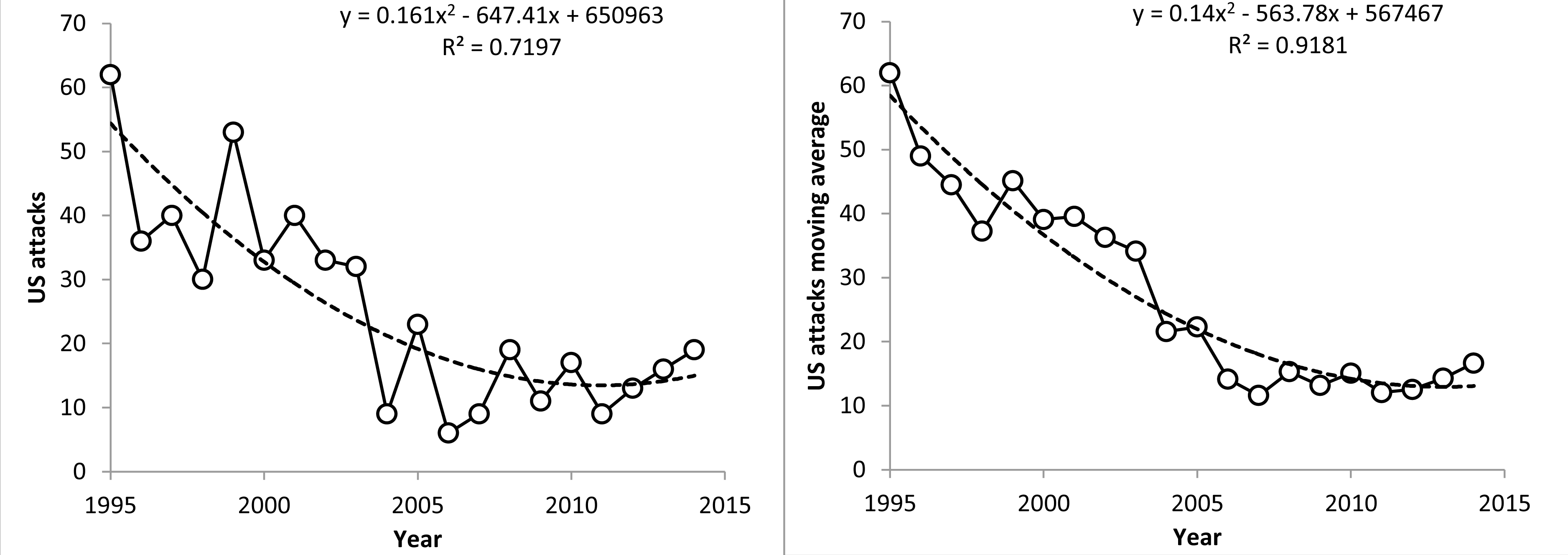
enter image description here

As the data is noisy, I also did a running average of the $\mu_{i}=\frac{1}{2}X_i+\frac{1}{2}\mu_{i-1}$ type. In either case, it is clear that the number of terrorist attacks has decreased significantly since 1995, and that this improvement appears bottomed out circa 2006-13.

To continue our magic trick, let us point out that a lack of terrorist attacks means a lack of deaths from attacks no matter how noisy the relationship is between attacks and deaths caused. True enough, we do not know that the ratio between terrorist attacks and deaths caused is an absolute constant in time, but any such hypothetical effect would arguably enhance the result. So, is it worth investing billions or trillions in anti-terrorism just to reduce the number of terrorist attacks from five dozen to one dozen per annum? Obviously not.

Terrorism is obviously not the problem. The terrorism magic trick relies on public perception enter image description here
fostered by obviously irresponsible journalism delivered on behalf of the desperately unscrupulous for digestion by the gullible. Then our "saviors" in the alt-left media, e.g., CNN, who are the progenitors of terrorism mythology$^1$ to begin with (e.g., CNN's three weeks of continuous loop narrative and images of 9/11 Twin Towers' attack), seek to debunk the nonsense they created by dangling it in front of our eyes, while pulling a fast one with finger counting. Indeed, this propaganda was so effective that it resulted in decreased Freedom of the Press. Relations between the media and the Bush administration sharply deteriorated after the president used the pretext of “national security” to regard as suspicious any journalist who questioned his “war on terrorism.”

Now, does the OP question mean anything? The propaganda sheet cited by the OP is being used in a discussion of vetting of refugees, not terrorism. Of the 1000 current, ongoing FBI investigations for terrorism more than 300 (nearly 1/3rd) are being conducted on refugees Source: Jeff Sessions, US Attorney General. The FBI in 2016 had 12,486 FTEs working in Counterterrorism/Counterintelligence. The FBI is one of 13,160 law enforcement agencies that, as of October 31, 2015, collectively employed 635,781 sworn officers. As counterintelligence is not counterterrorism per se, and assuming proportionality one would expect at least 15,000 active investigations of refugees for crimes other than terrorism. Now, considering that in 2015 in the US there were an estimated 1,197,704 violent crimes, and 7,993,631 property crimes, 15,000 active investigations of refugees hardly seems exaggerated. However, refugees from certain lawless societies bring bad habits with them, like sticking a knife in you for recreational purposes, which although not terrorism per se, is also a useless distinction, and, when prison records are examined (e.g., in New York State, which unusually, actually keeps records) there are indeed some ethnic groups who have a high prison population. Overall, 10.0% of NY prisoners are foreign born. Of this 10% or 5,510 detainees, the largest subgroup, 2,697, reported birth in one of the island nations in the Caribbean basin, and not the Near East (only 78 detainees).

So, yes, there is a problem with crime among the foreign born if the NY figures are any indication. Of the 19,889,657 NY State residents, Caribbean born are 1,080,000 or 5.4%. Among the prison detainees, 4.9% are Caribbean Islanders. So, it would seem they are just as bad as everyone else. Now concerning the Near East born, for all 50 states in the US, if I had to take a guess, I would guess ($H0$) that they are like everybody else with respect to crime, until proven otherwise. Moreover, the general lack of data for refugee crime and the lack of general definitive finding leaves us to speculate that the question itself is not statistically interesting. That is, we might be far better off looking at the socioeconomic status of a potential refugee; education, wealth, social status, occupation, etc. than at the isolated fact that someone is, or is not, a refugee.

There are certain neighborhoods I would not walk around in at all, and others in which I would feel safe. This has less to do with which ethnic groups are in those neighborhoods than how much crime occurs in them. Preventing criminals from entering the US seems reasonable, no matter where they are from.

That we find ourselves in a ridiculous political environment is a call to arms for searching out the truth. The only solution to that problem is to analyze well enough to find the truth and present that, and statistics is a very powerful tool for doing just that. Only the truth has enough economic leverage to be worth investing in. However, models have to achieve significance to be worth talking about, and, it is up to us to do exactly that.

In conclusion, I see no evidence in the OP's chart that merits consideration. It is off-topic for the topic it pretends to discuss, and is meaningless.

Then what is the problem, and what is its solution? The problem: Islamic culture regards Western culture as degenerate, and Western culture regards Islamic culture as a relic of the 12$^{\text{th}}$ century. The solution: 1) Islamic culture should be allowed a minimally acceptable degree of cultural isolation from the West. 2) Western culture should be allowed its own beliefs, which are sometimes difficult to accept even for those in the West, and without interference from Islamic culture.

While many people are busy misunderstanding President Trump, I note that he wishes to end the problematic practice of promoting Western values as if they were an international "gold" standard. Indeed, this is less a right wing nationalist view than a simple recognition of the fact that the world is not, and may never be, ready for a mono-culture.

  1. Dowd C, Raleigh C. The myth of global Islamic terrorism and local conflict in Mali and the Sahel. African affairs. 2013;112/448:498-509. doi:10.1093/afraf/adt039.
$\endgroup$
0
1
$\begingroup$

This is a picture representation of numbers for people who are too lazy to look at the numbers. This is almost statistically useless.

$\endgroup$
1
  • $\begingroup$ (+1) I agree, it is axe grinding. $\endgroup$
    – Carl
    Commented Feb 28, 2018 at 19:37

Your Answer

By clicking “Post Your Answer”, you agree to our terms of service and acknowledge you have read our privacy policy.

Not the answer you're looking for? Browse other questions tagged or ask your own question.