I am experimenting with bootstrapping and correlation coefficients, and I'm facing an unexpected behavior.
The confidence interval I'm calculating is not equivalent to the one calculated by the standard function (stats::cor.test in R).
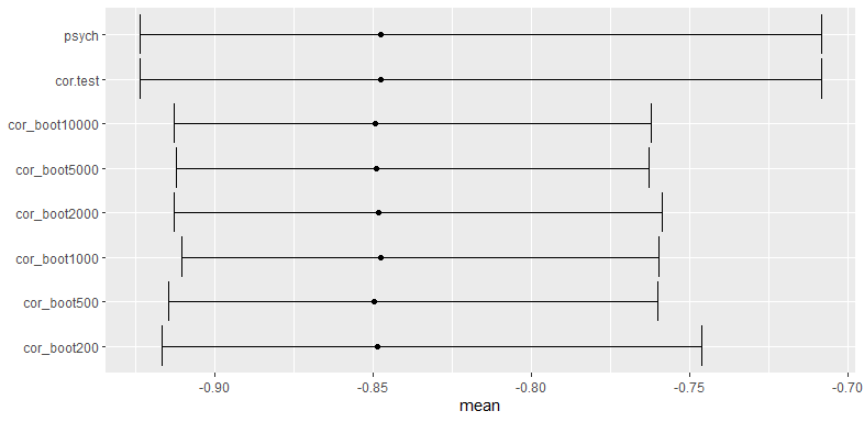
Indeed, the bootstrap interval is narrower, and increasing the number of bootstraps does not correct this difference.
Is this an expected result? In this case, is there a way to correct it?
R code for bootstrap simulation:
First, I declare a function that takes 2 vectors, put them in a data.frame, and then replicate B times the process "take N couples of values from those vectors (with replacement) and calculate the correlation".
cor_boot1 = function(x, y, B=200){
    dat = data.frame(x=x, y=y)
    N = nrow(dat)
    replicate(B, {
        idx = sample.int(N, N, replace = TRUE)
        cor(dat[idx, 1], dat[idx, 2])
    })
}
Then, I take 2 numerical vectors from the mtcars dataset and calculate the correlation along with the confidence interval using standard functions (cor.test and psych::corr.test).
x=mtcars$mpg
y=mtcars$disp

ct=cor.test(x,y)
ct$estimate # -0.8475514
ct$conf.int # -0.9233594 -0.7081376

ct2=psych::corr.test(x,y)
Now, I set the seed for reproducibility and calculate the correlation and intervals using my bootstrapping function for several values of B.
set.seed(0)
l = list(
    cor_boot200=cor_boot1(x,y, 200),
    cor_boot500=cor_boot1(x,y, 500),
    cor_boot1000=cor_boot1(x,y, 1000),
    cor_boot2000=cor_boot1(x,y, 2000),
    cor_boot5000=cor_boot1(x,y, 5000),
    cor_boot10000=cor_boot1(x,y, 10000)
)
Ultimately, for each result, I get the mean and the 2.5% and 97.5% quantiles (which are supposed to be the confidence interval bounds) of the bootstrap results. This allows comparing the results of standard functions and bootstrapping.
library(tidyverse)
rslt = tibble(name=names(l),
              mean=map_dbl(l, mean),
              # se=map_dbl(l, sd),
              # conf_i=ct$estimate-1.96*se, #saw this somewhere, obviously even worse
              # conf_s=ct$estimate+1.96*se,
              conf_i=map_dbl(l, ~quantile(.x, probs=c(0.025, 0.975))[1]),
              conf_s=map_dbl(l, ~quantile(.x, probs=c(0.025, 0.975))[2])) %>%
  rbind(
    c(name="cor.test", se=0, mean=ct$estimate, conf_i=ct$conf.int[1], conf_s=ct$conf.int[2]),
    c(name="psych", se=0, mean=ct2$r, conf_i=ct2$ci[["lower"]], conf_s=ct2$ci[["upper"]])
  ) %>%
  mutate(name=as_factor(name), across(c("mean", "conf_i", "conf_s"), as.numeric))
  name            mean conf_i conf_s
  <fct>          <dbl>  <dbl>  <dbl>
1 cor_boot200   -0.849 -0.909 -0.773
2 cor_boot500   -0.845 -0.914 -0.746
3 cor_boot1000  -0.847 -0.912 -0.755
4 cor_boot2000  -0.849 -0.910 -0.761
5 cor_boot5000  -0.848 -0.912 -0.761
6 cor_boot10000 -0.849 -0.913 -0.762
7 cor.test      -0.848 -0.923 -0.708
8 psych         -0.848 -0.923 -0.708
Here is the plot where the point represents the mean and the whiskers represent the quantiles:
ggplot(rslt, aes(x=name, y=mean, ymin=conf_i, ymax=conf_s))+
  geom_errorbar() + geom_point() + coord_flip() + xlab(NULL)
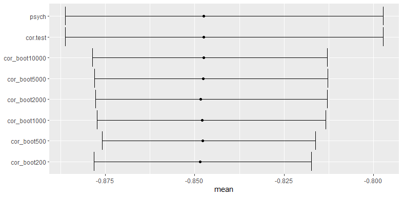
Here is the same plot with a 5-fold larger input:
x=rep(mtcars$mpg, 5)
y=rep(mtcars$disp, 5)


rtag, as this question may be a bit dependant on the statistical behavior ofRitself (the tag description fits perfectly to the question). I will try to explain my code with comments but I'm afraid that knowingRmight be somehow mandatory to answer this question. Still, this is not a programming question at all and I really think that it belongs here on SSE. $\endgroup$Rand theRpackages you are employing. $\endgroup$