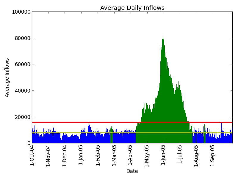
I have a data set which consists of 50 observed years for which I have date and inflow values between a river and a reservoir. The data is formatted as follows:
Day     Inflows
123      4356.0
I have 50 years of observed data which includes daily values for each day. The plotted data looks as follows:

Ignoring the small outlying patches of green for now, I'm looking for a method of simulating the green portion of the curve (which represents the spring runoff period) so that I can do a series of model runs with simulated spring inflows.
I'm hoping that someone might be able to point me towards a 'standard' method for approaching this kind of problem. There is extensive variation between the years in the data set (drought years show very little change between the blue and green portions of the year). What are some methods for approaching generating data like this?
Let me know if there is any other information that I can provide. I'm quite new to this kind of problem so I'm unsure what would be most useful.
