I'm just having a look through Hadley's very excellent book about his ggplot2 R package.
He has some code to remove a linear trend in the diamonds dataset, like so:
d <- subset(diamonds, carat < 2.5 & rbinom(nrow(diamonds), 1, 0.2) == 1)
d$lcarat <- log10(d$carat)
d$lprice <- log10(d$price)

detrend <- lm(lprice ~ lcarat, data = d)
d$lprice2 <- resid(detrend)

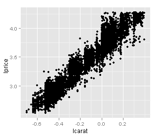
qplot(lcarat, lprice, data = d)
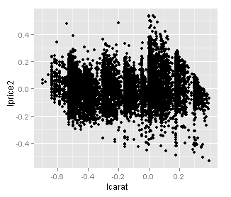
qplot(lcarat, lprice2, data = d)
Produces these graphs
Unadjusted...

Detrended...

I'd like to see what the actual values of lprice would be without the effect of lcarat. Plotting residuals vs lcarat shows the right shape, but the points are shifted toward y = 0 (look at the range of the y-axis units).
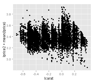
To get what I want, does it make sense to simply plot residuals + mean(lprice)? i.e. shift the previous graph up by mean(lprice).
qplot(lcarat, lprice2 + mean(lprice), data = d)

Does it make sense to do this? Is there a name for what I'm trying to do?
